 If you find anything about concept or design in a photography magazine, it’ll most likely be a puff piece about digital workflow or boring model shoots. I don’t need to read about what a softbox is or how putting my flash off my camera will enable better light control. What I’m interested in is advancing and expanding my ability to visualize and create cool-looking photographs. That’s why I’ve compiled a review of the best magazines (as I see it) to read if you’re interested in pushing your photo-making creativity abilities and improve your image-making capabilities.
The Background
What’s Photography without Design? If you go through the trouble of picking out the lens, capture medium, lighting, wardrobe and makeup, are you a designer or a photographer, or the art directory? If you’re trying to improve your photography, does it make sense to read meaningless photo publications with over-written gear reviews, or should you pick up fashion and design magazines instead? Photography magazines are often touted as places to learn about image capture and advancing your in your ability as a photographer – and they generally are if you don’t do much more than take generic pictures of sunsets and cats, but why be mediocre?
When I thumb through magazine racks, the photography-specific magazines are usually filled with little more than the latest meaningless gear reviews and photoshop tips, or the rare technique tutorial. Too often images in photography publications are generally boring and uninspiring because they serve no purpose but being content for selling a magazine which explains how to take generic photos.
The best way to get inspired and expand your conceptual mind is to learn about stuff aside from the easiest art form ever created (digital photography). To do this, I recommend reading a seemingly random combination of design, fashion, and commercial photography publications.
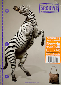
Archive
I always feel weird about buying Archive because it’s really just a giant collection of the best commercial images. So, I’m basically paying good money to look at advertisements. Ahhhh, but high quality ads are more than just good visual input for the brain. Archive shows you the trends and visual markers, which are driving advertising dollars. If nothing else, it’s probably the best place to go if you want exposure to the latest fresh ideas. You don’t have to be into commercial photography to enjoy Archive, because at this level the ads are art and it’s packaged in a form you won’t find anywhere else. One issue is on the order of $15, but it’s not something you buy every month.
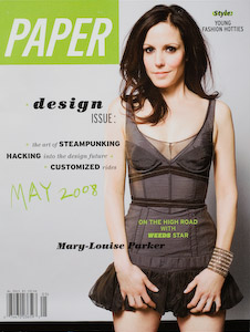
Paper
I used to think design was just an abstract marketing tool for high-end Swedish furniture companies and million dollar ad agencies. The cool thing about Paper is that it’s basically easy-to-digest design for non-art people. By reading Paper you get exposed to design concepts in different areas; from high-end art to the coffee maker on your desk, and it’s done in a very unpretentious, inspiring way. A lot of the written content will seem more like a pop-culture magazine, but it’s one of my favorite reads because it really shows you the artistic, design, and style elements in every day life.
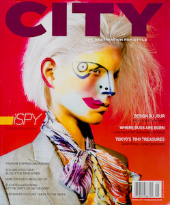
CITY
The Destination for Style CITY is a magazine somewhere in between high-end fashion and practically unobtainable design. Some highlights from the iSPY 2008 Design Issue (#56) covers product design in Tokyo, the internal design of a Volkswagen factory, and a photo spread shot by Vincent Skeltis (styled by Julie Ragolia). CITY is great because it gives the reader a wide range of high-end design and style input.
Nylon
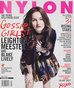
The more photography and portraits I make, the more I realize how little I know about fashion and current trends. It’s not like I want to copy every new fashion trend I see, but I like being exposed to new things. Nylon is a great publication because it has a certain street edginess and gives you all the latest fashion trends and insights without reading like an uppity advertisement-filled tome like Cosmo or In Style. Once you learn to translate a certain fashion style to your own work, you basically open up a whole new set of tools for visually communicating your concepts.
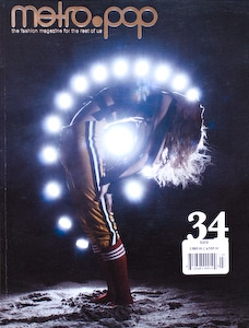
Metro.Pop
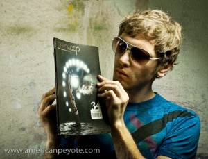
“A fashion magazine for the rest of us.” Most of the time when you pick up a fashion magazine it’s like 60 percent advertisements, 30 percent boring articles, and the actual fashion content in terms of photography and style can sometimes be very small. That’s why Metro Pop rocks, it’s basically a well-done fashion mag where the total focus is on presenting daring fashion images. Every time I pick up a copy of Glamour, the images are all easy, boring (from my viewpoint) well-lit glamour images. Conversely, the content in Metro Pop is sometimes out of focus, maybe a tad blurred, and the lighting will mostly be non-standard and definitely not flat. Read Metro Pop to get a feeling for how bad your fashion images suck.
Layers Magazine
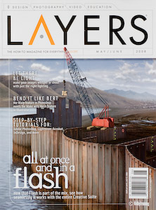
No progressive list of magazines for photography in the modern day and age is complete without the inclusion of Layers Magazine; the place to learn about all things Adobe. In the mixed-media world into which photography is heading, the image will just be part of the larger story. Layers gives you a feeling for how vast the possibilities are for producing visual content using Photoshop, Flash, Illustrator, InDesign, and any other Adobe product. Photography is often included in one form or another, either in Photoshop articles or in articles like the recent inclusion of a piece by Joe McNally, detailing the use of different modifiers in camera lighting.
What Does It All Mean?
Look, there’s not really anything wrong with reading magazines like Popular Photography, but pretty much all important parts of the content can be found online, so why pay for the hardcopy? Ahhh, yes, they publish all of those cool camera reports. So what, Your Camera Doesn’t Matter, well, at least not as much as most marketing people want you to think it does. For those learning photography, the difference between all DSLRs is pretty much nothing, so use the time and money you would have wasted on dissecting the differences between the Canon 5D and the Nikon D700 and produce some images or get inspired.
In its essence, a photo is just a capsule of concepts and elements of communication. I never buy photography-based magazines because they generally don’t contain engaging imagery or feed my creative mind. Instead, I’ve stared reading design, fashion and commercial photography publications to feed my need for visual exploration. The act of image making is the same as ever before, a lens focuses light on an image capture medium and the exposure is controlled by the shutter and lens aperture. That’s all photography is.
You can get all the near-meaningless (for most photographers) technical gear reviews and puff pieces about taking generic photos on the web, so why pay for the same lame content in magazine form? I love strong content, it drives my imagination, and I love seeing engaging imagery, (not limited to engaging photos).
If you want to push yourself and get exposed to new ideas move beyond the old photography publications, which have become largely redundant in the digital age. Get crazy and expose yourself to new ideas and be daring – otherwise, what’s the point in getting out of bed every morning?
