Dynamic Color Portrait Photoshop Tutorial

Here I present a workflow for creating a dynamic image using layers in Photoshop. Why? Well, because I like to share and because I got some requests on my Google+ album asking how it is done. To illustrate the process, I’ll use a set of images I created for Scaramanga Bags, a cool company in the UK that sells vintage leather bags and other things like journals and vintage suitcases and trunks (see the Scaramanga Concept Images here). On their website Scaramanga already has nice urban portraits with their bags, so I wanted to go in a different direction. I wanted to create portraits that convey a feeling of abstract motion. Something to invoke a feeling of movement and action. I love photography and painting. I began with photography looking for image perfection, and then moved to painting after developing a color palette in Photoshop. I like to light an image in layers, and in Photoshop I layer colors and backgrounds to add a sense of visual movement to an image. I look at a scene, put on a pair of rose-colored glasses, and I have a layered image (because at the base, this is all Photoshop does). When you can do this in your mind you then just need to translate that to something other people can see, and for that we have Photoshop. The aim of this article is to show you how to combine images together to create unique, balanced color combinations, which add a desired character to the original image.

The Basic Recipe


I generally apply this concept to portraits, where I want to add a certain character which complements the person photographed. First, begin by realizing that the person is a person, not simply a subject (A Person is not a Subject) for academic study. I start out with a base portrait image, generally shot in a studio environment with a two or three light setup using softboxes and maybe a beauty dish. Why? Because we need a decent (well exposed) portrait to start with. It should be something that speaks to you and has the look and pose you want. The layers in Photoshop are just there to modify the intention of the original image (otherwise just go ahead and create an image from scratch and render it in 3D).


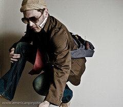
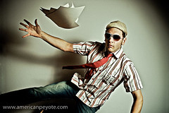
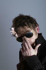
I always start with a well-exposed base image that defines the main textures, tones, and colors of the person. In the Scaramanga Flight Bag images I used a Sony A900 and Elinchrom lights with a CreativeLight softbox. You don’t need an expensive camera and equipment, but you do need to know that a properly focused image with proper exposure will give you the largest amount of information to work with. If your initial image has high contrast or deep and dark shadows, then you just need to know that you can’t modify those areas of the image very much, and they will not blend so well when we layer a new image on top of it, since the very dark areas contain very little color to modify. So, let’s start from the base image.

The Base Image


In reality we’re mixing static image layers one on top of the other. In my mind I’m painting on layers of color movement to complement a portrait. I began with images produced in my apartment studio, and posed in such a way as to communicate the idea of running or of standing still, with motion in the background. This is my base, a strong pose which will be modified (enhanced) by a new layered color environment. For more info on creating a dramatic pose portrait check out my post on this subject (Urban Ninja – Dramatic Pose Tutorial). In short, I take my inspiration for poses like this from comics and graphic novels such as Conan the Barbarian, 300 and Watchmen.


After importing the images into Lightroom I chose the best and then increased the Fill Light to reduce the contrast in the image, and then exported to Photoshop for layering work. When exporting from Lightroom I don’t want deep and dark shadows, but rather a lot of information to work with and which will respond well to layering. Once in Photoshop I will often start by adding a Black and White and High Pass layers to the base image (although I didn’t need to do that for this image set). I first copy the original layer, add a High Pass filter, and set the blending on that layer to Soft Light. This has the same effect as increasing Clarity in Adobe Lightroom, but in a more controlled way. I reduce the Fill value on this layer so that everything blends well together and the image doesn’t look gaudy or like it was just run through an actions industrial meat grinder. I will often also create a Black and White adjustment layer, and then set the blending to Multiply. You can then adjust the values for reds and greens and blues. This desaturates the color while intensifying the shadows of your base image. It can darken the image a lot, but the goal here is to modify the tones of different parts of the image (such as skin tones). Again, I will often reduce the Fill of this layer so as not to totally kill the base colors.

Choose Layers


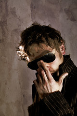
I always start from the base portrait and then choose layers on the fly. For the Scaramanga images I wanted a lot of bright colors with movement. So, I opened up Adobe Bridge and looked for long-exposure night scenes with lots of color and light streaks. To achieve this abstract motion goal, I picked a few images that I had shot in New Orleans, Zurich and Berlin. The key here was to have images with long light streaks and pockets of intense color, which would blend in with the form of the person in the Scaramanga portraits. By blending well I mean that the lines of the night scenes would coincide with the lines of the runner (think of drawing lines over his body and comparing it to the flow of the layer images – check out my Dynamic Pose Tutorial for clarification). There’s no formula here, you just need to pick images that work well together. Aside from light streaks, these images also have very interesting pockets of color, and also recognizable object elements such as a tram or street scene, which then defines the background environment of the final image. The night images from Zurich give the feeling of running through a city of lights, while the one of Bourbon St. gives the idea of a person standing still while the environment is exploding in color around him. Now that I have chosen the layer images, I just need to blend everything together.

Blending Layers


After picking the layer images in Adobe Bridge I opened them in Photoshop, and automatically set the blending mode to Overlay. This allowed me to preview how the different light and color elements of the layers would work together, and how the flow of the lines of the layers would mix with the base portrait. At this point, the image just looks like a couple of images stacked on top of one another, and that lazy sort of image production just doesn’t do it for me. To properly blend the images you need to play around with the blending modes, like Overlay, Softlight, etc. and also change the Fill and begin masking individual areas with a paint brush or gradients. To mask a layer by painting simply select the layer and then choose the layer mask icon. When you now paint with black, the layer will be masked (or hidden). You can change the Opacity of the brush to mask the layer gradually with each new brush stroke (the recommended method). When masking in this way I usually use a brush Opacity between 3-20 with a soft brush. This is where I act more like a painter than a photographer, masking and blending the layers uniquely together. I rarely use the entire layer image. Often I use a gradient to mask out half of it, and also paint away most of the layer over the person. I will also add full Color Fill layers (usually set to Overlay blending) to tweak the overall color. Eventually, the final image will then start to come out. To illustrate this process, you find here the secret goldmine of any Photoshop artist, the screenshots of my Layers window on my two favorite images from this set, the Runner and Bourbon St. You can clearly see how the different layers were masked, and what the original layer images looked like before blending.

That’s All


If this sounds complicated don’t be deterred. Essentially all I do here is to mask out the parts of the individual layers which don’t flow well together, and in the end I have an image with all the flow and color vibrancy I desire. The main idea is that the character of the layers complements the base portrait. I save the image and open it up in Lightroom. From Lightroom I play with the colors further, adjust shadow and highlight colors, Vibrance, Clarity, etc. until the final color tones are correct and then I export.


For more info on layers and portraits, check out my Hyper-Realistic Portrait Photoshop Tutorial. This covers the main topics I addressed in this post, but you get to see a screen cast of the whole process.


Sessions with Joey L – DVD Tutorial Review

This is a review of the Sessions with Joey L DVD Tutorial, including a break-down of the DVD content and how I feel it applies to my photographic directions and how it might be useful to other people.


Back in the fall of 2007 I was spending my days in a Tokyo dorm room playing around with Photoshop, and decided it was time to pick up some sort of tutorial DVD.  Yes, you can learn and be inspired without needing to buy these things, but I break my brain trying to figure out stuff like applying Altair Optistruct optimization strategies to fatigued composite structures with barley a manual to work with.  So with Photoshop I was looking for a way to relax and get a grounding in photo processing, so I bought the JoeyL Photoshop Tutorial DVD by photographer Joey Lawrence.  It was well received by some, ridiculed by others, and I found it to be a good buy.  However, I’m able to pull a great deal of knowledge from anything, due to my training in figuring out ball-busting simulation programs like Nastran.  However, for my purposes, what was lacking from the Photoshop Tutorial DVD was the connection between lighting and shot setup and Photoshop processing.  So when Mr. Lawrence released his Sessions with JoeyL DVD, I watched the trailer, and then decided to drop 200 USD on the DVD.


First some background on me


Here’s my situation.  I’ve mainly focused on learning photography and lighting during the last two years.  This was mainly in my spare time while finishing my Doctor of Science degree at ETH Zurich  I read Strobist in between experiments, and sometimes sketched out lighting diagrams at the SPIE Smart Materials conferences.  Since starting a normal job I’ve had time to develop a lighting and processing look that I like, which fits with what I see in my head.  To this end I finished with taking only self-portraits and started organizing model shoots.  The last piece is nearly in place and that is making a strong link between vision and reality.  Taking the image in my head and easily making it a tangible medium people can hold in their hands or see for themselves.  I sketch out shoot ideas, design lighting concepts, network, and do my own Photoshop.  Foe me it’s all part of the process of Arience, the integration of Art and Science in my life.  In my view, everyone is a poet and an engineer.  I attended a Strobist seminar and picked up the Sessions DVD to get a better perspective on how other photographers work, see the process of concept to photo in other people.


The Sessions content is broken down as follows


Lighting Theory

    The Vision

    Lighting Theory – The Basics

    Lighting Theory – Advanced Technique

    The Necessary Tools

    Modifiers

Photoshoots

    Forbes Assignment

    Monty Are I CD Artwork

    Thrillogy Advertisement Shoot

    Model Test Shoot

    Strange Familiar

Business

    Business Lecture

    Trust

    Misc Q&A

Travel

    Travel Lecture

    Ethiopia: Behind the Scenes

Photoshop

    Compositing

    Using Color Curves

    Strange Familiar – Swapping Skies

    Experimenting with Blending Modes

    Black and White Conversion

    Tonal Colorizing

    Fixing Blown Highlights

There’s something that always floats around in my head, namely that photography isn’t difficult, and it gets easier every year.  Images which took a full production studio to create 20 years ago can now be done in a bedroom quicker and with fewer resources.  The thing that interests me is the process and approach a person takes to the whole idea of photography from concept to lighting to final image, and I think this has been well communicated in the Sessions DVD.


Lighting Theory: Joey explains his philosophy and how he sets up lighting.  Then he moves on to modifiers and how the ones he uses to define the character of his images.  If you know nothing of lights and modifiers this is a great video, if you know everything already you probably won’t buy this DVD anyways.  I fall in the middle, and found this to be a very interesting section.  It didn’t totally revolutionize my ideas on lighting, but did make me think a bit more outside of the Strobist softbox.


Photoshoots: Joey presents a walk-through, behind-the-scenes videos of different shoots including bands, a plastic surgeon, and a model test shoot.  Throughout Joey gives explanations of lighting and concept, and you can draw a direct link between how he works and his previously described Lighting Vision.  Also interesting here is seeing the photographer-model interaction.  This is an important, I think the most important part of a shoot.  I try to make an emotional connection with models and explain what I’m trying to create in a shoot, and it’s interesting to see the way Joey works in these different situations, working with a TFP model versus a highly successful surgeon versus a band releasing a new CD.  All in all, very cool to see.


Business: Joey describes how he grew and developed as a photographer, the value of a portfolio, how he gets jobs, basically a discussion on how he works as a businessman.  Again, this is great to see, and would be interesting for anyone contemplating a business (even outside photography), because he focuses on the personal drive and interaction which are needed, as opposed to just having a slick portfolio online somewhere.  He also has a video on Trust and how important it is for business as well as directing shoots, again, very cool stuff to hear about.


Travel: Focus is on Ethiopia, and a lot about how he understands the culture of his subjects before blasting them with a Profoto strobe.  You don’t need to be planning a trip to Africa to get a lot out of these videos, they focus on the human connection between photographer and subject, a topic often missed and usually never even brought up in internet forum discussions (well, the ones I read at least).  The Travel section is great for looking at the human side of photography, and focusing less on the technical side.  It’s also a great motivational video if you’re the type who always thinks of traveling but hasn’t jumped on the plane yet.


Photoshop: Here are presented a few popular techniques, many things people are always asking about on the internet.  Yes, you can also find internet videos on the basic techniques, but it’s the application of those techniques in the larger puzzle which is of value here.  If you want to buy the DVD just for Photoshop, you’re better off looking at something else (I recommend Skin Photoshop the book).  The Photoshop section fits in very well with the rest of the DVD, bringing the vision full circle to the post processing stage.  This was something I found lacking in his Photoshop DVD Tutorial, because there a strong connection wasn’t made between lighting and post-processing.  Here however, you can see how the images from the Strange Familiar shoot are processed, including a new sky, and in this way you get a feeling for the whole process from start to finish.


Why I Liked It


What I like is seeing concept development in other people, and seeing how they think and work.  I like understanding their philosophy of creation and ideas or their approach to concept development and how it’s realized in a final form – be it a picture or an elegant toaster.  In this way, I think the Sessions DVD is fantastic, and I recommend it instead of taking a workshop (if you have to choose).  Sessions gives you a feeling for the whole process from lighting philosophy, through shoot execution, the business approach to final Photoshop editing, and throughout out you get a feeling for the human connection as a main driver of the process.


Is it worth the Money?


Is $200, $250, $300 too much for a photography DVD?  Maybe yes, possibly no.  I paid $200 for my copy, and I’m ok with that. The Zach Arias DVD is $250, the Strobist $135, and new ones come out all the time from places like Lighting-Essentials, Scott Kelby (how many remixed Photoshop books can we release this year?) and David Honl (to name a very few).  But not all are coming from a working commercial photographer who shoots stuff I find interesting. This isn’t the same as a working educator who also takes nice photos.  There is a significant difference here.  It’s easy to say, “you need to do this, this and this” to make cool pictures, it’s another thing to be a working photographer at this level and showing the whole process.


I consider it the difference between learning Physics from a tenured professor who hasn’t written a new publication in 2 years versus a Richard Feynman (even after he was at the top of his field, you can find some of his lectures on the net).  Maybe this sounds harsh, but my main critique of 90% of the photography/Photoshop learning material I see for free from internet sources as well as some professional educators is the lack of vision, and for me that makes all the difference.  The Sessions DVD is a tutorial with Vision and Heart.  But maybe that’s just me?  I got so bored with McNally’s Hot Shoe Diaries I didn’t get half-way through it, but I love re-reading Michael Grecco’s Dramatic Portrait.  It’s just what gets me off.


I’ve also reviewed and still like the JoeyL Behind the Scenes Photoshop DVD, the reason being that the focus isn’t placed on minute details of levels and curve operations, but because it focuses on process and development.  This is the same philosophy I use in engineering research, so maybe that’s why I like it.  The details can always be ironed out, but if you don’t have that overall big picture (that thing you’re reaching for) in your head, then you won’t have a clue about which details need to be fine-tuned.  This is one thing I wasn’t getting from reading Strobist or attending a seminar – but I just learn differently than other people, and so do you.  I don’t need someone to make me creative, I do that on my own, sometimes vie induced boredom.  It’s just cool to see how other people are creative in the scope of their vision.


Brass Tacs


The Sessions DVD isn’t some blue pill to take with a whiskey chaser, promising you everlasting creative abilities as well as the drive to bring your vision into the world.  It’s just another piece in the puzzle. Seek your knowledge in the way you know will be most effective for your own personal learning style.  I get Photoshop technique inspiration by actually painting, I get lighting inspiration when I’m listening to a Web Monday talk or a smart materials presentation.  No two people learn the same way, so find out what works for you and exploit it to make your own visions a reality.


Photoshop in My Analog Days

perspective-1.jpgPhotoshop is one of the coolest, most influential programs I’ve used in my computer life. Before I had a digital camera I had a Mac Cube, that beautifully designed simplistic computer which has never been equaled for elegance and class. It was a good time, I put contact paper on my walls and wrote on them whenever an idea took hold. Poetry, philosophy, thoughts on existence, everything that came into my head. The problem with drawing on static walls is that the ideas and pictures become locked in a certain place, a specific arrangement. Photoshop freed me from that. As soon as I got Photoshop I knew it would be pointless to use it with a mouse and picked up a Wacom Graphire tablet for $80 or something. From there I started experimenting with combining sketches and doing the color digitally.


In retrospect, it’s obvious that my background in Photoshop learning started in my Math, History, English, and Chemical Engineering classes. I wouldn’t say I was totally bored in school, but y=mx+b doesn’t need to fill the entire brain, and the vast expanse not consumed by redundant analysis of the Scarlet Letter were used to draw various things in my class notes. The problem is that you then have to run through old homework assignments on colloids to find that cool sketch of a screaming head, and much like Ulysses for writing, Photoshop has been great for giving life to random class sketches.


With Photoshop, a scanner, and a Wacom tablet, I knew I had it made. My first real attempt at creating something was a composite of hand-drawn sketches scanned with a Microtek machine and manipulated on screen. I included a portrait, taken during a biomedical engineering student meeting at Michigan State University (MSU). Somehow I guess it was the precursor to the current self-portraits on Flickr and my website.


geu_gnome-1.jpgI called this first thing “Perspective” I guess because, well, I have no idea. I was introduced to Pink Floyd: The Wall during this time, so it made sense to include a brick type structure, which was being demolished by small worker guys with devil legs and no hair on their heads. I also like the look of Marvel and Magneto from the X-men, so I added something with muscles and a cool Spartan helmet. It started as a few separate hand sketches which were digitized, and then colored in Photoshop.


Here was the workflow:

Draw random stuff
Scan sketches with flatbed scanner
Open in Photoshop
Cut up the sketches, just taking the ones I like
Assemble sketches so they sort of fit together
Ink over with a Photoshop brush
Expand and draw other strange images
Add color on separate layers for everything
Save and forget about for 8 years

dog-1.jpgIt’s been cool to look at what I do now with a sweet camera like the Sony A900 and what you can do today with Photoshop, and compare it to what I was doing nearly a decade ago in my apartment. What I edit photos today, it’s always with a Wacom tablet, adding to the shadows, manipulating the density of darkness on arms and cheek bones, using the exact same drawing techniques developed in Geometry class when I thought of how cool it would be to draw an issue of the Punisher. Photoshop is a sweet program, but like Altair Hypermesh, it hasn’t changed much in the past 10 years. There have been some essential changes, but the core philosophy has stayed the same. If you have a cool idea and some drive, you can create some tripped out stuff. It’s just the drive to create which is important and will propell you forward, not matter if you’re working on Smart Materials, a photo shoot, or a sketch during a chemical engineering class.


r0011876.jpg

Random Photoshop Tutorial – Grunge Textures

A Textured Sad Clown

In Photoshop a texture is just something, an overlay, an image layer, a way to add some sort of depth to the image which wasn’t there before. There are many different reasons and motivations for using textures in Photoshop, and I’m here to quickly educate the curious reader on how to use grunge textures in Photoshop.


First off, why grunge?


I don’t know why I like the feeling of grunge textures. Maybe it’s because I’m trying to re-create the feeling I get walking through Berlin or Detroit, maybe it’s because I’m a cliche and am just following the crowd. Joey Lawrence uses grunge texturing techniques, and I bought the Joey L Photoshop DVD Tutorial, so obviously I’m just copying his style. Maybe, but some people say that everything is just a copy of a copy of a copy. I know this because Tyler knows this and because Fight Club is one of my favorite books/movies. What I do know is that sometimes I take a photo and it’s perfectly exposed and has great shadows and yet it just doesn’t have the look, the texture that I want the image to have, so I have to go about adding such elements in Photoshop.


So, what’s a texture?

A texture is a separate image which is overlayed over your original image, and through the use of different blending techniques, defines a part of the image. Textures can be used to change the mood or intended interpretation of the original concept which was in your head when you took the photo. If an image is nothing but a story and the photographer is just the author, then textures are just visual storytelling tools.
Where do textures come from?

Anywhere, any image can be used as a texture and currently I prefer to use concrete and street art textures. I use custom images, which means that I photograph walls and doors and parts of cities which I think have an interesting texture or feeling, specifically to use as textures in Photoshop. I generally like creating images where the original photo, and the texture images are all taken in the same location. So if I do a portrait shoot in Winterthur, Switzerland, I will probably use textures shot in that area as well. I like this idea because it means you’re including environmental elements of the shooting location in the processing of the image, and then the final image is a combination of the subject as well as of the environment where the original image was produced. Once you have a image to use as a texture, how is it used in Photoshop?


YouTube Preview Image


How Do You Add A Texture in Photoshop?


If you’re visually inclined, check out the video tutorial above, which goes through how I created the Textured Sad Clown image. To add a texture to an image in Photoshop (or any other image edition program with layers) you just open the texture image and your main image, and then you copy the texture to the image to the main image. The texture will be imported as a separate layer, and now you just need to blend the texture into the layer below it. There are a number of different blending modes and techniques, which can be used to blend your texture into the final image. The two main ways to blend texture into the original image are via the blending mode, and then via masking of the texture layer. The blending mode defines how the colors, luminosity, tones, and visual parts of the texture blend into the layer below it. So, for example, if you choose “multiply” as a blending mode, then similar tones are multiplied together, producing a darker image. If it’s not the look you want, try another one till the image starts to look good. What is “good?” Good is whatever you think it is. There’s never one blending mode which works for each image and concept. You just go through them all till you find one that you like. Once you settle on a blending mode, you’ll probably still want to modify it to bring out different aspects of the image. This is done by masking. Masking is a technique to mask out or hide parts of a layer. It’s a non-destructive editing technique which is pretty essential in Photoshop. For example, with a portrait, you probably don’t want the texture layer to block out or dramatically change the face of your subject. So after selecting the layer mask on the texture layer, I can paint over Amber’s face, so her features aren’t hidden. The overall opacity of the image can also be reduced to uniformly reduce the impact of the texture layer.


Obtaining Textures


I’m continually adding to my texture library. It currently includes textures from Zurich, New Orleans, Tokyo, Winterthur, anywhere that I find a cool surface to shoot. The more textures you have, the more story telling elements you have at your disposal. I don’t use texturing techniques on every image, sometimes I want a certain look, sometimes I don’t. Sometimes it looks cool, sometimes it’s a cliche. Do what feels right to you when processing in Photoshop. If you limit yourself to a Joey L style or the Scott Kelby 7 Steps, then your images will look like those of a thousand other people. Is that what you want? Maybe every photo I take is just a copy of a copy of a copy. But so far I haven’t found that to be the case.


If you’re interested in trying out some texturing effects in Photoshop but don’t have any images to use, and you live inside a white box without a key, or it’s cold outside and you’re not in the mood to go shooting, or you just want to get started right now this second…


Here is a sample of my Texture library to download and fool around with. It includes custom images produced in the old industrial areas of Winterthur, Switzerland. These textures are free to use for non-commercial work and for educational non-profit uses.  When publishing an image, please add a credit for American Peyote, and link back to www.americanpeyote.com and please don’t hotlink to the Winterthur Textures zip file.


Winterthur Textures Library


I would be interested in seeing how you use these textures, so feel free to email me samples of your creations.


Additional Texture Library Sites:


Textura


Texture Warehouse

Photoshop Express – Divine Deliverance


In the dark ages there came to pass the revelation in imaging technology, which has since come to define and dominate the photo world.  Photoshop, has and will continue to be the premier photo editing go-to program for millions of minions – but it what form will the program take?  The introduction of Adobe Photoshop Lightroom brings the easy of photo organization and keywording to a new level.  Work-flows are faster, letting one access and edit images with gleeful ease.


But when one has images and feels a need to share them Photoshop and Lightroom falter, for they offer no output directly to the web.  And if your image are not on the web, then they don’t exist.  Images, like cartoons die without the attention of viewers.

This is why we love Flickr.  The easy of image uploading and keyword tagging means you can post and distribute your images across the web in femtoseconds.

What if some freak accident fused the awesomeness of Photoshop with the web-coolness of Flickr?


Bow down Earthly photo-crazed mortals, for the Divine ones from the digital sanctuary have again blessed us with new gifts.

Photoshop Express

The cosmic programmers at Adobe seem to have taken the best of Photoshop and Lightroom and fused those excellent image editing and browsing tools with the goodness of Flickr.

With a free Photoshop Express account one gets 2 GB of storage and a browsing and image editing interface similar to Adobe Lightroom.  You can upload images, edit them, their colors, tones, crop, fix exposure, red eye, white balance,sharpen, and do black and white conversions, but that’s not all.

Images can be distributed similar to Flickr, which means embedding images in websites and blogs and having them linked to you Photoshop Express account.  Naturally you can set up a gallery and show your images directly from Express.  The really cool thing is the images are not public until you make them so.  In Flickr everything is just up on your photostream.  Express also offers integration with Facebook, Photobucket and Picasa.

The Future with Photoshop Express?

Sweet Jesus, just imagine the future with me for a second…
You take a picture with your WiFi enabled camera, it uploads directly to Photoshop Express, with your WiFi laptop you do the editing and then distribute you digital media to blogs and website, all online, no computer program to load on a computer, it’s all online, in the air, across the radio waves.  The need for redundant backup harddrives at home is less needed and you can access and edit your photos anywhere with an internet connection.

...or whatever, brass tacks Photoshop Express is a pretty kickass – a cool photo editing and sharing platform, and it’s what we’ve been expecting for a while.  Program distribution over the net, and all you need is a license agreement with the provider.  Many are surprised Microsoft hasn’t already done this with Windows.

Here’s the future: No software, just onlineware, nolineware, and for now it’s freeware, but for how long?

You can sign up here:

Photoshop Express

And quick tutorials are here:

Photoshop Express Techniques