Photography

Toy Warz: Monster High and Team Fortress 2

Every time I spend time in Michigan I pull out a bunch of toys from the basement and mix up them up with current toys. Over the last trip I focused on Monster High, mainly because the Scarah Screams action figure has a lot of elements reminiscent of the Matrix, and of course Monster High dolls have articulating arms and wrists, making them much easier to hold weapons than Barbie dolls. In addition, I found these awesome figures from what seems to be an excellent video game called Team Fortress 2. I was mainly interested in the weapons and picked up a flamethrower and mini-gun figure for their armaments.

Given their size, the mini Star Wars Hoth battle play set seemed like a nice landscape element to work with. In Photoshop I started to experiment with layering options found in open museum collections, which I found through the OpenGLAM website. Additionally, I found some archives of World War I images, which were rather low resolution but still worked well for compositing. The Toy Warz series now includes these key elements of children’s toys, war and art all in one project. The inclusion of realistic weapons from Monkey Depot to further blur the line between toys and realistic war images of aggression.

More of the Toy Warz series can be found on Flickr:

The B TeamPatrolCosmic Flame of ResistancePoems for the SavedWater Attack

SMK Danish Art + Toy Warz BYOB Remix

KMS402

Art

While attending the Open Data Days hackathon at the Copenhagen Business School, I joined the BYOB remixing event in collaboration with the National Gallery of Denmark, as well as working on an energy app for the Gatesense. The point was to use some of the artwork from SMK, and remix it into a new and strange, or perhaps comfortably abstract form. My Toy Warz project popped into my head at this point. The Toy Warz project is all about taking toys like Bratz or Barbie dolls, and mixing them up with weapons and imagery from war toys. I shoot the Toy Warz scenes in Michigan and then composite in layers in Photoshop for the final image. On past trips to the Detroit Institute of Arts, I had become accustomed to shooting images of landscapes to mix in with the Bratz dolls. So, it was actually a perfect that the SMK libraries would be used in the remix event.

KMS7240

SMK Remix

However, what I didn’t have was a lot of time to work on the project. At the Open Data Day I attended a workshop by Marieke Verbiesen (http://marieke.nu/blog/), a sort of uber-amazing animation and projection artist who was staying around Copenhagen for a little while. After running quickly through the SMK collection, I settled on The “Summer Spire” on the Chalk Cliffs of the Island Møn. Moonlight by Sødring, F and Zealand Landscape. Open Country in North Zealand by Johan Thomas Lundbye. They are both calm, beautiful landscapes, which mix quite well with the Blue Team action figure and crazy female creature beast (picked up in Ann Arbor, Michigan). With these two it was nice to give an increased juxtaposition between war, beauty, spring, and a cold-looking sea scene.

SMK Toy Warz 1-

I had high aspirations of animating the whole scene in Adobe After Effects, but I was splitting my time with the art remixing and outlining the user flow for an Energy App which would give an energy profile of your life, lead in to gamification and see your energy impact on the world, blah, blah, etc.

EnergyAppFlow

Swiss Train Passenger Perspective Landscapes

TrainLandscapeSwitzerland-06281If you live in Switzerland and have no car you ride the trains a lot. It’s one reason why I like living here, because the time in-transit can be used for something. When you’re driving here or there or biking, you have limited attention and ability to do anything beyond watching the road. I stated doing train passenger landscapes on the train last winter. I wanted to create some slightly blurred landscape images to layer into the Toy Warz storyline I’ve been developing with Bratz and Monster High dolls.

Toy WarzToy Warz

Here for example, you can see how the blurred background trees give just a little landscape texture to the background, mixing in will with the foreground but giving some sense of depth and context to the central image. I wanted to give a bit the post-apocalypse feeling and the texture layer of clouds could be blended into the narrative of the image. Expanding beyond that, I was also looking for image to give more texture or shadows in waves, to mix on either side of portraits or or to direct the eye of the viewer from top to bottom.

Relative Motion

These image have been taking mainly from the route from Zurich to Winterthur and from Zurich towards Chur. I started expanding on this theme and realized I just like the landscape images, in particular when I pan while shooting. The effect is that the background landscape is sharp while the foreground elements like trees and houses are blurred. It’s an experiment of image capture and relative motion of the train to the landscape, mixed in with a long shutter speed, it gives a nice surreal feeling to the shots. If you shoot while the train is curving away from the foreground, you get an added wave texture to the image. Some of these I’ll use for the Toy Warz backgrounds, but I also love them as a series on their own.


Salomon XT Advanced Skin S-Lab 5 – User Review

I am a gear whore, sort of a bag slut. I have packs and bags for everything from urban adventures to backcountry camping, biking, climbing, painting, photographing, writing, skiing, summit assaults, but nothing I had fit right for mountain running and ultra marathons. Nothing worked until I was able to get my hands on a Salomon XT Advanced Skin S-Lab 5 running pack last year when I signed up to run the SwissAlpine K42 mountain marathon. The S-Lab 5 is now my pack for mountain and trail running in Switzerland. After a nice season of running with it in 2011, here are my thoughts on the S-Lab, let’s call it a user review…

Salomon S-Lab Line

Before we jump in, some background is in order. Salomon is an interesting company. I know them mainly from ski gear, but now they have branched out into serious trail and long distance (ultra) running. From my perspective they’re the only large sports company which is really trying to capitalize on the trail running and ultra-marathon market, in some ways actually pushing the sport forward (and are essentially expanding the market need for their products). Unlike other companies which are now bringing out trail running products in a me too fashion, I have the feeling that Salomon is more committed to creating great products for this growing sport, and they also have the design and distribution capacity to bring innovative products to the market. This lends more confidence in Salomon as a company and I consider their products to be the benchmark by which others are measured by.

The pinnacle of their effort is the S-Lab line (I guess this stands for Salomon Laboratory). Basically S-Lab means high-end clothing, shoes, and accessories for trail running. There’s an actual S-Lab place (a sort of prototype shop) where they design, build, test, and refine these products (check out this video on YouTube). They have a guy on their running team named Kilian Jornet who is a sort of a trail running God from Spxain. He wins a lot of ultra races (and came in 3rd after Dakota Jones and Andy Symonds at the 2012 Transvulcania) and is setting the pace for the sport. Salomon sponsors and learns from the best runners in the world, but it seems like the relationship with Kilian is very close. So close, that as I understand it, that various products in the S-Lab product line are developed with direct feedback from Kilian like the new Salomon Sense running shoe (and the S-Lab 5 pack). The result is a product line with a high level of design and attention to detail that addresses the needs of people pushing their personal limits on the trail.

The S-Lab products are lean, light, fit close to your body and really move with you. Normally clothing is something that you need to wear for protection, but in an ideal world you would go without, it’s just there because we want to protect our bodies from the elements. But the S-Lab products actually improve your performance in subtle ways (my scientist opinion). Function and design are combined in a beautiful way, and the 5 pack is a wonderful example of designing a product to specifically fulfill the needs of long-distance athletes.

S-Lab 5 Overview

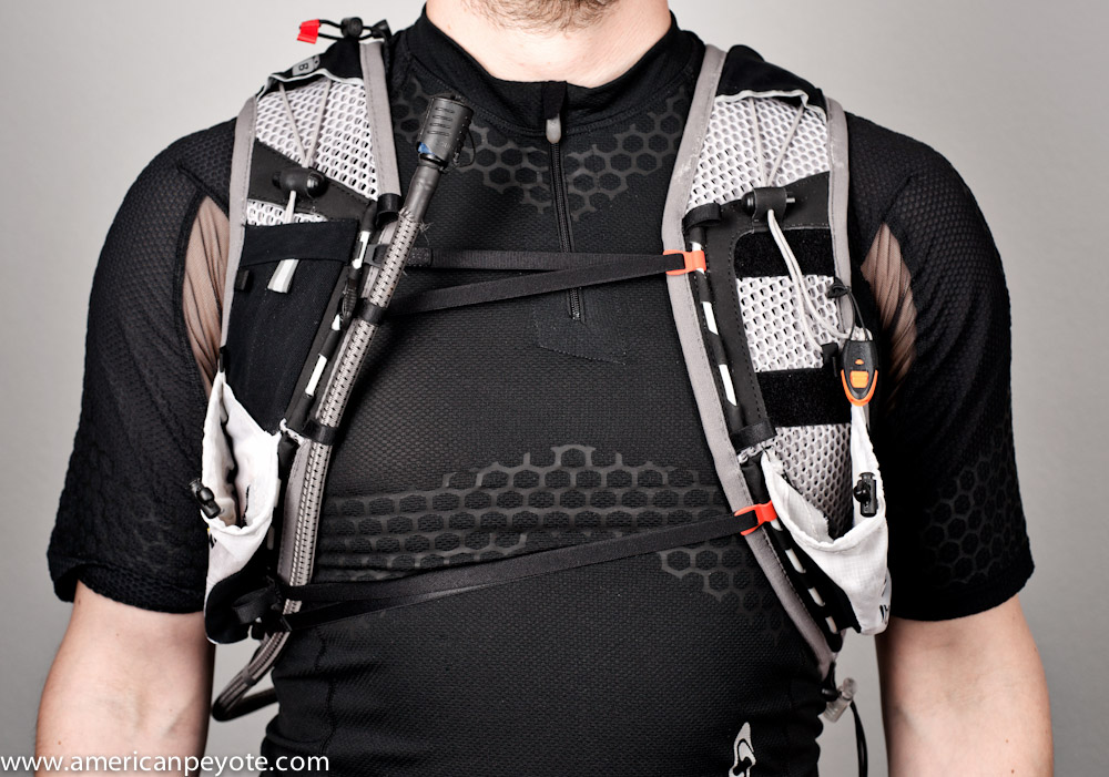
The S-Lab 5 is made very well with materials that stretch and conform to your body as you move (they call it Sensifit construction). The pack fits very close to your body and the fits like a glove analogy makes sense here. I have a fabulous pair of Mammut gloves that often wear with the pack when the weather is cold, and the two products give me the same sense of perfect form and function. Designed as a hydration pack with space for minimal gear, it’s not the type of pack you can stuff full of gear you might need. It’s a minimalist pack where you need to make sure you only take what you really need. There are two water bottle pockets on the shoulder straps (which also work well for small cameras, food, etc) and a water bladder in the main pocket on the back. The bulk of the pack is composed of a hexagonal mesh material. It’s an elastic 3D weave of hexagons (or you could call it honeycomb) that defines the core function of the pack, to feel like a second skin so that you almost forget that you’re wearing it. The open mesh also lets perspiration move through the material and dry quickly.

If you’re a material scientist (like me) you’ll instantly think of a hexagonal crystallographic lattice when you pick up the pack. The hexagon is a beautiful structure with three main directions and corresponding planes of symmetry that make it ideal for this application. From a mechanics viewpoint, this means the the fabric should stretch with an equal resistance in three directions. Other packs usually have 2D weave like normal nylon (think of the fabric weave of your clothing) which is basically orthotropic. This means it will provide equal stretch in two, the 0 and 90 degree directions, but at 45 degrees you get a different mechanical response. Anyways, I digress, the point is that a hexagonal arrangement isn’t an accident here and if I had designed this from scratch I would have taken a similar design path (the hexagonal crystal structure was inspiration for one of my patents on heat shield technologies).

The only real thing you need to know is that the design of the pack reduces pressure points over your body. It hugs and maintains contact with the surface of your back and frontal torso, more like a tactical vest than a traditional pack. Due to the multi-directional symmetric planes of the hexagon array the pack material expands as you move in different directions, differentiating from all other pack designs (as I know them).

Breath Easier

A huge problem with non-running packs when used for trail running is compression across the chest. In general, to keep a backpack on your body you need to stabilize the pack by closing down the shoulder and chest straps. As you start to run and the weight of the pack becomes more unstable and you can only counteract this by going slower or tightening the straps to their limit. However, this then constricts the ability of your torso to move, which constricts the volume of air you can take into your body. Basically your breathing ability is impeded and your running performance is reduced by your reduced ability to take in oxygen. Usually the only solution is to not wear a pack, or to reduce the load so that there isn’t as much mass to stabilize.

Traditional packs are designed so that load is carried by the shoulders and via contact with the lower back, generally using materials that are essentially static (don’t stretch). The S-Lab 5 is made of dynamic material that stretches easily in three different directions (thanks to the hexagon array) and maintains contact over your torso. This design greatly reduces and almost eliminates the stabilization problem (from my perspective). Since the pack is more like a vest, it maintains a large surface area in the back and over the shoulders. This essentially reduces the need for a chest closure system, because the pack is almost one with the form of your body. The S-Lab pack uses just two thin elastic bands that cross over your chest to close the pack around your torso. Since the pressure isn’t localized on the chest strap system and shoulders, the expansion of your chest isn’t restricted as much as with other packs. The pack remains stabilized around your body and therefore you can breath more naturally as the pack fabric expands and moves with you, so your breathing rhythm and oxygen flow isn’t restricted. The system makes for a much more natural running experience.

Detailed Construction

The manufacturing of the S-Lab is really top notch and includes a lot of attention to detail. Seams are sewn correctly, the materials are durable, and the design is streamlined. The main rear pocket has a stretch front, so you can cram in arm warmers, a jacket, water bottle, whatever, and it keeps the mass compressed as close as possible to your spine. I find this is important for running and balance because it means that the moment of inertia of the pack is minimized, and over the length of an ultra marathon this can greatly reduce fatigue as compared with a pack where the mass is positioned out too far from your center gravity (or is off-center from the vertical axis of your spine). Inside the main pocket you have a small magnet to close the opening. There is an adjustment system to pull the pack higher up on your back if needed (to customize the fit). The elastic cords are all high quality as are the plastic clasps which secure the chest compression straps. The front pockets have draw string closures making them super easy to access. I use them for gloves, snacks, cameras, or water bottles. The pack comes with a Source hydration water bladder, and includes a sleeve with reflective backing, which would help keep liquids cool from the heat of your back as you’re running. The drinking tube comes under your arm and then up the shoulder strap, so it isn’t flying around over your shoulder like on other packs. You can secure running sticks to the pack as well, although I haven’t tried this yet. There are small side pockets that are nice for a cell phone, extra snacks (like magnesium sticks) or keys.

Trial By Trails

I got into trail running because it combines the elements of speed from ski touring with the technical footwork of climbing and the thrill of mountaineering. I’ve taken my S-Lab 5 on the SwissAlpine K42, the Jungfrau Marathon, and on various mountain runs around Switzerland including Rigi Kulm, Lauterbrunnen – Eiger Rotstock, Braunwald, Elm – Linthal, biking from Winterthur to Bauma, and then running up and down the Hornli. In general I’m not one to count kilometers, but I’ve run with the S-Lab over long distances and terrain variations including asphalt, basic off-road and mountain trails, ascending and descending at high and low velocities, and S-Lab pack have been marvelous. It could also be the most comfortable pack I have for multi-pitch sport climbing, but for storage reasons I take my Lowe Alpine Attack pack. If I carry a normal mountaineering load I will often get a strained shoulder muscle (think it’s connected to cracking my clavicle long ago). I found this happens also if I run with a small pack like the Lowe Alpine Attack, but with the S-Lab I never have this problem. This tells me directly that the pack fits very well and distributes weight better than anything else I own (and biomechanics engineer side of my brain agrees).

Yes, It’s Worth It

If you’re looking for a casual running pack don’t even bother considering the S-Lab. It retails for 180 USD and you probably won’t use it enough to appreciate it (the true benefit comes when you’re logging lots of km). This is a piece of gear for serious distance and ultra runners, where you want a pack that will minimize your energy expenditure over long distances and will feel like a second skin around your body. The pack comes in two sizes, and this is probably the greatest limitation. If it doesn’t fit you well there isn’t much room to adjust it. I’ve tried mountain running with my Lowe Alpine Attack pack, my minimal Mountain Smith bike pack and other small packs, nothing compares to the S-Lab 5. It is vastly more comfortable and puts less stress on my shoulders than any other pack I have ever tried, and that makes the price totally worth it. I have loved running over the Swiss Alps with the S-Lab 5, and I’m now desperately trying to find the new larger version, the S-Lab 12 to take on the Swiss Irontrail T71 in July 2012.

The World Is Sick – We Are the Doctors – Iron Sky

The world is sick, but we are the doctors. The basic plot is that the Nazi government has been hiding on the dark side of the moon for the past 70 years and is now ready to take over the world. It’s been described as Sin City meets Inglorious Basterds plus, I don’t know, some measure of insanity and a healthy dose of sci-fi Philip K. Dick extravagance, and I can’t wait for Iron Sky to be released in the Zurich area.

Viewing the teaser material triggers in my mind the pioneering work of Metropolis, a silent masterpiece that blends well with techno remixes and stands the test of time. I get that awesome visual feeling of a black and white silent masterpiece, but beautifully interpreted for the current century. Personally I’m looking forward to this new emergence, resurgence of the European-Germanic cinema, and hope some of the abandoned factories around Berlin get converted to studios instead of posh apartments (Fuck Media Spree).

Iron Sky isn’t a German film, but it sort of invokes the analogy in my mind, that Germanic cinema has had an interesting history, pioneering film production and then withdrawing into a troubled post-world war purgatory where it wasn’t possible to make movies because of politics, resources, money, or probably everything in between. Getting quality movies made in Europe seems to be generally difficult (near impossible to get funding in Switzerland), and what I love is that the funding model of Iron Sky is showing how movies should be made. This film couldn’t be produced in a Hollywood studio, it just wouldn’t have been given a greenlight. It’s not from one studio or country, it’s a total collaboration with funding also coming from crowdsourcing and individual support.  The film is a collaboration-production including Blind Spot Pictures & Energia Productions from Finland, 27 Films from Germany and New Holland Pictures from Australia, with filming in Germany and Australia.

I get a sense that the humor here is a sort of part of an evolution, it reminds me of TRaumschiff Surprise, an excellent mockery of Star Wars meets Star Trek meets the German form of the Love Boat (Traumschiff)…and the teaser for Iron Sky reminds me of that type of humor, but mixed with visuals beyond Aliens and violence beyond Inglorious Basterds. No doubt, countless youtube remixes of Der Untergang and Iron Sky will hit the internet when Iron Sky is released on DVD (actually they’ve already started).

Iron Sky is a cult success before the release, the trailer teaser stands on it’s own as the most unique and absurd plot I’ve ever heard of, and come next Halloween I foresee an pleathura of politically compromising Nazi space-trooper costumes heading to Berlin dance parties and filling in the dark shadows of the Cathedral (my favorite Goth club). The visuals of Iron Sky are almost more amazing than the plot. The released images of Nazi space ships, giant space Zeppelins rival the work seen in Aliens and in my mind near surpasses the cinematic visuals of HR Giger. If you’d like to learn more, buy war bonds or invest in the film, check out the main website, http://www.ironsky.net/.

Dancing with Water & Urban Affairs – Ethan Oelman Zurich Show

Dancing with Water & Urban Affairs, a show by Zurich photographer Ethan Oelman at *Galerie 16b. I’m planning to visit the Vernissage. I’ve assisted Ethan on one of his water shoots and made a companion video with the material called Birth-Kraft (http://vimeo.com/18276591) and also an interview where Ethan explains the background of his Dancing with Water project (http://vimeo.com/20802817), so I’m looking forward to seeing the images in a gallery setting.

It’s raining in Zurich today, so it should be a perfect environment to attend the Vernissage, today Friday January 20th from 17.00 – 21.00. Water will be pouring over the streets, and then I’ll experience the water and urban photography. The show is at *Galerie 16b and runs till the Finnisage on January 27th.

*Galerie 16b
Ausstellungsstrasse 16
8005 Zürich

Berlin Notes: Bärenquell Brauerei Urbex

Back from Berlin, recovered from the flu, dreaming and scheming of something new, new, new.The But first, I worked on some images from the Bärenquell Brauerei, an abandoned brewery in former East Berlin. I found out about the place from Abandoned Berlin, a blog devoted to urbex in this fabulous European city. I wasn’t sure what to expect, but the place is like an urbex mecca, fabulous graffiti, old but not so old that it has fallen apart. I had a wonderful time there running around with my Cinevate Atlat FLT slider shooting video with my VG10 for the video poetry project with Bobby Cuevas.


1 Day of Art London – (t)here Magazine

The next 1 Day of Art event from (t)here Magazine is going to be in London on Oct. 28th-29th. If you’re an artist around London I highly recommend contacting them to see if you can participate (How to Participate). I was at 1 Day of Art Copenhagen last fall and it was an amazing experience (Thank you talenthouse!). The format is simple. You get together with the magazine crew on Friday night, draw a topic to work on, and then you have 24 hours to produce your work within the city limits. For my part I did three paintings in the bathroom of the Diamonds room at HotelFox, based partially on my experiences walking around Copenhagen late Friday night. Before the 24 hours kicked off we were all interviewed, and the camera crew and editors came around during the day to see how the work was progressing.

The whole thing has the nonlinear feeling of a hackathon or startup weekend, naturally without any coding, laptops and API’s replaced by canvas, paint, cameras, whatever you use to put your vision into the real world. Once the spark goes off you get the materials you need together and then create. The work from the other artists at Copenhagen is going to be revealed with the next issue of the magazine, but the cover is already on the web. Believe in the energy of the night and inspiration of the process and great things will come to those who decide to create. I’m looking forward to see what comes out of London.

VOLUME 13 – COPENHAGEN – COMING SOON…

My Awesome Hedingen Wohnung zu Mieten

Various events in life now make it necessary to find a new renter for my current apartment, my wohnung is now free zu mieten. It’s at Arnistrasse 16, CH-8908 Hedingen in the Zurich countryside. In order to promote the project, I decided to make a website for it. It was a great time to apply my knowledge of SEO, and first I picked up the domain www.hedingen-wohnung.ch and then starting putting together some photography for the site. I needed some proper pictures for the apartment  – well, technically it’s more of a house, anyways, it was the ideal time to start playing with HDR photography. I played with the HDR option in Photoshop (CS3) and it resulted in some amazingly horrible results. So, I decided to get a proper program HDR tone-mapping program. After a little searching I decided on Photomatix Pro, a fine piece of software that makes high dynamic range imaging painless and the results are fantastic.

The apartment is fabulous combination of an old 200 year farm house rebuilt from the inside, but retaining much of the original wood and structure. A steel stair case connects the floors and the whole place is like a warm hug. On the top floor there’s a gallery and I put my photo studio up there. The ceiling is high enough for a small trampoline, but I just have a background setup.

Getting the place ready to shoot also entailed clearing things away to make it all minimalist and show off the design (as opposed to views of my camera equipment cluttering up the floor space). When you get that far you might as well wash the floors too, so I did that and then setup my Sony A900 with a 20mm Minolta lens to shoot my first interior images. I’ve seen amazing house photography before, but was mainly just hoping to produce some nice images. Happily, Photomatix is an excellent software program and you can easily produce natural looking images with minimal time input. I supplemented the natural light in one image with an Elinchrom strobe, but otherwise it was all just natural light. Photomatix gives you different tone mapping options which range from that horrible gaudy-over-saturation look to the very natural, almost like you’re standing there, but with a little pop so it feels just a tad like the image is from Wonderland look.

Arnistrasse 16 is easily the best designed place I’ve ever lived in, and I feel like I’m walking through a magazine some days. It includes such funky amenities as an induction oven and internet connection in every room. It’s a certified Minergie place, which means it uses the minimal energy for heating and cooling. It technically has four floors, with an open gallery on the top level where you can setup a studio, or an office if you like. More information on the wohnung is on the main site, www.hedingen-wohnung.ch and if you’re interested in visiting the place I would be happy to show you around.

Piotr Soluch – Web Portraits Zurich

The latest addition to the Web Portraits Zurich project is Pitor Soluch, he just opened his web design business in Zurich, and I photographed in my new studio space in Hedingen. I hadn’t worked many projects lately, between moving out and moving in and running a few marathons I didn’t find a lot of time to organize any shoots or projects this summer. I met Piotr at a few web gatherings in Zurich like Web Monday, and we also ran into one another at the 2011 Swiss Startup camp in Basel. He’s an intricate designer with that required attention to detail that makes the difference between a professional site, and the ones that I throw together. For the shoot be came by with cookies and Polish beer. This was a fantastic combination and the shoot went smoothly for both of us.

I wanted to get back to fine painterly shadows and images with a dramatic feeling. This included lighting Piotr with some CreativeLight strip boxes from behind either shoulder, a Metz MZ40 in a beauty dish from the front and LastoLite TriLite reflectors from the front. I then pulled in some textures from Rome and the abandoned hospital of Beelitz, just outside of Berlin. There’s no substitute for fantastic texture images. I’ll walk around a city for hours shooting walls and the streets and then maybe not use them till a year later. They add something you never expected when the shoot started.

Le BonBon Paris Portraits by Emilie Brion

Paris is one of the those iconic places that you don’t want to get sucked into because it’s so well known (like Las Vegas), but there’s a reason that it’s so popular. No matter how much you may think it’s a cliche to stroll down the Champs-Élysées, it’s still a unique experience. The Effel Tower simply does not get boring, and I’ll never pass up a trip to this wonderful heart of Europe. The last time I was back there I met up with Emilie Brion, we know each other from an eternity ago in Michigan and I promised to look her up next time I was Incognito in Versailles. We killed a few hours at a cute cafe near the Opera and we got into some heavy conversations about photography, portraits, and the Decisive Moment. She appreciates the capture of a singular moment in time, which can never be relived or improved upon, I say that I produce decisive moments in the studio when I decide to. In truth there’s a never a way to relive a photograph, either from a darkroom or from the computer, and it was excellent when I regained this sense of fleeting time captured in a camera after our conversation. Since that time Emilie has started shooting a portrait project with Le Bonbon magazine, which features portraits of people from the different districts of Paris. I wanted to write about her project, my mind freshly finely tuned for some prose after watching the trailer for the Rum Diary (the novel by the late Hunter S. Thompson) with Johnny Depp playing Paul Kemp. But to be honest, some things are best left in their perfect natural state – and no post processing or editorial drama is necessary. So I present here, in Emilie’s own words – her portrait project of the 6th and 7th districts of Paris for Le Bonbon.

The online version of her portraits can be found here pages 48-49:

Le Bonbon Juillet 2011 Rive Gauche

In Emilie’s words…

Le Bonbon, ‘the candy” in French, is a local free Parisian magazine by arrondissements (for each districts of Paris) made for and close to the locals. It includes information on what’s happening in each district and promotes local restaurants, stores and events. Each magazine includes two pages dedicated to 32 snapshots of people from that district. Since I love to take pictures, I was asked if I wanted to take the pictures for the magazine for the 6th and 7th district of Paris. I thought it would be a new challenge and interesting project.

Since the pictures are snapshots, I did not want to use a digital camera but simply use my iPhone 4 so that when I would approach people to ask for their permission to take pictures, I wouldn’t be a photographer – but like them, a pedestrian walking on the street with an iPhone in her hand…. Less intruding I find…

Shooting street portraits of strangers is challenging. Often when you see a stranger you want to photograph, you can’t seem to ask them for their photo. For my part, I don’t want to intrude and I have the fear of the rejection. The struggle to shoot through the fear is worth it as when you get a spontaneous approval then you get excited and want to shoot more.

The reaction varies, either you get a firm “no”, or a spontaneous “oh, ok” or some people ask you numerous questions s as they are intrigued by the reason they were chosen and what the purpose is. Approaching people on the street is quite a sociological and psychological experience in itself…

The light is my biggest challenge… I walk around and find someone that I feel represents the districts or I am just struck by their face but I don’t want them to pose and position them to get the best light. I prefer the “instant” moment as these are not professional photos but snapshots so I often disregard the light and the one thing I want to capture with every portrait was that ‘unguarded’ natural look… that look that moved me in the first place when I spotted them on the street… I want to avoid that usual snapshot smile… you know, that smile that you’ve smiled a thousand times whenever you’re in front of a camera that “forced and fake smile and posture”. I want it to be REAL and spontaneous.

This project was a challenging and rewarding experience for me. I remember each and every encounter I’ve had with all these strangers: how I spotted them, how nervous i felt, how they reacted to me, and the rewarding feeling afterwards knowing that I just got one more keeper in a set of a hundred keepers I was aiming to get. Now I feel so lucky having been able to connect with these people even for just a few seconds. Different faces… all of them beautiful in very different ways with whom I have had a brief encounter that I tried to capture to its best in its instant.

As Marcel Proust said: “The only real voyage of discovery consists not in seeking new landscapes but in having new eyes.”

Dynamic Color Portrait Photoshop Tutorial

Here I present a workflow for creating a dynamic image using layers in Photoshop. Why? Well, because I like to share and because I got some requests on my Google+ album asking how it is done. To illustrate the process, I’ll use a set of images I created for Scaramanga Bags, a cool company in the UK that sells vintage leather bags and other things like journals and vintage suitcases and trunks (see the Scaramanga Concept Images here). On their website Scaramanga already has nice urban portraits with their bags, so I wanted to go in a different direction. I wanted to create portraits that convey a feeling of abstract motion. Something to invoke a feeling of movement and action. I love photography and painting. I began with photography looking for image perfection, and then moved to painting after developing a color palette in Photoshop. I like to light an image in layers, and in Photoshop I layer colors and backgrounds to add a sense of visual movement to an image. I look at a scene, put on a pair of rose-colored glasses, and I have a layered image (because at the base, this is all Photoshop does). When you can do this in your mind you then just need to translate that to something other people can see, and for that we have Photoshop. The aim of this article is to show you how to combine images together to create unique, balanced color combinations, which add a desired character to the original image.

The Basic Recipe

I generally apply this concept to portraits, where I want to add a certain character which complements the person photographed. First, begin by realizing that the person is a person, not simply a subject (A Person is not a Subject) for academic study. I start out with a base portrait image, generally shot in a studio environment with a two or three light setup using softboxes and maybe a beauty dish. Why? Because we need a decent (well exposed) portrait to start with. It should be something that speaks to you and has the look and pose you want. The layers in Photoshop are just there to modify the intention of the original image (otherwise just go ahead and create an image from scratch and render it in 3D).

I always start with a well-exposed base image that defines the main textures, tones, and colors of the person. In the Scaramanga Flight Bag images I used a Sony A900 and Elinchrom lights with a CreativeLight softbox. You don’t need an expensive camera and equipment, but you do need to know that a properly focused image with proper exposure will give you the largest amount of information to work with. If your initial image has high contrast or deep and dark shadows, then you just need to know that you can’t modify those areas of the image very much, and they will not blend so well when we layer a new image on top of it, since the very dark areas contain very little color to modify. So, let’s start from the base image.

The Base Image

In reality we’re mixing static image layers one on top of the other. In my mind I’m painting on layers of color movement to complement a portrait. I began with images produced in my apartment studio, and posed in such a way as to communicate the idea of running or of standing still, with motion in the background. This is my base, a strong pose which will be modified (enhanced) by a new layered color environment. For more info on creating a dramatic pose portrait check out my post on this subject (Urban Ninja – Dramatic Pose Tutorial). In short, I take my inspiration for poses like this from comics and graphic novels such as Conan the Barbarian, 300 and Watchmen.

After importing the images into Lightroom I chose the best and then increased the Fill Light to reduce the contrast in the image, and then exported to Photoshop for layering work. When exporting from Lightroom I don’t want deep and dark shadows, but rather a lot of information to work with and which will respond well to layering. Once in Photoshop I will often start by adding a Black and White and High Pass layers to the base image (although I didn’t need to do that for this image set). I first copy the original layer, add a High Pass filter, and set the blending on that layer to Soft Light. This has the same effect as increasing Clarity in Adobe Lightroom, but in a more controlled way. I reduce the Fill value on this layer so that everything blends well together and the image doesn’t look gaudy or like it was just run through an actions industrial meat grinder. I will often also create a Black and White adjustment layer, and then set the blending to Multiply. You can then adjust the values for reds and greens and blues. This desaturates the color while intensifying the shadows of your base image. It can darken the image a lot, but the goal here is to modify the tones of different parts of the image (such as skin tones). Again, I will often reduce the Fill of this layer so as not to totally kill the base colors.

Choose Layers

I always start from the base portrait and then choose layers on the fly. For the Scaramanga images I wanted a lot of bright colors with movement. So, I opened up Adobe Bridge and looked for long-exposure night scenes with lots of color and light streaks. To achieve this abstract motion goal, I picked a few images that I had shot in New Orleans, Zurich and Berlin. The key here was to have images with long light streaks and pockets of intense color, which would blend in with the form of the person in the Scaramanga portraits. By blending well I mean that the lines of the night scenes would coincide with the lines of the runner (think of drawing lines over his body and comparing it to the flow of the layer images – check out my Dynamic Pose Tutorial for clarification). There’s no formula here, you just need to pick images that work well together. Aside from light streaks, these images also have very interesting pockets of color, and also recognizable object elements such as a tram or street scene, which then defines the background environment of the final image. The night images from Zurich give the feeling of running through a city of lights, while the one of Bourbon St. gives the idea of a person standing still while the environment is exploding in color around him. Now that I have chosen the layer images, I just need to blend everything together.

Blending Layers

After picking the layer images in Adobe Bridge I opened them in Photoshop, and automatically set the blending mode to Overlay. This allowed me to preview how the different light and color elements of the layers would work together, and how the flow of the lines of the layers would mix with the base portrait. At this point, the image just looks like a couple of images stacked on top of one another, and that lazy sort of image production just doesn’t do it for me. To properly blend the images you need to play around with the blending modes, like Overlay, Softlight, etc. and also change the Fill and begin masking individual areas with a paint brush or gradients. To mask a layer by painting simply select the layer and then choose the layer mask icon. When you now paint with black, the layer will be masked (or hidden). You can change the Opacity of the brush to mask the layer gradually with each new brush stroke (the recommended method). When masking in this way I usually use a brush Opacity between 3-20 with a soft brush. This is where I act more like a painter than a photographer, masking and blending the layers uniquely together. I rarely use the entire layer image. Often I use a gradient to mask out half of it, and also paint away most of the layer over the person. I will also add full Color Fill layers (usually set to Overlay blending) to tweak the overall color. Eventually, the final image will then start to come out. To illustrate this process, you find here the secret goldmine of any Photoshop artist, the screenshots of my Layers window on my two favorite images from this set, the Runner and Bourbon St. You can clearly see how the different layers were masked, and what the original layer images looked like before blending.

That’s All

If this sounds complicated don’t be deterred. Essentially all I do here is to mask out the parts of the individual layers which don’t flow well together, and in the end I have an image with all the flow and color vibrancy I desire. The main idea is that the character of the layers complements the base portrait. I save the image and open it up in Lightroom. From Lightroom I play with the colors further, adjust shadow and highlight colors, Vibrance, Clarity, etc. until the final color tones are correct and then I export.

For more info on layers and portraits, check out my Hyper-Realistic Portrait Photoshop Tutorial. This covers the main topics I addressed in this post, but you get to see a screen cast of the whole process.