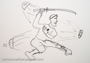
 I was on a train heading back from Zurich and I had an image in my head, so I sketched it out and the next night setup some lights to create a few concept images of the Urban Ninja. This set of images is probably one of my more thought-out to date. The image is meant to be dark, with the main action elements distinct, this includes the pose, lighting, and post-processing. I can’t really say why I designed an Urban Ninja image concept. Partially it’s because I’m enthralled with the new Watchmen movie, partially it’s because I watched Akira Kurosawa’s movie Ran, and finally because I happen to have a Katana sitting on a shelf in my apartment. So how was the Urban Ninja image designed and executed? Well, lets look at the various elements, Pose, Wardrobe, Lighting Design, Processing.
Pose
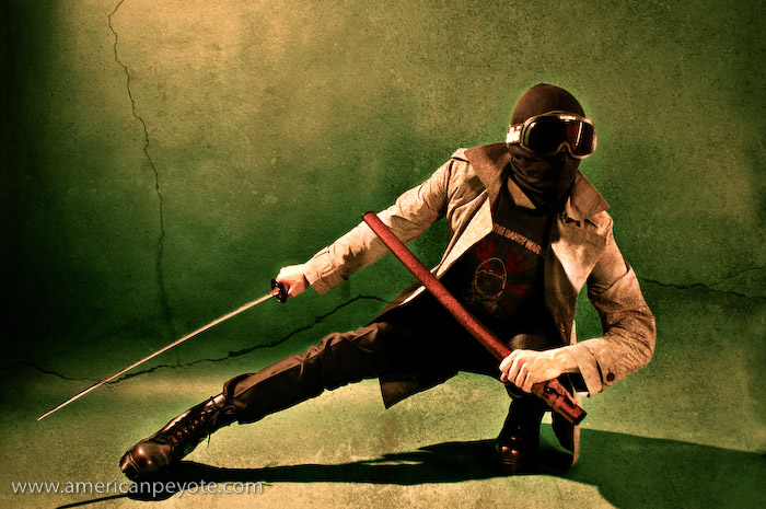
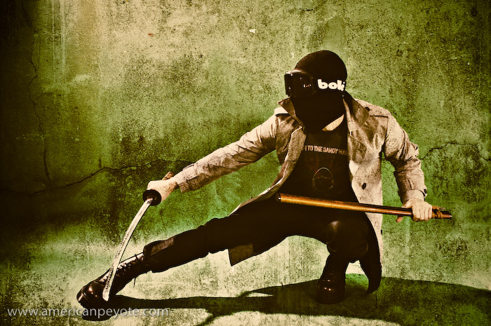
The pose was the primary reason for this image, and the driving force being it’s creation. I have a book somewhere in Michigan that I used to learn about drawing comics from. It was called something like, “The Marvel Way” it basically describes how characters are portrayed in the Marvel Universe. The main idea is that you draw characters at the height of anticipation or the climax of action. So you draw Spiderman in a crouched position before his energy explodes and he leaps off of the roof of a building, or you draw Batman with his fist connecting to the jawbone of some villain, but never portray the in between action, where people are just standing around looking normal. So, here our Urban Ninja is in full crouch, poised for action. The leg and sword extend and there’s a sense that there’s something just out of the frame. This is accomplished due to the lines of the body, leading the eye of the viewer. The line of the body leads you into it. The Katana is drawn and ready for blood. The scabbard is in a defensive position to extend the line of the right arm. All these elements are key to the visual impact of the image.
Further reading: Urban Ninja – Dramatic Pose Tutorial
Samurai Sword
The Katana is meant to be an extension of the warrior’s body, the curvature of the blade mimics the swoop and fluid moments of the body when it’s in motion, and this a key element in the pose. Symmetry between the leg and sword contrasts with the defensive crouch of the Ninja, using the scabbard in a defensive position forms a perpendicular line to the sword arm. These all lead the eye of the viewer.
Face Design
The face of the Ninja is totally covered in a mask I got the last time I drove go-carts at Block in Winterthur. The idea is to hide the face, while retaining the features of the face. The goggles are over-sized and remind me of Snake Eyes from G.I.Joe. The mask and goggles are essential to remove the sense of identity and humanity from the Ninja and focus on the pose. The hands were left bare to represent the philosophy that while we can hide our faces and identities in life, we conduct our lives with our own two hands, and there is nothing to hide behind when we have to answer for our deeds.
Wardrobe
Lighting is easy, but to have a cool image you need detail that people will find interesting. In this case, I just wanted to find it interesting for myself, thinking that others might as well. The trench coat and pants are from We, chosen for their close fit and reflective (but not gaudy) texture, which I knew would mix well with the hard lighting design I had in my mind. The Purple Doc Marten combat boots were chosen as the base of the image, the elements which connect the Ninja to the environment. Their size and hard lines complete the line of the legs and also work well with hard lighting. The T-shirt is from a Dandy Warhols concert in Zurich. I used it because the design is just sort of astronaut-cool and cuts down on the seriousness of the image. You just can’t take yourself too seriously when you’re posing for a self-portrait with a Katana in one hand and wearing black ski goggles.

Lighting Design
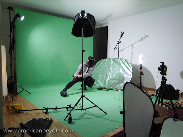
The main driving force in the lighting design was to create some hard shadows and give definition to the Ninja which would hold up well during the post-processing in Adobe Lightroom and Photoshop. Hard light and a bit of soft fill was used to define the hardness of the trench coat and portray the face as melting into the night. Three lights were used and one reflector. The overall desire was to have hard light illuminating the Ninja, forming shadows of the night. The main light is a Sunpak 120J placed above and slightly behind the Ninja. I went with a 120J with a parabolic reflector because it dumps a lot of hard light, which is exactly what I wanted. An Orbis ringflash adapter with a Sunpak 383 was positioned in front of the Ninja, filling in shadows on the front and adding definition to the features of the Ninja. A second Sunpak 383 in an Alzo softbox filled in the front without softening the hard light from the 120J. The ultra cheap Gadget Infinity 16 channel radio triggers were used to fire the strobes. A Minolta 7D with 28mm lens was used, capturing the whole subject and adding a bit of wide-angle distortion which I like.
Color and Post-Processing
A green background was used, to contrast with the black and grey color scheme of the wardrobe. The 120J illuminated the background from the upper left, giving a sense of a moon or street light cascading down over the ninja and rendering a hard shadow on the ground below. An orange layer was added in Photoshop to balance out the darks and work with the grunge concrete layer I used for the processing. The post-processing design was sort of hyper-real, translating into a few layers of Levels, Highpass, Curves and Smart Sharpening. This allowed the Ninja to have some deep shadows, and sharp definition of the body. I use a light de-saturation layer as well to tone down the color and match the “feeling” of the color scheme with that of the concrete grunge layer. This is better described in my Photoshop Grunge Tutorial.

