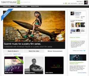
 The grand video poetry creative invite experiment is going to the next level. I am pleased to announce that Bobby Cuevas is the winner. There were 15 entries from artists in different corners of the world submitting to the contest, and I had the opportunity to pick one to work with. Thank to everyone who submitted to the contest, it was truly an honor to see people creating music for the project, and using Talenthouse to connect us was excellent. The winner of the contest has the opportunity to work together with me on my next series of video poetry short films. I’ve never been in the position of choosing a contest winner, and in the end the choice was made on context.
Context
Judging creative work of others is a strange business, and in the end it comes down to tastes and context. There’s really no other honest way to do it. Something can be technically great but not be what you’re looking for. The context is the head of the person choosing, and isn’t something that can be predicted or necessarily designed for. This was one of the main lessons from the Professional Artists seminar I attended at the F&F Kunst schule in Zurich this summer. Art is bought in the gallery scene based on context. Is it new, does it fit with the gallery, is it maketable, does it create a reaction – and how does it do that in relaitonship to all the other art in the Zurich art world? Art doesn’t have value without context, and as the context changes, so does the value of the art.
Decisions Decisions
For the decision process, I mainly looked to see what the music would create in my head, and based off of how ambivalent or twisted those images were, I decided to go with that artist. I figured, the music which creates the strongest reaction in me is probably the best one to go with. This was a measure of how the work of the artists would match my work. There were a number of entries which were excellent, and I could imagine creating a movie with them, but just didn’t fit into the context of the project I have in my head. As an artist, the most important thing is to connect with people who like your work, that is the context in which you will be successful, and sometimes it just needs to be one or two people.
Bobby did a production called Coming Together, it starts with a cut from the song Come Together, and then drops into a drumming rhythm, it sort of bores into my head and remixing into a fluid menagerie that just mixes well with images of a Bratz doll 50 feet tall, walking through Detroit with a .50 Cal sniper rifle. It was the later part of the track that started pushing my neurons around. I could see a sort of blackness with interspiced flashes and a person walking down the street, the camera in my head did a pan and then a steadycam momevent around a guy’s face, then the scene was reversed in editing and then there was a robot fish crawling out of the ocean and started to walk.
So, I look forward to working with Bobby on a video poetry short film series. Thank you to Talenthouse, adambrioza, ybudman, lollyjean and everyone who submitted to the video poetry creative invite.


