Interpreting the world around you and understanding the small graphic design and photography aspects of ad campaigns can be very useful for any aspiring photographer. Open your eyes when you walk down the street, and take in advertisements you’re exposed to. By thinking about their message and how well the advertisers present their visual message, you can begin gaining insight into how the visual medium can be used to communicate different messages and concepts. In particular, lookout for the overdone cliche messages and sex-sells overtones which seem to permeate ad campaigns the world over.
After four years in Switzerland, I’m still generally at a loss when it comes to interpreting advertisements and billboard messages. Understanding these things is essential to becoming at least somewhat integrated in any society. How advertisers communicate with the public gives great insight into the mind set of a people.
One of the more peculiar ad campaigns in Switzerland, and particularly around Zurich is the LOVE LIFE STOP AIDS campaign to bring exposure to the idea of having only protected sex, and thereby reduce the spread of the most notorious sexually transmitted disease in modern history, the HIV/AIDS virus.
A primary visual communication tools for LOVE LIFE STOP AIDS is billboards; on street corners, at train stations, wherever people might glance and have their attention diverted to the idea of stopping the spread of HIV/AIDS. As with any advertisement, it’s the way in which the viewer’s attention is diverted which makes the LOVE LIFE STOP AIDS campaign stand out.
Each billboard involves two people having sex – somewhere. Attached is the message: LOVE LIFE STOP AIDS and promotes safe sex in Switzerland. The real attention grabber is the location. For some unrelated reason, the sex acts take place in unique locations: under water, in caves, in the jungle and…on Mars, yes, the planet – not the candy bar.

Now, there are various ways of interpreting this ad, obviously the message has to do with sex, seemingly of a homosexual nature, and the dull witted observer might suppose the idea is to have unprotected sex on Mars to stop AIDS – unprotected in the sense that Mars has no atmosphere, and if you open your space suit to engage in intercourse, the pressure difference will no doubt force your eyeballs out of their sockets; thus leaving the love-struck stud gasping for air like Arnold in Total Recall after he’s ejected onto the arid martian surface.

Poorly translated, the written part of the ad basically says, “Always with, also on the business trip” and no doubt encourages people to take condoms with them wherever they are going. Because, obviously if you’re going to Mars it’s going to be for business, as commercial tourist flights are not currently flying to that planet – and if you happen to have sex on the surface of the planet, using a condom is far more important than ensuring your space suit is properly sealed against the Martian atmosphere.
On some level the LOVE LIFE STOP AIDS message is communicated well using the gay-sex-on-Mars analogy. Now, it’s obvious that sex on Mars won’t stop AIDS, and that opening your space suit on the Martian surface will mean certain death. So in some sense the space suit could be analogous to using condoms during sex, implying that simply that engaging in unprotected sex in a dangerous environment will dramatically increase the possibility of contracting the HIV virus. Most likely the aim is that the shock value of displaying a somewhat graphic depiction of homosexual intercourse on the street will shock people and lock a visual marker in their brain, connecting condoms and AIDS prevention.
A thorough description of the 2008 LOVE LIFE STOP AIDS campaign can be found on the official Swiss Federal Office of Public Health (FOPH) website. It includes TV spots, printed ads, and a pretty cool flash-based webpage (check-your-lovelife.ch), which shows that some serious design thought and photography was put into the LOVE LIFE STOP AIDS message.
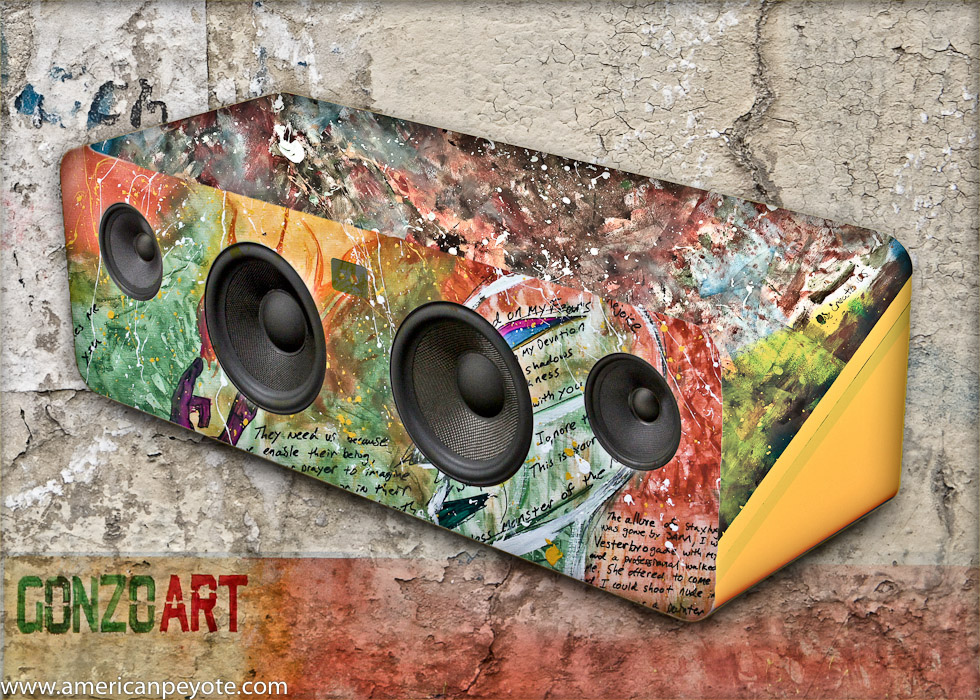
 I was looking through my Facebook and saw that Jennifer Chalbaud, a designer I had met through Talenthouse had submitted to the Kanto AV speaker Creative Invite, and that it was ending in 6 hours. I had a vision for a second, and wondered what it would be like to combine Lazy Art IV and Gonzo Art in a speaker design. It seemed fitting, to take the art created from 1 Day of Art Copenhagen, and see how it would work when applied to product design. I got back to my place around 5:30pm and had until 7pm to submit my design. After screwing around with SketchUp and a dxf file in Adobe Illustrator for 30 minutes I decided to go back to what I know and started making layers and masking in Photoshop. The result might scare some people, but I would buy one.
 I started off with a white Kanto speaker box from Talenthouse…it’s a nice simplistic design, speakers on the front, clean lines, contoured sides and curves, something very clean and sexy. At this point, one could go with a minimalistic design to complement the form of the product, or go in the opposite direction and create something that dominates, both in color and form. I decided on impulse to go with the latter approach, and in my mind grafted two paintings onto the Kanto…
 My favorite painting from 1 Day of Art went on the front, using the lower section of the patinting, which includes passages of writing, and this flows upwards with the Basquiat-Alien inspired head. I wanted somthing else for the top though, and decided to go with Lazy Art IV, which is sort of a universe view, with lots of color combinations running into one another. The paintings are sort of inspired from music, visions in the head, so it made sense to combine them with a speaker design. The final design is on Talenthouse at…Design for limited edition Kanto speakers

