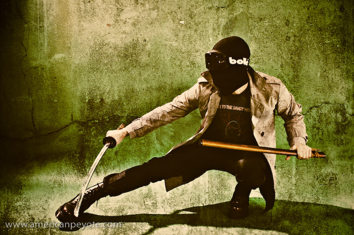
Urban Ninja

It’s Good to Know Photogaphers with Weapons

It’s good to know other photographers. It’s good to meet, and to discuss things like life and vision and get some perspective from other creative people. It’s good to do collaboration shoots, the two of you decide on an idea/subject to shoot and work to make it a reality. And lastly, it’s good to know photographers with weapons. The conversation went something like…

“Ummmm, do you want to do a creative shoot in your studio?”
“Yeah, sure. Just come over with some stuff and we’ll do a martial arts shoot.”

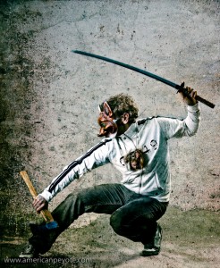
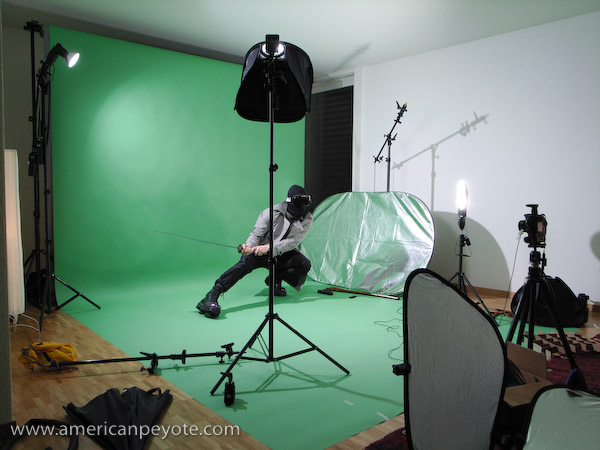
Ethan from Zurich did just that. In addition to being a photographer he’s also into martial arts, and in addition to a ThinkTank rolling case he walked through my doorway with bag of fun including numbchucks, short swords, and an Onitsuka Tiger jacket. From my side I provided the studio space and lights, along with a Katana. It was the perfect time to add to the Urban Ninja series I had started last year. First we decided on some lighting and then I posed with a pair of my green and white Onitsuka sneakers and the white jacket.

As the night wore on I switched from the Katana to posing with numbchucks and short swords. Posing like a comic book ninja isn’t easy when you’re at it for a few hours, and it equalled a night of climbing in the gym. Plus, when you first start posing with nunchucks you’re careful and timid, then you swing them around a bit, channel the spirit of Bruce Lee, get brave, and start accidentally hitting your head and elbows. When the temple gets hit, that’s when you know it’s time to switch up the model-photographer role in the shoot. After shooting me for a while we switched, Ethan took to posing with deadly blades and I took up my Sony A900 to shoot with.

Authenticity is Key

Posing with weapons is probably the hardest thing I’ve done photographically speaking. It’s easy to think up a cool image (Urban Ninja Concept to Photo), but finding the right model to pose authentically is harder than you might think, and in the end it’s easier to be model and photographer. I mean, as a guy with a childhood American Ninja fantasy, it’s natural for me to bust out a Katana attack pose. I’m always bewildered when the female models I shoot don’t do the same. The thing is, unless the model is really good at taking direction and is athletic, they probably won’t know how to pose with a sword with any authenticity. The worst thing you can do is pose a guy or girl with a sword and expect it to look good just because…

“ummmm, you know, hot women and dudes with and swords are cool!”

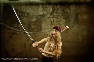
Right, just like adding a gun to shoot makes a woman “sexy” and “dangerous.” Think what you like, but I’m of the opinion that an attractive woman who doesn’t know how to hold a sword will just look awkward, and the resulting image will look like crap, unauthentic, and generally be a waste of time to look at (but only if you were going for authenticity in the first place). For example, when I did a shoot with Alexandra, it was obvious that the Katana was too heavy for her, but since we were shooting the Barbie Hunter concept, it fit – because Ninja-Authenticity wasn’t the subject of the shoot. It was awesome doing an authentic martial arts shoot with Ethan. He knows the pose and understands the form of the body and how this all relates to the position of the sword or other weapons. Ethan could probably kill me five different ways with his pinky finger before I realized I was standing in a blue tunnel and as a bonus he has a sweet look.

The Urban Ninja

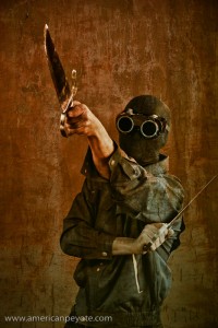
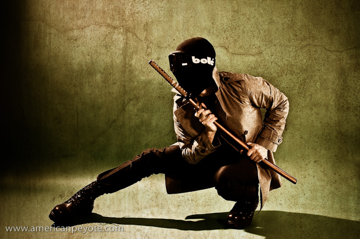
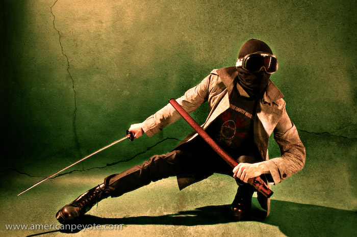
For the Urban Ninja look I gave Ethan a mask and a pair of welding goggles to wear while he stabbed the air with the short swords. For lighting I used my Creative Light softbox (60cm x 90cm) with a grid from the side and my Elinchrom BxRi 250ws strobe. I had a Sunpak 383 in a Kacey Beauty Reflector high from the opposite side, and there was fill coming from a Lastolite TriLite reflector kit. I post-processed this image with a couple of texture layers, creating a color transition from top to bottom and gave it some grit.

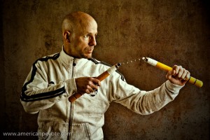
I also shot Ethan with numbchucks wearing the Onitsuka jacket, lighting him only with the gridded Creative Light softbox and added fill from the opposite side with a large silver reflector. With his bald head and muscle-memory knowledge of martial arts, the images of Ethan are just fantastic. This will sound strange, but I love shooting guys with bald heads. You can really focus on the features of the face without getting distracted by the hair. Without the hair your attention is drawn so much more to the eyes and I think this makes for interesting portraits.

More Info

To check out more on my Urban Ninja Concept here are some other posts.

To see more of Ethan’s work check him out on Flickr or his website.

Urban Ninja – Photo to Concept Video Tutorial

Urban_Ninja_IV

Fooling around with video presentations is a fun way to waste a few nights. This one focuses on lighting, posing, and post-processing of my Urban Ninja photo concept. Aside from the concept and posing, which I discussed previously, this video includes a screencast of the post-processing.

The post-processing for the Urban Ninja images was done in Adobe Lightroom and Photoshop CS3. The processing was designed to define and enhance shadow areas of the arms and hands, while the pose of the image is the main element. The face falls off into blackness and shadows, so that the form of the Ninja is focused on by the viewer. Grunge layering techniques were used to add the dark-gritiness I seem to like. Two concrete layers were used here, one I shot in Wintethur, Switzerland, and the second came with the Joey L Photoshop Tutorial DVD. I blended the concrete layers using overlay or softlight, and a few curves and levels adjustment layers were included to better define the shadows. A final color layer was used to give the final color-cast and define the overall image feel. Anyways, to see the full process just check out the video below.

I used black+white adjustment layers to control the shadow depth. With his technique you create a B+W layer, then blend it using Luminosity or, as I prefer Multiply. This darkens the shadows and since it’s a black and white layer, you can go in and adjust the amount of red, green, blue, etc. which is being defined in that layer. This technique can be used in many images so long as you don’t abuse it. In addition to portraits I like to use it for landscape images with a deep blue sky and a collection of clouds. This image below from the Swiss National Park was shot on film with my Fuji GA645, scanned with a Nikon LS-9000 scanner, then worked on in Photoshop, with a B+W layer used to control shadow texture.

Urban Ninja – Dramatic Pose Tutorial

Urban_Ninja-1.jpgThere are many things that are easy to buy in life. Cameras, lights, guns (in America), pants, Katana swords. And it’s easy to say, “Yes, I have a Katana, and therefore I’ll hold it and logically the resulting picture will be cool.” Why? “Because, I’ll have a sword, and Samurai swords are cool…like guns. So, I’ll just hold it and it’ll be a cool shot.” No my son, you’ve seen too many Tarantino movies. The simple fact that you decided to use a gun or a sword in a photo shoot is not a magic-bullet-express to coolness. Yes, yes, I know, you want to believe that your model can become Uma Thurman from Kill Bill or Bruce Willis from Pulp Fiction – just because they’re holding a highly evolved Japanese decapitation device. I may be daft, but I think that even Angelina Jolie looks awkward and fake with a firearm in her hand. Not quite as foolish as Pamela Anderson in Barb Wire, but not far off either. Good photos come from the imagery of the subject and the message contained within their static forms. It only has to look believable for 1/120 of a second if you’re taking a photo, but it’s easy to come up short. So what goes into creating a cool dramatic image using things like swords and guns as props in photos?

The Emotional Connection

Images and pictures are interesting because the viewer feels a sensation, a reaction to the medium. This is paramount over everything else, and 99.99% of the time your camera doesn’t matter too much. You don’t need a Hassy and a production team to do some cool ninja shots, you just need to get a handle on the visual imagery. Visual imagery? Ok, so where does that come from?

urban_ninja-2One day I was thinking up image concepts and settled on the Urban Ninja concept. This involved a bit a sketching, lighting design, wardrobe, post-processing, but the most important part was the visual pose of the model. Why is the pose so important when creating a dramatic action image? Because photography is just a fake representation of reality, and the more realistic and powerful the emotional message, the more unique your image will be. The whole point of weapons (swords or guns) is to inflict irreversible bodily harm onto another human being or animal. The purpose is to kill. You can read all the Sun Tzu you want, recite all the Samurai poetry you can remember, imagine valiant soldiers as warrior poets transplanted from killing fields in Scotland and Thermopylae, but weapons are simple extensions of the body, meant to draw blood. The actions from the warrior are pure intentions to kill before being killed. We’ve dressed this up in popular media and comic books, but the point is that the body should communicate a sense of power and desire to inflict bodily harm, to kill someone else. Otherwise, there’s no reason for the sword/gun/weapon to be in the image. And therein exists the heart of the dramatic action image.
dramatic-pose-1-3.jpgThe Dramatic Pose

The dramatic pose has evolved and reached a pinnacle of artistic expression in comic books and graphic novels. In these static mediums you have to communicate the dramatic action in just a few static frames, but give the reader a sense of danger and adrenaline. So what can a photographer learn from comics books? Many things my children; color palette, posing, attention to detail. Recently a number of graphic novels have found their way to the silver screen, among these latest attempts, Watchmen and 300 have been the best adaptations, which really capture the drama of a graphic novel in the fluid movement of a feature film. The basic premise when designing the pose of your subject is to ensure that there’s a connection between the weapon and the model. If you hand some random person a sword and say action there’s a very good chance you’ll just get an awkward image of a person with a sword. The Katana is a beautifully curved piece of steel, which needs to flow with, and be a part of (because it is simply an extension of) the body of your model. Portray it in any other way and you end up with something which doesn’t look genuine. It’ll look forced, fake, and a viewer will pick up on that. Something will click in their mind and they’ll think, “no, that’s not right.” If your viewer doesn’t intuitively feel themselves drawn into the image, and don’t believe that they are Uma Thurman wielding a Samurai sword, then the photograph has failed. So what are the specific mechanics of the dramatic pose?

urban_ninja-4Pose Dynamics

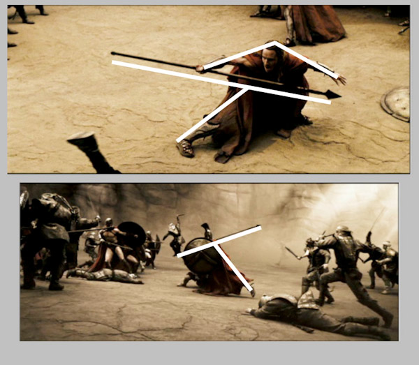
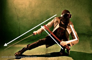
Naturally these mechanics of posing will change for whatever crazy weapon you ask your model to hold, but here are the basics from the comics and my own experiences. Think about a body, think about a body holding a sword and about to decapitate someone. The body moves from the center of gravity, from the Chi center of the warrior. If you don’t respect this notion then your model will look unbalanced, your ninja will look like a drunk Halloween party-goer, and the result will be sub-par. Momentum moves from the center of the body, which is generally taken to be at the center of gravity, near the abdomen. Force is translated to the legs and reaction forces move through the arms, but as any dancer knows (and I a-love-a the techno dance nights) it starts from the center of the body. With a ninja concept, the Katana follows the curve of the body as it moves in space. Therefore, the relationship between the legs, arms, body center, and sword is very important. It seems most dramatic to capture this relationship at the two extremes: when a person is recoiled, ready to explode, or at the end of the action, after the head has been decapitated and is flying through the air. That’s the way they do it at Marvel and D.C. Comics. Let’s look at a few screen shots of 300 and Watchmen to illustrate the concept.

dramatic-pose-1.jpg

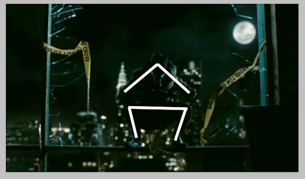
So what do we see? We see King Leonidas of Sparta at the pinnacle of recoil, (bottom image) about to bring down a wicked spear-death on some poor Persian bastard who got send to the front-lines. Look at the lines of the body and the weapon. The line of the legs from the ground to the connection to the spear is very angular, nearly 90 degrees. Look at Stelios (top image), recoiled in a defensive position just after killing the representative of Xerxes. The line of the legs to the spear are very hard (although more difficult to see here) and prominent. Look at the geometric position of Rorschach (shown below) when he’s crouched on what’s left of the Comedian’s window. Actually, the lines are very similar to the Kanji for the Shibuya train station in Tokyo. Coincidence? Yes, of course. There is no magic formula to the Universe. There is no hard rule, but some loose patterns do seem to possibly exist.

dramatic-pose-1-2.jpg

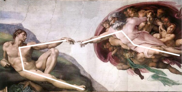
I interpret it this way, harder angles generally tend to  communicate a sense of strength and power. If you look at a the lines of two people having sex, the lines of the bodies are all interconnected and chaotic, because that is the point of extreme vulnerability. Think of the lines of a nude image, one meant to express sensuality. The lines of the body in a traditional nude will be very subtle. What do we see from Art history? Lets consider the connection between humanity and God (or whatever the interpretation is) from Michaelangelo. God stretches out in a subtle way towards Man (feel free to interpret as Wo(man) as well). The lines are relaxed and not very hard. You get more a sense of calm (of course the lighting has an effect as well), which is far different from 300 and Watchmen. Even if a Katana were thrown into the mix between Adam and the Creator, it wouldn’t come across as a dramatic expression of rage. I’m not an Art historian or an illustrator, I’m a Doctor of Science, and these are just the patterns my mind has picked up on.

dramatic-pose-1-4.jpg

So, if you’re interested in creating a hard-dramatic image, consider the pose first. It will help define the overall tone and drama of the image. From the pose flows the intention of the subject, to love or kill, and if you form a good basis here, the resulting image will better communicate the drama and emotions you originally intended. Or, you could just put a gun in a picture and the result will likely be a generic, uninteresting image of a gun and some person.

Urban Ninja – Concept to Photo

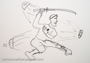
urban_ninja-2I was on a train heading back from Zurich and I had an image in my head, so I sketched it out and the next night setup some lights to create a few concept images of the Urban Ninja. This set of images is probably one of my more thought-out to date. The image is meant to be dark, with the main action elements distinct, this includes the pose, lighting, and post-processing. I can’t really say why I designed an Urban Ninja image concept. Partially it’s because I’m enthralled with the new Watchmen movie, partially it’s because I watched Akira Kurosawa’s movie Ran, and finally because I happen to have a Katana sitting on a shelf in my apartment. So how was the Urban Ninja image designed and executed? Well, lets look at the various elements, Pose, Wardrobe, Lighting Design, Processing.

urban_ninja

Pose

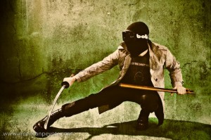
The pose was the primary reason for this image, and the driving force being it’s creation. I have a book somewhere in Michigan that I used to learn about drawing comics from. It was called something like, “The Marvel Way” it basically describes how characters are portrayed in the Marvel Universe. The main idea is that you draw characters at the height of anticipation or the climax of action. So you draw Spiderman in a crouched position before his energy explodes and he leaps off of the roof of a building, or you draw Batman with his fist connecting to the jawbone of some villain, but never portray the in between action, where people are just standing around looking normal. So, here our Urban Ninja is in full crouch, poised for action. The leg and sword extend and there’s a sense that there’s something just out of the frame. This is accomplished due to the lines of the body, leading the eye of the viewer. The line of the body leads you into it. The Katana is drawn and ready for blood. The scabbard is in a defensive position to extend the line of the right arm. All these elements are key to the visual impact of the image.

Further reading: Urban Ninja – Dramatic Pose Tutorial

Samurai Sword

The Katana is meant to be an extension of the warrior’s body, the curvature of the blade mimics the swoop and fluid moments of the body when it’s in motion, and this a key element in the pose. Symmetry between the leg and sword contrasts with the defensive crouch of the Ninja, using the scabbard in a defensive position forms a perpendicular line to the sword arm. These all lead the eye of the viewer.

Face Design

The face of the Ninja is totally covered in a mask I got the last time I drove go-carts at Block in Winterthur. The idea is to hide the face, while retaining the features of the face. The goggles are over-sized and remind me of Snake Eyes from G.I.Joe. The mask and goggles are essential to remove the sense of identity and humanity from the Ninja and focus on the pose. The hands were left bare to represent the philosophy that while we can hide our faces and identities in life, we conduct our lives with our own two hands, and there is nothing to hide behind when we have to answer for our deeds.

Wardrobe

Lighting is easy, but to have a cool image you need detail that people will find interesting. In this case, I just wanted to find it interesting for myself, thinking that others might as well. The trench coat and pants are from We, chosen for their close fit and reflective (but not gaudy) texture, which I knew would mix well with the hard lighting design I had in my mind. The Purple Doc Marten combat boots were chosen as the base of the image, the elements which connect the Ninja to the environment. Their size and hard lines complete the line of the legs and also work well with hard lighting. The T-shirt is from a Dandy Warhols concert in Zurich. I used it because the design is just sort of astronaut-cool and cuts down on the seriousness of the image. You just can’t take yourself too seriously when you’re posing for a self-portrait with a Katana in one hand and wearing black ski goggles.

urban_ninja-3

Lighting Design

The main driving force in the lighting design was to create some hard shadows and give definition to the Ninja which would hold up well during the post-processing in Adobe Lightroom and Photoshop. Hard light and a bit of soft fill was used to define the hardness of the trench coat and portray the face as melting into the night. Three lights were used and one reflector. The overall desire was to have hard light illuminating the Ninja, forming shadows of the night. The main light is a Sunpak 120J placed above and slightly behind the Ninja. I went with a 120J with a parabolic reflector because it dumps a lot of hard light, which is exactly what I wanted. An Orbis ringflash adapter with a Sunpak 383 was positioned in front of the Ninja, filling in shadows on the front and adding definition to the features of the Ninja. A second Sunpak 383 in an Alzo softbox filled in the front without softening the hard light from the 120J. The ultra cheap Gadget Infinity 16 channel radio triggers were used to fire the strobes. A Minolta 7D with 28mm lens was used, capturing the whole subject and adding a bit of wide-angle distortion which I like.

urban_ninja-4

Color and Post-Processing

A green background was used, to contrast with the black and grey color scheme of the wardrobe. The 120J illuminated the background from the upper left, giving a sense of a moon or street light cascading down over the ninja and rendering a hard shadow on the ground below. An orange layer was added in Photoshop to balance out the darks and work with the grunge concrete layer I used for the processing. The post-processing design was sort of hyper-real, translating into a few layers of Levels, Highpass, Curves and Smart Sharpening. This allowed the Ninja to have some deep shadows, and sharp definition of the body. I use a light de-saturation layer as well to tone down the color and match the “feeling” of the color scheme with that of the concrete grunge layer. This is better described in my Photoshop Grunge Tutorial.