Fooling around with video presentations is a fun way to waste a few nights. This one focuses on lighting, posing, and post-processing of my Urban Ninja photo concept. Aside from the concept and posing, which I discussed previously, this video includes a screencast of the post-processing.
The post-processing for the Urban Ninja images was done in Adobe Lightroom and Photoshop CS3. The processing was designed to define and enhance shadow areas of the arms and hands, while the pose of the image is the main element. The face falls off into blackness and shadows, so that the form of the Ninja is focused on by the viewer. Grunge layering techniques were used to add the dark-gritiness I seem to like. Two concrete layers were used here, one I shot in Wintethur, Switzerland, and the second came with the Joey L Photoshop Tutorial DVD. I blended the concrete layers using overlay or softlight, and a few curves and levels adjustment layers were included to better define the shadows. A final color layer was used to give the final color-cast and define the overall image feel. Anyways, to see the full process just check out the video below.
I used black+white adjustment layers to control the shadow depth. With his technique you create a B+W layer, then blend it using Luminosity or, as I prefer Multiply. This darkens the shadows and since it’s a black and white layer, you can go in and adjust the amount of red, green, blue, etc. which is being defined in that layer. This technique can be used in many images so long as you don’t abuse it. In addition to portraits I like to use it for landscape images with a deep blue sky and a collection of clouds. This image below from the Swiss National Park was shot on film with my Fuji GA645, scanned with a Nikon LS-9000 scanner, then worked on in Photoshop, with a B+W layer used to control shadow texture.
There are many things that are easy to buy in life. Cameras, lights, guns (in America), pants, Katana swords. And it’s easy to say, “Yes, I have a Katana, and therefore I’ll hold it and logically the resulting picture will be cool.” Why? “Because, I’ll have a sword, and Samurai swords are cool…like guns. So, I’ll just hold it and it’ll be a cool shot.” No my son, you’ve seen too many Tarantino movies. The simple fact that you decided to use a gun or a sword in a photo shoot is not a magic-bullet-express to coolness. Yes, yes, I know, you want to believe that your model can become Uma Thurman from Kill Bill or Bruce Willis from Pulp Fiction – just because they’re holding a highly evolved Japanese decapitation device. I may be daft, but I think that even Angelina Jolie looks awkward and fake with a firearm in her hand. Not quite as foolish as Pamela Anderson in Barb Wire, but not far off either. Good photos come from the imagery of the subject and the message contained within their static forms. It only has to look believable for 1/120 of a second if you’re taking a photo, but it’s easy to come up short. So what goes into creating a cool dramatic image using things like swords and guns as props in photos?
The Emotional Connection
Images and pictures are interesting because the viewer feels a sensation, a reaction to the medium. This is paramount over everything else, and 99.99% of the time your camera doesn’t matter too much. You don’t need a Hassy and a production team to do some cool ninja shots, you just need to get a handle on the visual imagery. Visual imagery? Ok, so where does that come from?
One day I was thinking up image concepts and settled on the Urban Ninja concept. This involved a bit a sketching, lighting design, wardrobe, post-processing, but the most important part was the visual pose of the model. Why is the pose so important when creating a dramatic action image? Because photography is just a fake representation of reality, and the more realistic and powerful the emotional message, the more unique your image will be. The whole point of weapons (swords or guns) is to inflict irreversible bodily harm onto another human being or animal. The purpose is to kill. You can read all the Sun Tzu you want, recite all the Samurai poetry you can remember, imagine valiant soldiers as warrior poets transplanted from killing fields in Scotland and Thermopylae, but weapons are simple extensions of the body, meant to draw blood. The actions from the warrior are pure intentions to kill before being killed. We’ve dressed this up in popular media and comic books, but the point is that the body should communicate a sense of power and desire to inflict bodily harm, to kill someone else. Otherwise, there’s no reason for the sword/gun/weapon to be in the image. And therein exists the heart of the dramatic action image.
The Dramatic Pose
The dramatic pose has evolved and reached a pinnacle of artistic expression in comic books and graphic novels. In these static mediums you have to communicate the dramatic action in just a few static frames, but give the reader a sense of danger and adrenaline. So what can a photographer learn from comics books? Many things my children; color palette, posing, attention to detail. Recently a number of graphic novels have found their way to the silver screen, among these latest attempts, Watchmen and 300 have been the best adaptations, which really capture the drama of a graphic novel in the fluid movement of a feature film. The basic premise when designing the pose of your subject is to ensure that there’s a connection between the weapon and the model. If you hand some random person a sword and say action there’s a very good chance you’ll just get an awkward image of a person with a sword. The Katana is a beautifully curved piece of steel, which needs to flow with, and be a part of (because it is simply an extension of) the body of your model. Portray it in any other way and you end up with something which doesn’t look genuine. It’ll look forced, fake, and a viewer will pick up on that. Something will click in their mind and they’ll think, “no, that’s not right.” If your viewer doesn’t intuitively feel themselves drawn into the image, and don’t believe that they are Uma Thurman wielding a Samurai sword, then the photograph has failed. So what are the specific mechanics of the dramatic pose?
Pose Dynamics
Naturally these mechanics of posing will change for whatever crazy weapon you ask your model to hold, but here are the basics from the comics and my own experiences. Think about a body, think about a body holding a sword and about to decapitate someone. The body moves from the center of gravity, from the Chi center of the warrior. If you don’t respect this notion then your model will look unbalanced, your ninja will look like a drunk Halloween party-goer, and the result will be sub-par. Momentum moves from the center of the body, which is generally taken to be at the center of gravity, near the abdomen. Force is translated to the legs and reaction forces move through the arms, but as any dancer knows (and I a-love-a the techno dance nights) it starts from the center of the body. With a ninja concept, the Katana follows the curve of the body as it moves in space. Therefore, the relationship between the legs, arms, body center, and sword is very important. It seems most dramatic to capture this relationship at the two extremes: when a person is recoiled, ready to explode, or at the end of the action, after the head has been decapitated and is flying through the air. That’s the way they do it at Marvel and D.C. Comics. Let’s look at a few screen shots of 300 and Watchmen to illustrate the concept.
So what do we see? We see King Leonidas of Sparta at the pinnacle of recoil, (bottom image) about to bring down a wicked spear-death on some poor Persian bastard who got send to the front-lines. Look at the lines of the body and the weapon. The line of the legs from the ground to the connection to the spear is very angular, nearly 90 degrees. Look at Stelios (top image), recoiled in a defensive position just after killing the representative of Xerxes. The line of the legs to the spear are very hard (although more difficult to see here) and prominent. Look at the geometric position of Rorschach (shown below) when he’s crouched on what’s left of the Comedian’s window. Actually, the lines are very similar to the Kanji for the Shibuya train station in Tokyo. Coincidence? Yes, of course. There is no magic formula to the Universe. There is no hard rule, but some loose patterns do seem to possibly exist.
I interpret it this way, harder angles generally tend to communicate a sense of strength and power. If you look at a the lines of two people having sex, the lines of the bodies are all interconnected and chaotic, because that is the point of extreme vulnerability. Think of the lines of a nude image, one meant to express sensuality. The lines of the body in a traditional nude will be very subtle. What do we see from Art history? Lets consider the connection between humanity and God (or whatever the interpretation is) from Michaelangelo. God stretches out in a subtle way towards Man (feel free to interpret as Wo(man) as well). The lines are relaxed and not very hard. You get more a sense of calm (of course the lighting has an effect as well), which is far different from 300 and Watchmen. Even if a Katana were thrown into the mix between Adam and the Creator, it wouldn’t come across as a dramatic expression of rage. I’m not an Art historian or an illustrator, I’m a Doctor of Science, and these are just the patterns my mind has picked up on.
So, if you’re interested in creating a hard-dramatic image, consider the pose first. It will help define the overall tone and drama of the image. From the pose flows the intention of the subject, to love or kill, and if you form a good basis here, the resulting image will better communicate the drama and emotions you originally intended. Or, you could just put a gun in a picture and the result will likely be a generic, uninteresting image of a gun and some person.
After hiking out of the San Jacinto wilderness in California I slept on a couch in an apartment in the Silverlake area of Los Angeles. On Sunday I took a walk in LA with Eric Wech, the famous comedian. It wasn’t a full day of walking, we had to drive of course. It’s impossible to walk in LA. Das Ziel of our hunt was graffiti. I wanted to shoot some with my new Canon G10 to continue my project of capturing graffiti images of all the cities I visit like Zurich. We stopped somewhere on Sunset Blvd. and started walking around. We found our way to Echo park, an oasis in the LA jungle with a lake with paddle boats. The local community was out enjoying the beautiful Sunday and a sidewalk sale from the locals started up. I was in a curious mood and we checked out the offerings. Most of it was pointless stuff I could never use, as I was set to fly back to Switzerland in a week. Nothing that is, till I met a nice Latino mother with a box full of Bratz dolls. $3 a piece she said, “Hells yes I says in my heads.” I picked up two Bratz, one with Go-Go boots, one with respectably unrealistic high-heels. I didn’t want to be too weird, so I just bought the two. The concept was easy, take the Bratz dolls around the LA streets and record the excursion with my Canon G10.
While the Bratz dolls provided tons of cheap fun on the streets of LA and San Diego it was obvious to me that more characters would need to be added. The key was contrast, as with camera lighting, contrast is needed in the subject matter. For some reason, I felt that nothing short of a vintage Godzilla would contrast correctly with the Bratz. This proved difficult to find, and I stepped into a toy store in Horton plaza in downtown San Diego. The store clerk asked if he could help me find something, and I promptly said I needed a Godzilla or giant lizard to go with my pair of Bratz. He laughed joyfully into the air and I could tell that he was down with the adventure. There were no Godzillas in the store, so he recommended a T-rex at first, but then brought up the idea of a large alligator. See, the alligator has proportions close to that to that of the Bratz, and I agreed. My credit card came out and the alligator joined the Bratz street shoot.
Shooting on the street is a pretty cool photo project when visiting a city. You find a cool spot, unload a Bratz from your bag and set her plastic heels on the pavement. With the Canon G10 I underexposed the background and then added a reduced flash to the exposure. This allowed me to balance the power of the sun and fill in shadows around the Bratz. The challenge is to keep things fresh, so it drives you to keep moving, thinking up places and backgrounds. The fact that you’re shooting from street level means you’re challenging your photo eye in new ways and forcing a new perspective on to your visualization capabilities. A day later I was tooling around downtown San Diego, and happened to step into Sam Goody, on the hunt for a copy of the High Fidelity soundtrack. I found a used copy at a sweet price and realized that Sam Goody also sells various assortments of tripped-out toys and action figures. It was a hard decision: should I go with the Hellboy, Nite Owl from Watchmen, no…a bobble head Joker, and two freaky creatures. The Joker was only $10 on sale, I couldn’t resist. Now I had an entourage of Bratz, an alligator, two Freaky Creatures, and a bobble head Joker.
I shot the Bratz with my Canon G10, generally using the on-camera flash to fill-in shadows and balance the sun exposure. Generally I would want to shoot with an off-camera strobe, but I decided to go light on this trip and leave the lights at home. The relative size of the Bratz dolls versus the flash is very good, meaning you have nice control over the exposure of the Bratz doll, and can easily over-power the exposure of the sun. Excellent training ground for setting up future shots with “real” models. You would think people might find it weird to see a man walking around LA and San Diego with a Bratz doll and camera, but when you’re wearing Levi jeans and a green Berlin sweater, folks only look upon you with interest and merriment. I kept my assortment of toys, Brats, Freaky Creatures, alligator, etc. in my Mountain Smith backcountry briefcase and pulled them out whenever I felt the inspiration. On the San Digo trolley, at the train tracks, on the beach, during breakfast, at the Oceanside Triathelon, whenever I had few minutes to kill and felt bored. That’s the point of vacation, doing new things. What comes next? Well, the Bratz are in Switzerland now, and the possibilites are endless.
The full set of so-far processed and edited photos can be found at the Flickr Bratz Set.
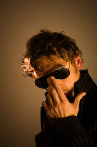
I was on a train heading back from Zurich and I had an image in my head, so I sketched it out and the next night setup some lights to create a few concept images of the Urban Ninja. This set of images is probably one of my more thought-out to date. The image is meant to be dark, with the main action elements distinct, this includes the pose, lighting, and post-processing. I can’t really say why I designed an Urban Ninja image concept. Partially it’s because I’m enthralled with the new Watchmen movie, partially it’s because I watched Akira Kurosawa’s movie Ran, and finally because I happen to have a Katana sitting on a shelf in my apartment. So how was the Urban Ninja image designed and executed? Well, lets look at the various elements, Pose, Wardrobe, Lighting Design, Processing.
Pose
The pose was the primary reason for this image, and the driving force being it’s creation. I have a book somewhere in Michigan that I used to learn about drawing comics from. It was called something like, “The Marvel Way” it basically describes how characters are portrayed in the Marvel Universe. The main idea is that you draw characters at the height of anticipation or the climax of action. So you draw Spiderman in a crouched position before his energy explodes and he leaps off of the roof of a building, or you draw Batman with his fist connecting to the jawbone of some villain, but never portray the in between action, where people are just standing around looking normal. So, here our Urban Ninja is in full crouch, poised for action. The leg and sword extend and there’s a sense that there’s something just out of the frame. This is accomplished due to the lines of the body, leading the eye of the viewer. The line of the body leads you into it. The Katana is drawn and ready for blood. The scabbard is in a defensive position to extend the line of the right arm. All these elements are key to the visual impact of the image.
The Katana is meant to be an extension of the warrior’s body, the curvature of the blade mimics the swoop and fluid moments of the body when it’s in motion, and this a key element in the pose. Symmetry between the leg and sword contrasts with the defensive crouch of the Ninja, using the scabbard in a defensive position forms a perpendicular line to the sword arm. These all lead the eye of the viewer.
Face Design
The face of the Ninja is totally covered in a mask I got the last time I drove go-carts at Block in Winterthur. The idea is to hide the face, while retaining the features of the face. The goggles are over-sized and remind me of Snake Eyes from G.I.Joe. The mask and goggles are essential to remove the sense of identity and humanity from the Ninja and focus on the pose. The hands were left bare to represent the philosophy that while we can hide our faces and identities in life, we conduct our lives with our own two hands, and there is nothing to hide behind when we have to answer for our deeds.
Wardrobe
Lighting is easy, but to have a cool image you need detail that people will find interesting. In this case, I just wanted to find it interesting for myself, thinking that others might as well. The trench coat and pants are from We, chosen for their close fit and reflective (but not gaudy) texture, which I knew would mix well with the hard lighting design I had in my mind. The Purple Doc Marten combat boots were chosen as the base of the image, the elements which connect the Ninja to the environment. Their size and hard lines complete the line of the legs and also work well with hard lighting. The T-shirt is from a Dandy Warhols concert in Zurich. I used it because the design is just sort of astronaut-cool and cuts down on the seriousness of the image. You just can’t take yourself too seriously when you’re posing for a self-portrait with a Katana in one hand and wearing black ski goggles.
Lighting Design
The main driving force in the lighting design was to create some hard shadows and give definition to the Ninja which would hold up well during the post-processing in Adobe Lightroom and Photoshop. Hard light and a bit of soft fill was used to define the hardness of the trench coat and portray the face as melting into the night. Three lights were used and one reflector. The overall desire was to have hard light illuminating the Ninja, forming shadows of the night. The main light is a Sunpak 120J placed above and slightly behind the Ninja. I went with a 120J with a parabolic reflector because it dumps a lot of hard light, which is exactly what I wanted. An Orbis ringflash adapter with a Sunpak 383 was positioned in front of the Ninja, filling in shadows on the front and adding definition to the features of the Ninja. A second Sunpak 383 in an Alzo softbox filled in the front without softening the hard light from the 120J. The ultra cheap Gadget Infinity 16 channel radio triggers were used to fire the strobes. A Minolta 7D with 28mm lens was used, capturing the whole subject and adding a bit of wide-angle distortion which I like.
Color and Post-Processing
A green background was used, to contrast with the black and grey color scheme of the wardrobe. The 120J illuminated the background from the upper left, giving a sense of a moon or street light cascading down over the ninja and rendering a hard shadow on the ground below. An orange layer was added in Photoshop to balance out the darks and work with the grunge concrete layer I used for the processing. The post-processing design was sort of hyper-real, translating into a few layers of Levels, Highpass, Curves and Smart Sharpening. This allowed the Ninja to have some deep shadows, and sharp definition of the body. I use a light de-saturation layer as well to tone down the color and match the “feeling” of the color scheme with that of the concrete grunge layer. This is better described in my Photoshop Grunge Tutorial.
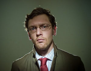
There are many boring things to do on a lazy Sunday in Switzerland. You can climb up a klettersteig, go paragliding, chill in a coffee shop, enjoy a movie, brunch in die Giesserei in Oerlikon, tour over a glacier, vegetate in front of the TV, but if you did all of that last weekend, then the obvious option is to go shoot urban portraits in Winterthur. As a Strobist-educated photographer, it’s nice to go out and shoot with someone who actually makes money taking photographs, and has an Elinchrom Ranger RX system. So, on a Lazy Swiss Sunday Matt and I headed to the old industrial area of Winterthur, just outside of Zurich to shoot some pictures that we called, the Urban Poet series.
I’m a bit of strange guy, and when I shoot images I naturally try to infuse a bit a strangeness into the process. Dry Tooling in a parking garage, vintage glacier goggles, and hiding my beautiful eyes behind sunglasses are my thing at the moment. This contrasts wonderfully with Matt’s take on portraiture, which is influenced by his background in photo journalism and wedding photography. He captures the beauty of reality, while I try to do anything but. Fortunately, I was able to add my hint of strangeness during the post-processing.
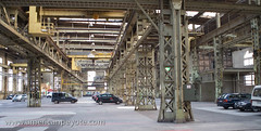
Our location was at the back of the Lagerplatz near the train tracks in Winterthur. Winterthur is a historic industrial manufacturing base of Zurich, Switzerland. Since the Swiss economy has transitioned away from large-scale industrial manufacturing and become focused on biotech, medical, and technology companies, the hard industrial areas of Winterthur have gone through a large transformation in the past 50 years. Lagerplatz translates from German as something like loading or inventory place, basically it’s where you have warehouses for loading trains, and is right next to the old Sulzer manufacturing area. Since it’s industrial heyday, the whole area has since been transformed into a hip business location for designers, swanky apartments, a climbing gym, and is the go-to place for wedding photographers who want to make urban portraits for high-paying clients.
The Concept
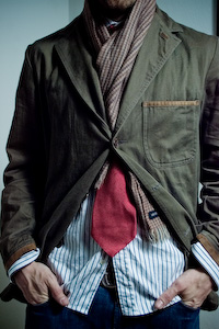
We had two ideas in mind, one as an experimental action image, and would then go do some reality based shots. For the action shot, I had picked up a toy gun at the store the day before. In addition I took along my Pelican hard case and a simple wardrobe, consisting of Levi’s jeans, a form fitted T-shirt, and olive jacket with nice clean lines. As per Matt’s direction, I kept my vintage motorcycle goggles in my pocket and wore instead a pair of traditional black sport glasses.
The Gear
Nikon D300
Nikon 80-200 f/2.8
Nikon 12-24 f/4.0
Elinchrom Ranger RX strobes
Skyport RX radio triggers
Shoot-through and silver umbrellas
Medium Elinchrom octabox
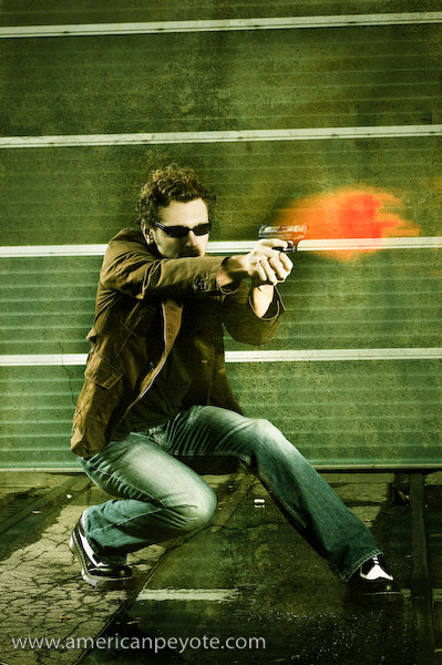
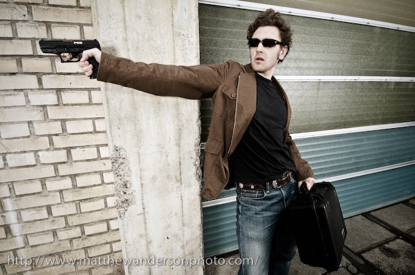
Bullets Are My Prose
The night before I had been watching Casino Royale, getting ready for the release of Quantum of Solace, so I was pretty geeked to pick up a toy version of the P99 and pretend to be an extra from James Bond, Spy Game or a Jason Bourne movie for 1/100th of a second. The occasional kid would stop to look on his way to the indoor skate park at Block, asking what we were doing, and, “is that a real gun?” For the lighting Matt alternated between hard lighting and flatter diffused looks using the umbrellas. I went with this wardrobe because I like modeling with my olive We sport coat and relaxed Levi’s, the light blue and white of the jeans contrasts well against the green of the coat. Overall it has a sort of hip urban feeling mixed with funtionality of something I actually like to wear. Additionally, both types of clothing give great definition with harder or flatter lighting schemes. The shadows from the creases along the arms give a subtle dramatic texture to the overall image with the right light. I went with my Doc Marten wing tips (model 3989) because their large soles have a very defined edge, forming a nice separation visually between the subject and the ground. Again, the whiteness of the Docs juxtaposes nicely against the coat and sunglasses. It might have been better to have gone with a lighter T-shirt, as the dark grey shirt needs more direct lighting to bring out features of the subject’s torso area. Here it acts more like a visual void in the image, or maybe this is just my science mind making too much of nothing. The gun and Pelican case were added to give some story elements, and because Matt and I wanted to experiment with different visual elements in this series.
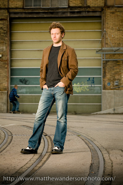
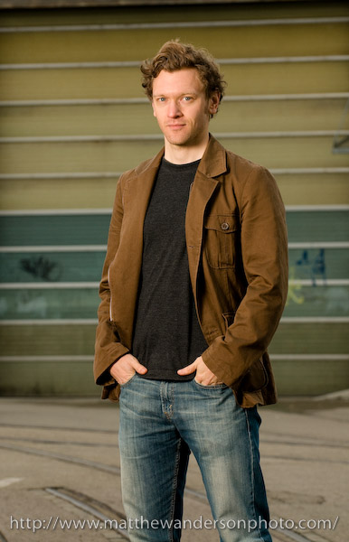
The Urban Poet
For the main Urban Poet portraits, Matt positioned me well in front of one of the buildings with one of those large garage doors in the background. This renders a nice geometry to the background, without over-powering the colors of the subject. For this shot Matt used the Nikon 80-200 f/2.8 lens, which gives a nice compressed image and control over depth of field to isolate the subject from the background elements of the shooting environment. And, the Nikon 80-200 is of course, very sharp. The lighting was done with one medium Octabox with an Elinchrom head. You can see in the portrait how the light is basically hitting about 1 meter in front of the subject, and then lighting the whole person. For this image, Matt designed a very cool portrait by separating the subject from the background using his choice of lens, and by keeping a shadow on the foreground, he minimizes the tendency of the viewer’s eye to be drawn away from the subject. So, basically it means your eye is drawn directly to the subject and not distracted by either the foreground or background elements. At the same time, having this foreground an background elements in place is what defines the urban environment, and makes the image look cooler and much more interesting than a simple studio shot.
Could this shot have been done with small flash gear, yes, to a certain extent I’m sure it would have been possible, but if you happen to have an Elinchrom Ranger RX system with a medium-sized octabox, dealing with a small flash Strobist setup is just crazy. The Elinchrom octabox combined with the Ranger strobe heads gives you beautiful diffused light, and using the Skyport RX system meant that Matt was able to control the strobes without moving from his shooting position. If you have an assistant running around changing your lighting settings, then it’s fine to use a Pocket Wizard to trigger your lights, but when working alone the Skyport RX system makes the whole process painless. The use of the octabox is what made this image possible, otherwise it would be more difficult to create this dark shadow seen in the foreground, and hence, the image would have a different character.
Shooting with Matt was a great experience from multiple perspectives. First, being directed by a photographer and doing what models do gives one valuable experience on how best to ineract with people which I shoot in separate projects. If you’re a photographer who has never gotten in front of the lens, I highly recommend it. When you act out the part of a model, you become more aware of you body movements, and more aware of the difficulties of taking direction. So, when you shoot your own projects, you now have a base for better connecting with your models. You understand what it’s like to be on stage, their insecurities, and it will make you a better photographer. It’s also important to work with photographers who have a vision and style which differs from your own. You understand the value of different working methods, different lighting schemes, different portrait techniques, and in the end you are then challenged to reassess your own style and become a stronger photographer because of it.
Photography and text-based web publishing are fantastic tools for communicating ideas across the world. However, they have their limitations. I think in a 3D moving picture mindset, and therefore, it made sense to start communicating using moving pictures and spoken words. Concept to Photo – Urban Dry Tooling is a video tutorial about starting with a concept, and then translating that inspiration into a final photo.
This isn’t a new idea, there are many photography related video tutorials on the web. However, I rarely find one I want to watch for more than 30 seconds, because they’re either boring, or filled with the least relevant information possible. Another problem is that in many ways the photography tutorial video genre has become a dumping ground for marketing videos from photographers trying to emulate Chase Jarvis – the famous commercial photographer from Seattle who is often credited with starting the photo-video marketing movement. However, he’s a unique gem in the chaotic video landscape of the internet, and his videos have yet to be matched for style or content. I’m not a photographer posting a video to show off my equipment and pretend like I have a cutting edge production studio. I’m a guy in an apartment with an old G4 Macintosh and an old Minolta 7D DSLR who likes to think up concepts and express them.
The concept behind this video is simple, compress my creative and photo production process into the upper attention span limit of an average internet video viewer.
This video tutorial was created to fulfill three functions: first, as an exercise for me in producing a video I would want to watch (but I’m weird so this probably doesn’t apply to the average internet viewer). Second to help me understand my creative workflow by packaging it in a video form (teaching to others is the best way to learn). And Third to give other photographers, creatives, and anyone else interested in a new (or old) perspective on the creative process as applied to photography.
Audio was recorded using my Zoom H4, screen capture video was obtained using Snapz Pro X, music was obtained from Kevin Mcleod’s music collection, and the rest is just still images and titles. Some say that soon cameras and camcorders will be one and the same, and they’re right. But in transitioning to the video world I wanted to start simple, and that meant using primarily still images.
For some reason the job details between photographers and scientific researchers are dramatically different, but from my perspective the motivation and work-flows are almost indistinguishable. Maybe it’s just my will to be weird, but when I sketch out a photo concept or think up a new research project, the exact same centers of my brain are working at peak capacity. This was the inspiration in developing this article on the creative workflow from concept to realization as applied to photography.
IKEA Dry Tooling
The generic view of artists is that they’re filled with an abundance of talent and drive and create through pure inspiration – bubbling from a magical fountain in their soul. The generic view of a scientist/engineer is one of a logically cold calculating individual slaving for days and nights and eventually years with a sort of mad-scientist personality detached from reality – characterizing the world in theories and mathematics that normal folks just don’t understand.
The more I started actually doing photography I began to realize some things would go faster and come out better if I actually thought about them – laid them out beforehand you see. It’s not like I need to define the process in a textbook. After all, photography is Art, the result of intuitive inspiration and amazing talent…blah, blah, blah. But the fact is, as an engineer I acutely appreciate the poetry in a well executed project. An elegant well-thought out project map is as beautiful as a fleeting mountain vista or abstract impression. The link between art and science/engineering/design is indistinguishable, so why not integrate them all? Take the analytical themes of science and fuse them with the free out-of-the-box thinking of art and photography.
I like to take the analysis aspects of science, combine with the project management aspects of engineering, mix with the artistic element of design and cap it off with the fool-proof ease of digital photography and computer imaging. We end up with a total process for the concept develop though image execution and output.
I’m not defining the creative process because I feel a need to before producing an image. Yes I can pick up a camera, set up lights, or not use any lights and produce great images. Sure art is supposed to be free-wheeling and off the cuff and pure inspiration and guess what – so is engineering. Even if you don’t think there’s a process going on inside the nicely packaged computer inside your skull, doesn’t mean it’s not happening. So why not exploit it? Why not explore the creative production process and learn how to improve it?
So, for clarity let’s quickly define the photo production process as:
Concept – Production – Shooting – Processing – Deliverables
Concept
This stage probably doesn’t need to include a camera or computer or anything more complicated than a pen and paper and your thoughts. You just think up what you want to do and start putting it down so it doesn’t get erased in your short-term memory banks. Sure this can be done inside your head, visualize a subject with lights and angles and photoshop layers and then try to produce it directly with a camera. Alternatively setting things down on paper usually brings up more questions. Like, what color should the pants of the model be, will I need a grid to highlight the face or will two soft boxes suffice. Of course, all of this can be worked out on the fly as you’re shooting, but if you can visualize everything before you start, you will naturally get more accomplished and probably get closer to realizing of your vision faster than doing it all on the fly. Essentially the concept stage is there for brainstorming: subject, location, colors, lighting, message, mood, etc. These are realized as sketches, mock-ups, whatever you need. Figuring these things out early means not having to screw around with them later.
Production/Logistics
Once everything is set up in your head, you just need to go through the actual process of producing the work. How will lights be set up, what equipment and wardrobe is needed? Do we need to buy a purple velvet jacket? How about some clear makeup to reduce glare on the nose? Where will the shoot will take place, and how do we get equipment and the models together in production. You could even include a subsection purely for logistics. Screwing things up here means you forgot to bring batteries and your cool new flash doesn’t work or that awesome Octabox is useless because you didn’t pack the speedring. And that means not having the elements necessary to get the image you wanted. Developing equipment lists, maintaining an organized lighting kit which can be taken when needed, and knowing how to set everything up and execute the shooting session efficiently means it could take 10 minutes instead of 60 to get the images you originally wanted.
Shooting
With the concept in your head, and all the logistics worked out and the various elements of the production set up, all you have to do now is press the shutter and head to the next step (in theory). We could also call this the execution stage, but that sounds a tad morbid. Probably it won’t go so smoothly as simply depressing the shutter button, but the point is that if you work out the concept and logistics before you actually start shooting, you won’t have to run around looking for random flashes or light modifiers or – trying to come up with a totally new concept on the fly and not have the resources to see it realized. Many people will say they’re in their “element” when running around fiddling with flash position and making models wait because they didn’t prepare beforehand. I’d rather take the least amount of time as needed to do the actual shooting and move on to Processing the images moving on to the Deliverables. The idea is, get the shot and make great exposures that can be successfully processed into the final image you want.
Processing
In the golden ages of darkrooms and chemicals the main essence of your image was produced in-camera, unless you were a real wiz who lived in the darkroom. I now more or less consider the image from a camera to be a nice starting point – or a possible end point. Processing can be as easy as tweaking the levels or a bit more complicated, leading to various layers, filters, and electronic brush strokes in Photoshop. Processing can mean compositing multiple images together or working exclusively on one from the camera. Processing can make an angry man look approachable or a little girl look like a devil. The colors, shadows, image sharpness, it can all be defined and/or modified at this point to realize the final interpretation of your original concept/vision. How you do it is up to you. My processing work-flow starts by loading images in Adobe Lightroom, editing those images to focus on the images I want, the ones which best communicate the original concept I had. Those are further edited down and the finalists are exported to Photoshop for editing and compositing (if needed), whatever is needed before finishing and moving on to Deliverables. The final images are generally exported from Lightroom (even if heavily modified in Photoshop), primarily because last minute exposure tweaks, cropping, and adding watermarks is far easier in Lightroom than in Photoshop. Depending on your output destination color management is either irrelevant (like to the web) or essential (like for printing).
Deliverables
Website, Flickr, print, Flash movie, printed tattoo, however the image gets from your computer to your audience/client is the Deliverable. Here, beyond sizes, formats, and possibly printer and color profiles there’s not much to enhance or to dilute the vision conceived in the Concept stage. If the Concept-Production-Shooting-Processing stages were done well then the output will look great in any media. If you got lost somewhere between Concept and Processing and forgot to pack an extra flash, then the Deliverable might be lacking, it’s the culmination of everything which came before.
The End?
Here it was and now it’s not, a guide to conceptualizing and producing the fantastic images you want out of your digital life. You can be an engineer, naturally untalented Artist or a librarian, or anything else you can imagine to classify yourself, but if you recognize and follow a process or develop your own and stay true to the vision in your head (and pay attention to the details) the images will come out fantastic. Getting down to Brass Tacs, any project, whether scientific or artist can be thought of as the effective management of resources. You have models, locations, lighting equipment, etc. The job is simply to communicate a message/concept based off of those resources in the least painful way.
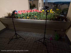
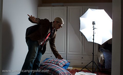
After too many days and weeks of rain and snow and late spring sleet the Sun shown bright and strong over Zurich on the second Sunday of April in the year 2008. I took the opportunity to sun bathe and then set up flashes, picked up my Minolta 7D and Ricoh GRD and set about photographing the excellent garden on the terrace.
One of the coolest things you can do with off-camera lighting is balancing the power of Sunlight with the watt-seconds of your strobe. Now, with powerful studio flashes from Alien Bees, Elinchrom, Profoto, and many others, this is easy. But the technique is often overlooked by amateur photographers since normal camera flashes are too weak to balance, or to over-power the exposure from the Sun.
I set up two flashes, a Contax TLA280 and Metz MZ40-3i. Gadget Infinity radio triggers were used to fire them. I had to use direct flash, with both set to nearly full output, since the high afternoon sun made weaker flash settings and any umbrella diffusers useless.
This meant I could light the main parts of the garden and create a nice blue sky in the background. The flowers take on a sort of unrealistic shine, a certain texture your eyes can’t perceive in reality. Ah, but the magic of simple off-camera lighting makes the magic appear with little effort.
A number of photos were taken during this session with the Minolta 7D and 20mm lens, but the best were produced using the Ricoh GR Digital with a 28mm lens. The near infinite depth of field of the Ricoh GRD coupled with the with wide angle of view of the 21mm and 28mm lenses produced nothing short of perfection for capturing the cool colors of the flowers to contrast against the deep blue sky. The Ricoh GRD rendered excellent saturation and sharpness of the flower petals and sharp green stems.
The setup for this shot took all of 10 minutes and there was no real concept I was trying to communicate. The motivation was keenly contained within a desire to play around with my cameras and flashes and produce an image I’d never seen before.
There’s little doubt that flash photography and flowers has been around for decades and countless photographers will produce more countless generic flower photos with deep blue skies and saturated petals. However, these will stick in my memory for a while, mainly because I was just playing around, and that’s when all the really cool things are done, when we don’t mean to do anything beyond killing the time we find on our hands.
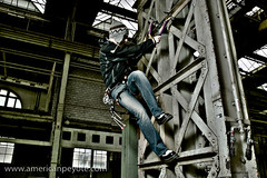
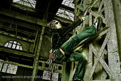
How was that image created? What was the workflow from the initial idea to the finished product? Concept to Photo is a growing collection of articles detailing how various images were produced, starting from the initial concept stage through to the final image. What worked, what didn’t, could the concept be translated to an image, and how successful was the experiment? This installment includes the development of the Urban Dry Tooling Concept: the perfect mix of climbing coolness and the industrial edge.
The Concept:
I’ve been moving towards combining climbing and urban concepts for a while. It’s a natural result when you have little time to climb and too much camera equipment combined with a night of self-portrait experimentation. Everyone knows what the generic city mountaineer looks like: jeans, fuzzy hat, fleece gloves, cool sport sunglasses, Teva or Chaco sandals in the summer and hiking boots in the winter, all topped off with an expensive Gortex jacket fit for Nepal but mainly used to fend off the wind in front of Starbucks. I’m not an exception, except that I keep the boots at home in favor of Dr. Martens. Anyways, I wanted to take the Urban Climber/Mountaineer look a bit further than the coffee shop.
The concept started with a sketch and was simple, take the best parts of Urban and combine with the edginess of mountaineering. I wanted something sort of dramatic, I wanted movement (or the sense of it), and I wanted it to look cool (at least to my eyes). For the Urban part this meant that dark industrial backdrop only available from a circa 1940’s sky scape or an old factory. It also meant fashion and not just taking a mountaineer and putting them onto the side of a building.
I wanted the coolest elements from mountaineering: ice tools, quickdraws, well-fit jacket, cool hat, and sunglasses – and then combine with a clean hip urban look. Unless you ice climb you probably know what an ice axe is but don’t have any idea what an “ice tool” is supposed to look like. Ice tools are short and meant for climbing frozen waterfalls or hanging from rock edges in winter. They’re curved, wicked and stylish.
The clean hip Urban look was realized by integrating jeans and super-fly Dr. Martens into the mix. The location was an old industrial area, in conjunction with a zuerichflickrdrinks Flickr group outing.
The Location:
The old industrial Sulzer-Areal complex in Winterthur, just outside of Zurich, Switzerland. Originally a manufacturing complex, since transformed into an ultra-chic locale with apartments and one fantastic parking garage which is largely unused on the weekends.
The Wardrobe:
Mountain Hardware Jacket
Levis Jeans
Dr. Martins wing tips
Bolivian Hat
Trango Captain Hook Ice Tools
Random Accessories (quickdraws and ice screws)
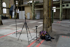
The Execution
The original idea was to hang on to the columns of the parking garage with the ice tools and be pulled by a rope attached to the harness. Then the model could have his legs pulled out into space or jump out. This actually seemed a lot more dangerous in real life with actual steel and concrete to bash his head into – and hence was scraped as an option. After killing that notion static posing on the steel column in classic climbing fashion became the main focus. Assisting with the camera was done by ubiquity_zh.
Sometimes the lighting dominates the subject and other times very simple lighting is paired with a subject. There are a number of things which could have been done better, like lighting the steel column or mixing soft overhead light with some hard lights for contrast, but in the end a simple (somewhat pathetic) one umbrella setup mixed with the natural light filtering through the ceiling was used. A Contax TLA280 was reflected into an umbrella high camera left and a 20 mm lens was used to get some slight distortion and bring out the Dr. Martens when the feet were properly positioned.
The Processing
Dodging and burning was used on the jeans to bring them out. Then various curves, high-pass and levels adjustment layers were used to stylize and a deep green color was added with a fill layer. Layer masking was used where appropriate to bring back facial features lost in the layers. A grung texture was produced from the concrete in the factory and used as the final step.
The Debrief
The images from the Urban Dry Tooling shoot were ok, more or less what was wanted, but in many ways don’t really pop in the way intended. On the one hand this is good, it means the photographer is not egotistical to the point where he’s fooled into thinking that crap photography is fabulous because he designed it. On the other hand it means one can see the road of improvement.
One main problem is the poor separation between the black Mountain Hardware jacket and the background. A light grey jacket or T-shirt would have absorbed less light, and would’ve rendered better defined shadows. Furthermore, a diffused light from the right would have illuminated the torso of the model better. Of course, adding some back-lighting would have helped as well to improve separation, and grid spot to light the ice tools probably would have prevented them being lost in the shadows of the steel framework. What comes next? Only the Shadow knows.
I’m somehow drawn to photography – not to necessarily document an interesting or unique view of the world, but to get the picture that I didn’t know existed. That concept, that image in my head which sits there till I try and make it for real. This is generally means combining bokeh, focus, and wide angle lenses with a subject to get that certain “look” which the eyes don’t intuitively capture. And few things are harder for the eye-brain connection to interpret than motion. That’s why the use of off-camera strobe flash was developed by Harold Edgerton in the first place: to capture motion in ways never before possible. Adding motion to a static subject can add a certain “something” it’s unexpected and generally produces an image that sticks in my head. So, I took the concept in my head and set about translating it into a viewable form.
Creating a Dramatic Motion Image
When you live in a place that doesn’t include a vast studio space, improvising and designing a shoot becomes important. It’s the best environment to learn in because you’re challenged to make things look “cool.” Cool is easy when you’re shooting a Swatch Watch commercial with a full staff and art director, but I don’t do these things – and need to organize things like models and locations and wardrobes on my own.
For the concept, I wanted the images to have movement, some sort of dramatic character, and to look “cool.” “Cool” is at best a meaningless relative term and I don’t profess to having my finger on the pop-culture pulse of the trend setting world…but I went for the concept in my head anyways.
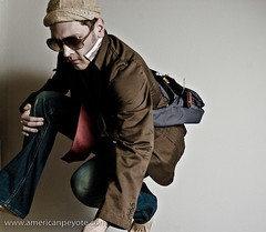
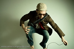
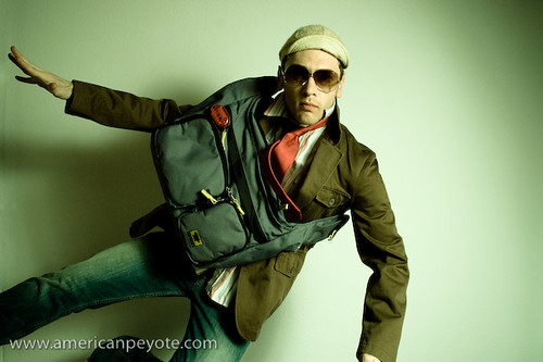
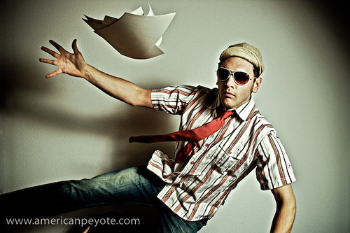
Having no budget or creative vision, I decided to go with my only available model, myself – and capture myself in a dramatic fashion: Flight (jumping through the air). The apartment has wood floors, so first I set about setting up crash pads (guest beds) to land on and then added wardrobe elements and props which would add motion effects to to the final images.
Wardrobe: Shirt (BC Ethic), Tie (H&M), Jeans (Levis), Olive Jacket (We), Messenger Bag (MountainSmith)
The crash pads were setup in front of a white wall and the camera went on a tripod. I started out using the 2 sec. shutter delay function on my camera, but coordinating my jump with the delay wasn’t’ working so well. Instead I opted for using a wired cable release. My hand was often out of the frame, instinctively trying to break my fall – but the trigger release could eventually be Photoshopped out of the picture.
The wardrobe seemed to work, the jacket and tie floated in the air when needed and a stack of paper added another element, a main focus for the eyes to lock onto and juxtapose against the main subject. The Mountain Smith courier bag was, well, one of those Urban elements, suggesting the subject is “going somewhere” and has “things to do” – people to see. I love my MountainSmith bags like I love my ice tools, and try to integrate them into shots whenever possible.
Post processing of the images was done in Lightroom and Photoshop, sometimes using some processing elements I picked up in the Joey Lawrence Tutorial DVD.
In the end, I fell short of achieving the vision in my head, mainly because I didn’t have a trampoline and the cielings were too low for one anyways. This meant jumping on my own, and since I don’t jump very high I had a very short time to pose while in freefall. The jump and freefall where rarely timmed correctly to the camera shutter and my head statred hurting from the impacts after a while. Still, achieving 1/4 of your vision is far more productive than 2 hours of watching TV.
Jumping looks easy, and it is twice in a row, but if you’ve spent the previous day ice climbing and every other photo sucks because the timing is off and you’re out of the frame, well…the jumps add up and the photos session quickly turns turns into a workout fast. I think of Michael Grecco’s book The Dramatic Portrait – he’s shooting Jet Li doing a flying kick at one point, and the translator says, Jet Li doesn’t need a trampoline.
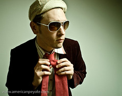
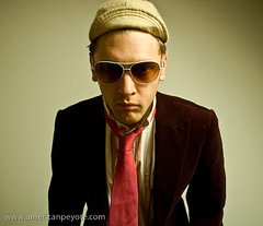
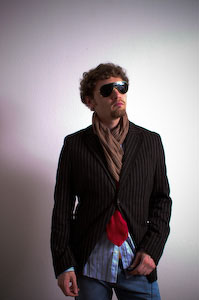
On a cool Thursday night after German class and before a Greek dinner party I had a deep desire to do some fashion consious shopping in Zurich. I walked into one of the bright storefronts on Bahnhofstrasse to find a jacket, and perhaps some pants to match.
"We" is a cool clothing store for guys, more realistic style than H&M, more cutting edge than Fossil, way cheaper than Hugo Boss, and they have decent quality stuff. There was a cool olive blazer, but I wasn’t ready for the shoulder inserts, plus it seemed to fan out too much around the sides. I can’t do black velvet yet and the purple relaxed velvet is just so beyond realistic contemplation for me I didn’t even try it on.
Distraught and subdued I took one more look around the ground floor before leaving and my eyes settled on a non-fitted (only small, medium, and large) urban relaxed styled offering. It was made to look like linen; a rustic brown with faded white vertical stripes. I wasn’t expecting much but I tried on the medium and it seemed to fit like a glove. It was only two button, but it was also only 99 CHF, I took it to the counter without a second thought.
Heading back along Bahnhofstrasse I stopped in at H&M. It’s not my favorite store since they like to sell too many trendy trinkets (sparkling belts and leather wrist bands) that kids buy like bubble gum cause Brittany wore it on MTV. But the guy section actually has some cool suits and pants. I only had one goal; and found a cool blue-stripped button down shirt to go with the blazer.
I fell in love with the H&M dress shirts earlier this year when I picked one up on a whim. Seeing as I used to be quite the chubby Star Wars/G.I. Joe geek, there’s some sort of quiet contentment in buying shirts with the words "size medium – slim fit" on the tag. They hug my body like no other non-sport shirt I’ve ever worn. Up until the age of 18 I’d say that over 80% of my clothes came from my mom via various second=hand stores. Now the idea of spending $80 on a pair of non-waterproof, non-tear resistant, just-cause-they-fit-well-and-look-cool pants is almost digestible. The next night I wore the blazer, new shirt and light blue Levis. The red tie made an appearence, as did the Saks 5th Ave. scarf.
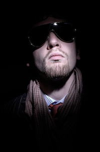
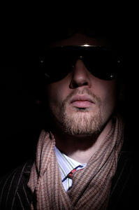
As I was heading out the door I grabbed the Purple Dr. Martin 10 eye combat boots (not pictured), they just seemed like the perfect addition. The aviator sunglasses were just for the photographs. I don’t really wear sunglasses during the night, unless I happened to have lost my normal glasses – which has happened before (Oktoberfest is a dangerous place). I wasn’t really drinking during the shoot, mainly because the beer had been sittng out for two or three days.
I had a will to be weird on one Friday night, which for me entails not wearing sandals and trading in the climbing jacket for a blazer. The decision process took about a half hour. First, I was thinking of the black DKNY jacket, but it didn’t go with the dark blue (2% Kevlar Polo Sport) jeans that I wanted to wear (plus it felt a bit too stiff and dressy). The green corduroy Levi safari jacket was promising, but I wanted something lighter, and although I kinda liked looking like a Beetle wanabe-reject, it was too dark to wear the sunglasses which would have been necessary to complete the ensemble. I finally settled on the Alagash olive green travel jacket with leather elbows and no shoulder inserts. At this point my sister is probably asking the same question she asked me when I was showing her my Purple Doc Marten combat boots, “are you sure you’re not gay?” Underneath I wore a dark-stripped white H&M button-down shirt. There was gel in my hair and high-gloss Dr. Martins on the feet. Around my neck I wrapped a Sakes 5th Ave. scarf my mom probably paid less than 1$ for 10 years ago at some second hand store in Michigan – but something was missing.
To complete the look I tied on a bright red tie (also H&M). The scarf covered up the top of the tie so as not too look to pretentious (who wears a tie outside of work?), and the bright redness of it peaked out nicely over the top of my stomach when I pulled the jacket back and put my hands in the jeans pockets. After all, how else is one supposed to casually walk through Zurich on a fine fall evening? I call this my laid-back but dressed up. Cutting but comfortable. After all, clothes are unnatural if you’re not comfortable in them – costumes are only for Mardis Gras and Halloween. Otherwise you just seem like a trend-jailed fool trying to look cool but all the while projecting a feeling of uneasy make-believe. Ineffective and sad to look at.
I’m sometimes shy and it takes some motivation for me to get up the courage to be comfortable and wear a blazer-type jacket in public – but I also sleep on glaciers, and I had a Will to be Weird. Sometimes you have to face the fear of looking foolish when going out in a fashion nebulus of the world (like Zurich). But really, if you do it with fearless confidence it doesn’t matter what you’re wearing. Besides, life gets boring if you don’t take a few reasonable risks here and there every once in a while, and since I had no plans to galavant across mountain ridges this past weekend, the fashion risk would have to suffice to keep my senses peaked and primed to effectively handle whatever life would reveal.


 One day I was thinking up image concepts and settled on the


 While the Bratz dolls provided tons of cheap fun on the streets of LA and San Diego it was obvious to me that more characters would need to be added. The key was contrast, as with camera lighting, contrast is needed in the subject matter. For some reason, I felt that nothing short of a vintage Godzilla would contrast correctly with the Bratz. This proved difficult to find, and I stepped into a toy store in Horton plaza in downtown San Diego. The store clerk asked if he could help me find something, and I promptly said I needed a Godzilla or giant lizard to go with my pair of Bratz. He laughed joyfully into the air and I could tell that he was down with the adventure. There were no Godzillas in the store, so he recommended a T-rex at first, but then brought up the idea of a large alligator. See, the alligator has proportions close to that to that of the Bratz, and I agreed. My credit card came out and the alligator joined the Bratz street shoot.