Photography

Alexandra – Anatomy of a TFCD Model Shoot

Barbie HunterA little while ago I started networking on with models on websites like Model Mayhem and Stylished to organize some shoots. One day I was reading my email and saw a contact from Alexandra (MM# 809690) on Model Mayhem, she liked some of my shots of Amber and we organized a TFCD shoot. What follows is an article on my approach to organizing ideas and lighting scenarios for the shoot with Alexandra. I took a project management based approach in this case. This included a pre-shoot meeting, concept development, and laying out all the ideas, resources, and equipment in a mind map project file. Organization overkill for a basic TFCD shoot? Some will say yes, some will say no, and some will have no clue of the appropriate response.

Alexandra-4Pre-Shoot Networking

A Time For CD (TFCD) shoot is the digital incarnation of the Time For Prints (TFP) concept developed in the film area. In the purist form this means that a photographer and model work together, both contributing their time and talents free of charge, and in the end both use the resulting photos for their respective portfolios. In this particular case Alexandra (the model) contacted me (the photographer) via Model Mayhem. We discussed a few details and expectations via email, and then met in Zurich one fine Saturday afternoon to discuss concepts and logistics in person. During this meeting we decided to shoot three photo set concepts with different outfits in my studio. Those concepts were…

  • Basic spring dress
  • Business suit
  • Hippy Ninja – Barbie Hunter

The spring dress and business suit ideas were basic, safe concepts, sure to result in some usable images. The Hippy Ninja was a riskier notion I wanted to work with – an adaptation of my Urban Ninja photo set.

Photo Shoot Project PlanningAlex-08.06.09_Concepts.jpg

There are two extremes to the approach of organizing a photo shoot. On the…let’s call it Conservative end you have a photographer planning each and every detail of the shoot from start to finish. On the…let’s call it Liberal end, you have a photographer showing up with a camera and lights and doing everything “in the moment.” The former sounds calculated and boring, the latter a romantic vision of what a creative photographer “should” be like. I’m a mix of the two, and I happen to know that the best example of Gonzo journalism ever written: Fear and Loathing in Las Vegas, was not written in the Gonzo sense of a reporter furiously filling up a notebook and sending off directly to Rolling Stone for publication. Fear and Loathing was a great short story which took a lot of work to translate into a novel. It’s easy to be creative and spontaneous in “the moment”, but translating a vision into a solid tangible photo concept is another story. So I just did what I do best. I took my project management skills honed in the academic research world at ETH Zurich and EMPA and built up a project plan detailing all the shooting concepts and resources required to complete them using a little Computer Aided Creativity.

The photo concept stage started with our first meeting between myself and Alexandra. We came with our ideas of what we wanted and came to a middle ground. I took the notes from my meeting with Alexandra and started creating a mind map on my PowerBook. I used MyMind to list and then organize all the elements of the shoot, listing the photo ideas, what would be needed for each concept, the lighting style I wanted, and my available resources (cameras, lights, etc), and finally what I would rent or need to buy for the shoot. The mind map isn’t necessarily a rigid plan for the shoot, rather it’s used here to collect and organize all the ideas. Since I’m acting as financier, creative director, photographer, and post-processing artist, I can change the game plan as needed. The organization of ideas is useful so that way I remember to buy a couple of Barbie dolls to remove their heads for the hunter necklace, in addition to buying fresh flowers for the Ninja head dress. Although I love my Minolta 7D I rented a Sony A900 and the Zeiss 24-70 lens from GraphicArt in Zurich. Why? Well, mainly because I’d been using a Minolta 7D for many years and now wanted something with better resolution, auto-focus accuracy and dynamic range.

Camera:BarbieHunterSetup-00828.jpg
Sony A900
Zeiss 24-70mm

Lighting Kit:
2x Elinchrom BxRi 250ws strobes
2x Portalite softboxes
1x Elinchrom beauty dish
2x Sunpak 383 flashes
1x Kacey Beauty Reflector
1x Orbis Ring Flash Adapter
1x Lastolite TriLite Reflector kit
Skyport and Gadget Infinity radio triggers


Photo Concept: Color and Lighting Design

The three different looks would require different background colors and lighting designs. My backgrounds included dark green, deep red, and storm grey.

Summer Dress

Yellow summer dress with different scarfs (picked up at H&M and from my closet). for the spring type feeling I went with my green background and main lighting via the BxRi flashes using a softbox and beauty dish. We also added a deep red scarf and a few hats. The lighting scheme was to use the BxRi flashes, a large softbox light with the beauty dish for some directionality, giving some deeper shadows and better definition on the skin. The dish also provided nice sort of hard shadows over the brim of the hat to form a vile over here eyes. Lastolite TriLite reflectors were used to add fill from beneath.

Alexandra-3.jpg

SuitSetup-00677.jpgBusiness Suit

Here I shot with a deep red background, contrasting with the black suit Alexandra wore and giving a moody feeling. I pulled the cushion from my couch for Alexandra to lounge on and we also did standing shots. For these shots I used a beauty dish, softbox, and added fill with a Sunpak 383 in an Orbis ring flash. I setup the softbox on a boom up high with one BxRi. The second BxRi was in a beauty dish on a boom and used as a shaping and fill light to create some moody shadows and balance out the light from the softbox. The 383-Orbis light was used to fill in more of the dress, as it was a dark fabric it needed more light to define the texture.

Hippie Ninja – Barbie Hunter

At some point in the concept stage I remember thinking something like, “It would be sweet if she were a Ninja hunting Barbie and Bratz dolls and then made a necklace from their severed heads.” Here I wanted a harder look, and deviated from the softbox-beauty-dish combination. Two softboxes were placed directly perpendicular to Alexandra, creating definition on her arms and side (think Joel Grimes). The TriLite reflectors added fill to her front, and a Sunpak 383 on the lowest setting in a Kacey Beauty Reflector was used high in the front.BarbieHunterSetup-00828.jpg

Post Processing

Alexandra originally contacted me because she liked the processing work I do with layered texture techniques. While I made it a point to stay true to these desires, it was obvious that all these images didn’t necessarily “want” to be textured with concrete and graffiti layers. Yes, you read right, I listen to the image while post-processing, the colors and shadows speak to me and we build the final image together. No, I don’t do drugs, I just listen to the rhythm of the world. In the end I worked on the images Alexandra chose for her portfolio and applied the urban style I like to play with. However, for many images I left them mostly true to the in-camera look. Naturally I modified the shadows and color feeling, but for the Barbie Hunter images, I wanted Alexandra to stand out – contrasted with the Barbie Head necklace.

Barbie Hunter

Wrap-Up

Shooting with Alexandra was pretty cool. We did a few safe image concepts and then moved into the experimental territory with the Barbie Hunter. I loved doing the pre-shoot planning and concept design. The more time you put into pre-shoot planning, the less you have to worry about during the actual event and everything will just go smoother. The Elinchrom BxRi flashes are awesome and the Sony A900 + Zeiss 2470 is a sweet combination. Many people will tell you to buy the more powerful 500 ws strobes, but the 250 ws strobes have a fast recycle time and provide more than enough light for my current studio setup. I got Elinchrom strobes from Profot in Switzerland.

Alexandra-2.jpg

What comes next? A photo shoot with Margarita…

Margarita_I-2.jpg

Urban Ninja – Photo to Concept Video Tutorial

Urban_Ninja_IV

Fooling around with video presentations is a fun way to waste a few nights. This one focuses on lighting, posing, and post-processing of my Urban Ninja photo concept. Aside from the concept and posing, which I discussed previously, this video includes a screencast of the post-processing.

The post-processing for the Urban Ninja images was done in Adobe Lightroom and Photoshop CS3. The processing was designed to define and enhance shadow areas of the arms and hands, while the pose of the image is the main element. The face falls off into blackness and shadows, so that the form of the Ninja is focused on by the viewer. Grunge layering techniques were used to add the dark-gritiness I seem to like. Two concrete layers were used here, one I shot in Wintethur, Switzerland, and the second came with the Joey L Photoshop Tutorial DVD. I blended the concrete layers using overlay or softlight, and a few curves and levels adjustment layers were included to better define the shadows. A final color layer was used to give the final color-cast and define the overall image feel. Anyways, to see the full process just check out the video below.

I used black+white adjustment layers to control the shadow depth. With his technique you create a B+W layer, then blend it using Luminosity or, as I prefer Multiply. This darkens the shadows and since it’s a black and white layer, you can go in and adjust the amount of red, green, blue, etc. which is being defined in that layer. This technique can be used in many images so long as you don’t abuse it. In addition to portraits I like to use it for landscape images with a deep blue sky and a collection of clouds. This image below from the Swiss National Park was shot on film with my Fuji GA645, scanned with a Nikon LS-9000 scanner, then worked on in Photoshop, with a B+W layer used to control shadow texture.

An American Ninja in Bern – Swiss Strobist

sarah-bratz-iii.jpgThere are probably very few reasons to walk through a Swiss train station with a sword slung around your body. Even if you are a Ninja, in modern times the Katana offers little to the needs of a hired killer, except to show-off and behead a target if paid to do so. If you’re a photographer en-route to a Swiss Strobist meetup however, it makes perfect sense, and is even acceptible in some ways, to casually stroll through the Bern train station with a Katana slung over your shoulder and a Kacey beauty dish under your arm. It’s unclear to me, the actual legalities of walking around a Swiss train station with a Katana slung over the shoulder. So it’s best to bungy a light stand to the Katana after wrapping in olive green farbic, now when you’re stopped by die Polizei you can say something like, “Ah, das is nur eine Blitz Stative.”

The Swiss Strobist meet-up in Bern was organized by Mark Howells-Mead. Traveling under the name Permanent Tourist on the net, he’s an aspiring photographer who’s taken some initiative to organize photographers in Switzerland around the Storbist philosophy of location shooting. I know Bern fairly well, but I’d never shot there, and when you’re presented with an option of staying in bed or jumping on a train to Bern with your Katana, the word “Yes” should dominate any other suggestion in your head at 6:30am on a Sunday morning.

Why take a Katana to a Strobist meetup? Mark said he was impressed by the Ninja shots from Chase Jarvis and my Urban Ninja images, and asked if I could swing by with my sword, as he had some idea of executing a modern Jack the Ripper photo on the streets of Bern. It seemed like a reasonable request, so I agreed to head to head to Bern on a fine Sunday morning for the Strobist meet-up. I had other motives of course, for me das Ziel of the day was to fool around with my new fantastic lighting combiation, a Kacey Beauty Reflector with a Sunpak 120J powered by a TR-II battery pack. Beautiful light, power, and long battery life in a mobile configuration. I’d just received a Kacey dish the week before and shot with it in my apartment. I love the light from the Kacey dish, and wanted to try it out on a location. So when my alarm went off around 6:30am, I set about collecting my things for the day. Minolta 7D, Canon G10, Kacey reflector, light stand, Doc Martens, Katana, Bratz doll…let’s roll.

The format of the Bern Swiss-Strobist meet-up was a bit more structured than I’m used to at these things. In the morning we broke up into groups including a model with a leader to run the shoot, then in the afternoon it was a free-for-all with photogrphers shooting models and experimenting. This offered a nice mix, letting some photographers teach, with the option of getting more interactive in the afternoon. The best way to learn with flash is just to do.

bern-strobist-setup-1.jpg

The Kacey Dish on Location

The Kacey dish is large. I realized this when a giant box was given to me by the nice woman at my local post office. I had ordered the dish along with the Kacey location bag. I figured, what the hell, if I don’t buy the bag I probably won’t take the dish with me when I leave my apartment, and that would a be a shame. The Kacey dish is marketed as a small-flash beauty dish, ideal for people like myself, who primairly uses small flashes and loves the idea of shooting with a dish.

The Kacey dish is actually very enjoyable to travel with. I took the train from Winterthur to Bern, and then walked around, went on a bus, walked around some more, did some shooting, walked around, blah, blah, blah. At the end of the day I was still skipping along the streets of Bern like a woodland creature from Narnia with my Kacey dish slung over my shoulder. I have no complaints on mobility. Even though the dish looks large and heavy, it’s rather light for what it is and travels extremely well. The Kacey reflector is made from plastic, no doubt some impact resistant formulation formed via an injection molding process. Is it a good idea to mold a beauty dish out of plastic instead of aluminum? Yes, without a doubt. As a Doctor of Science with a Master’s in Materials Science, I have full confidence in the durability and strength of the Kacey reflector, and plan to be using it till I loose interest in photography, or die.

I carried the Kacey dish with the optional bag, as a sometimes avid world travler and mountineer, I’ve developed sort of a bag fetish over the years. My adventure equipment room is stocked with everything from North Face to Lowe Alpine summit packs, multiple Mountain Smith lumbar designs, a Go Lite here, a Mammut there, and my favorite all around climbing/ski touring/mountaineering bags; my Osprey Exposure packs. I know packs, and from a materials standpoint I look for durability in the fabric and robustness in the zippers. The Kacey dish bag is no bullshit, one of the most well-made, highest quiality bags I’ve ever used for anything. The quaility of the $85 Kacey bag is bomb-proof, the stitching is exact, the materials are robust, and the zippers even surpass those on my North Face basecamp duffles.

bern-strobist-setup-3.jpgSwiss Strobists and the Kacey Dish

So, how did the dish perform, how was it received by the Swiss Strobists? Our first shoot was in the Wasserwerk, an industrial site-turned hip nightclub (like many nightclubs in Winterthur, Zurich, and Bern). Mark was trying to light the fully black interior of the club with our model Rahel sitting on a black lounge couch and some Nikon speedlights. Mark had been to the Strobist Cern Workshop, and he started to channel David Hobby, running around the place setting up a flash here, an umbrella there, taking test shots, checking the exposure…then we setup the Kacey dish with my Sunpak 120J (we later switched to one of Mark’s Nikon SB-something flashes so he could use his radio triggers).

I remember Mark saying something like (no, I’m not sure of the exact quote), “Wow, I don’t really need all these flashes, the light is just so perfect already.”

Yes, umbrellas are cheap and great, but nothing beats the light from a nice dish like the Kacey reflector. That’s why people like to use them, they just work, they produce beautiful light without much stress on the part of the photographer. Mark seemed to be impressed by the Kacey reflector, so much so that it was used as the main lighting source on the first two shoots of the day (including his new-age Jack the Ripper shot). He might have used it in the afternoon as well, but I took it back and was able to get a few shots with one of our other models, Sarah before my battery pack died.

sarah-bratz-i.jpg

Shooting Sarah with the Kacey Dish

In the afternoon we photographers had a free-for-all setting up shots in various places. I chose to work with Sarah. I’d taken a Bratz doll with me (I take at least one every time I pack up my camera gear now) and had some ideas. I keep expecting people to look at me like a crazy person when I pull out a camera and Bratz doll, but everyone on the streets are continually amused at my antics. Sarah and I set up near the Aare, the river running through Bern. We were in a small alcove area, with a beautiful view of the river and some nice graffiti on the walls of the old city. I posed Sarah with and without a blonde Bratz doll. Sometimes I threw it up in the air, sometimes I just posed them against one another.

The Kacey dish was used on a light stand, and I leaned it in closer as needed to fine-tune the light. In the first setup the Kacey dish was acting more as a large light source from above Sarah, and the light here would probably be similar to that of an umbrella. I was able to get some nice light fall-off, lighting both Sarah and the Bratz doll with nice, even light. Soft yet directional, and was able to get a nice exposure on the wall as well, where you can see the fine texture near the graffiti.

sarah-bratz-ii.jpgI also posed Sarah against the backdrop of the city in the sun, and bumped up the power on my 120J to balance Sarah’s exposure with that of the background. I was able to get that fine type of light fall-off on Sarah’s face that I love, the type where the face has an even exposure and then the shadows just lightly surround the face. This is exactly why I bought the Kacey reflector, to get those fantastically beautiful shadows with the ability to move and direct the light to where I want it. It’s not something I can easily do with normal umbrellas, and is the reason the Kacey dish is now my favorite light modifier. For the post-processing I went with a graffiti grunge feel, high-lighting the natural graffiti of the walls, or combining Sarah with graffiti overlays from Zurich which I had shot earlier.

bratz-bern-1.jpgSo, brass tacks – the Kacey Beauty Reflector is light and nimble on location. I love the light from it, use a bare-bulb 120J, or just a traditional Nikon SB (or a similar design), and you just get fantastic light. No mess, less fuss, excellent light and you direct it where you want it. An enthusiastic thumbs-up, a vigorous affirmation of my affection for the Kacey dish. Now I just need to get it mounted for my in-the-mail Elinchrom BxRi flashes. If you ever find yourself in Bern and happen to look down only to find a Bratz doll standing next to a giant magic mushroom, don’t be alarmed, this is simply the natural order of things in the Universe, and if you keep looking, you’re sure to find stranger things along the path in this life or the next.

?

?

?

Shooting with the Kacey Dish in my apartment Studio

Kacey Beauty Dish Review – Bill Millios

Kacey Enterprises

Urban Ninja – Dramatic Pose Tutorial

Urban_Ninja-1.jpgThere are many things that are easy to buy in life. Cameras, lights, guns (in America), pants, Katana swords. And it’s easy to say, “Yes, I have a Katana, and therefore I’ll hold it and logically the resulting picture will be cool.” Why? “Because, I’ll have a sword, and Samurai swords are cool…like guns. So, I’ll just hold it and it’ll be a cool shot.” No my son, you’ve seen too many Tarantino movies. The simple fact that you decided to use a gun or a sword in a photo shoot is not a magic-bullet-express to coolness. Yes, yes, I know, you want to believe that your model can become Uma Thurman from Kill Bill or Bruce Willis from Pulp Fiction – just because they’re holding a highly evolved Japanese decapitation device. I may be daft, but I think that even Angelina Jolie looks awkward and fake with a firearm in her hand. Not quite as foolish as Pamela Anderson in Barb Wire, but not far off either. Good photos come from the imagery of the subject and the message contained within their static forms. It only has to look believable for 1/120 of a second if you’re taking a photo, but it’s easy to come up short. So what goes into creating a cool dramatic image using things like swords and guns as props in photos?

The Emotional Connection

Images and pictures are interesting because the viewer feels a sensation, a reaction to the medium. This is paramount over everything else, and 99.99% of the time your camera doesn’t matter too much. You don’t need a Hassy and a production team to do some cool ninja shots, you just need to get a handle on the visual imagery. Visual imagery? Ok, so where does that come from?

urban_ninja-2One day I was thinking up image concepts and settled on the
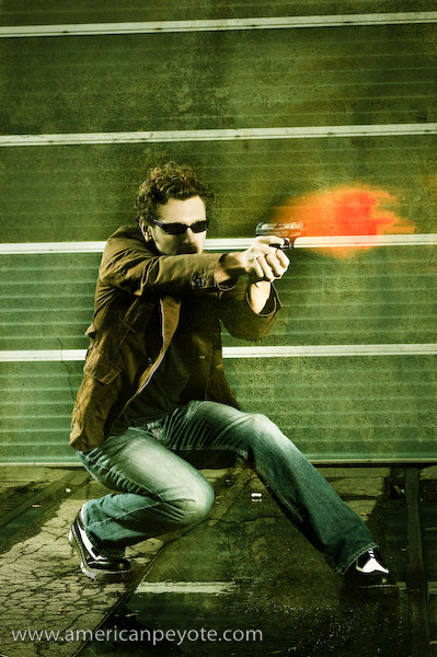
 Urban Ninja concept. This involved a bit a sketching, lighting design, wardrobe, post-processing, but the most important part was the visual pose of the model. Why is the pose so important when creating a dramatic action image? Because photography is just a fake representation of reality, and the more realistic and powerful the emotional message, the more unique your image will be. The whole point of weapons (swords or guns) is to inflict irreversible bodily harm onto another human being or animal. The purpose is to kill. You can read all the Sun Tzu you want, recite all the Samurai poetry you can remember, imagine valiant soldiers as warrior poets transplanted from killing fields in Scotland and Thermopylae, but weapons are simple extensions of the body, meant to draw blood. The actions from the warrior are pure intentions to kill before being killed. We’ve dressed this up in popular media and comic books, but the point is that the body should communicate a sense of power and desire to inflict bodily harm, to kill someone else. Otherwise, there’s no reason for the sword/gun/weapon to be in the image. And therein exists the heart of the dramatic action image.

dramatic-pose-1-3.jpgThe Dramatic Pose

The dramatic pose has evolved and reached a pinnacle of artistic expression in comic books and graphic novels. In these static mediums you have to communicate the dramatic action in just a few static frames, but give the reader a sense of danger and adrenaline. So what can a photographer learn from comics books? Many things my children; color palette, posing, attention to detail. Recently a number of graphic novels have found their way to the silver screen, among these latest attempts, Watchmen and 300 have been the best adaptations, which really capture the drama of a graphic novel in the fluid movement of a feature film. The basic premise when designing the pose of your subject is to ensure that there’s a connection between the weapon and the model. If you hand some random person a sword and say action there’s a very good chance you’ll just get an awkward image of a person with a sword. The Katana is a beautifully curved piece of steel, which needs to flow with, and be a part of (because it is simply an extension of) the body of your model. Portray it in any other way and you end up with something which doesn’t look genuine. It’ll look forced, fake, and a viewer will pick up on that. Something will click in their mind and they’ll think, “no, that’s not right.” If your viewer doesn’t intuitively feel themselves drawn into the image, and don’t believe that they are Uma Thurman wielding a Samurai sword, then the photograph has failed. So what are the specific mechanics of the dramatic pose?

urban_ninja-4Pose Dynamics

Naturally these mechanics of posing will change for whatever crazy weapon you ask your model to hold, but here are the basics from the comics and my own experiences. Think about a body, think about a body holding a sword and about to decapitate someone. The body moves from the center of gravity, from the Chi center of the warrior. If you don’t respect this notion then your model will look unbalanced, your ninja will look like a drunk Halloween party-goer, and the result will be sub-par. Momentum moves from the center of the body, which is generally taken to be at the center of gravity, near the abdomen. Force is translated to the legs and reaction forces move through the arms, but as any dancer knows (and I a-love-a the techno dance nights) it starts from the center of the body. With a ninja concept, the Katana follows the curve of the body as it moves in space. Therefore, the relationship between the legs, arms, body center, and sword is very important. It seems most dramatic to capture this relationship at the two extremes: when a person is recoiled, ready to explode, or at the end of the action, after the head has been decapitated and is flying through the air. That’s the way they do it at Marvel and D.C. Comics. Let’s look at a few screen shots of 300 and Watchmen to illustrate the concept.

dramatic-pose-1.jpg

So what do we see? We see King Leonidas of Sparta at the pinnacle of recoil, (bottom image) about to bring down a wicked spear-death on some poor Persian bastard who got send to the front-lines. Look at the lines of the body and the weapon. The line of the legs from the ground to the connection to the spear is very angular, nearly 90 degrees. Look at Stelios (top image), recoiled in a defensive position just after killing the representative of Xerxes. The line of the legs to the spear are very hard (although more difficult to see here) and prominent. Look at the geometric position of Rorschach (shown below) when he’s crouched on what’s left of the Comedian’s window. Actually, the lines are very similar to the Kanji for the Shibuya train station in Tokyo. Coincidence? Yes, of course. There is no magic formula to the Universe. There is no hard rule, but some loose patterns do seem to possibly exist.

dramatic-pose-1-2.jpg

I interpret it this way, harder angles generally tend to  communicate a sense of strength and power. If you look at a the lines of two people having sex, the lines of the bodies are all interconnected and chaotic, because that is the point of extreme vulnerability. Think of the lines of a nude image, one meant to express sensuality. The lines of the body in a traditional nude will be very subtle. What do we see from Art history? Lets consider the connection between humanity and God (or whatever the interpretation is) from Michaelangelo. God stretches out in a subtle way towards Man (feel free to interpret as Wo(man) as well). The lines are relaxed and not very hard. You get more a sense of calm (of course the lighting has an effect as well), which is far different from 300 and Watchmen. Even if a Katana were thrown into the mix between Adam and the Creator, it wouldn’t come across as a dramatic expression of rage. I’m not an Art historian or an illustrator, I’m a Doctor of Science, and these are just the patterns my mind has picked up on.

dramatic-pose-1-4.jpg

So, if you’re interested in creating a hard-dramatic image, consider the pose first. It will help define the overall tone and drama of the image. From the pose flows the intention of the subject, to love or kill, and if you form a good basis here, the resulting image will better communicate the drama and emotions you originally intended. Or, you could just put a gun in a picture and the result will likely be a generic, uninteresting image of a gun and some person.

Kacey Beauty Reflector – Review

kacey-bd-1.jpgI picked up the Kacey Beauty Reflector for various reasons, first I’ve always wanted to experiment with a beauty dish. Second, the Kacey reflector is designed for small flashes as well as for studio strobe use, offering excellent adaptability in a photo world full of too many mounting systems and of course, it looks cool. The Kacey design comes off very similar to the Mola Demi dish, which is also a very cool beauty dish for the studio. However, like many good ideas, the Kacey dish offers an adaptation from a standard design. It was designed for small flashes and made of plastic to be light and therefore more portable for location shooting, hence fulfilling the desires of people like me, who are self-taught via the internet and highly influence by the Strobist movement. The Mola dishes look interesting, but they’re really outside the budget and needs of anyone but a full-time studio pro shooter. Like many photo startups (think RadioPopper) Kacey Enterprises is fulfilling the purchasing desires of a market, which the established companies have not been innovative enough to design and offer products for. Since I have no desire to acquire a standing as a full-time photographer, the Kacey design is the logical choice for me and my apartment studio, stocked with Metz and Sunpak flashes.

kacey-bd-shots-2.jpgMy first experience with the Kacey dish was photographing my bookcase, complete with Bratz dolls, DVDs and an assortment of toys from California because, well – I’m a geek. What was I expecting and why did I want a beauty dish in the first place? Well, I like umbrellas for throwing a very large amount of light with spill going in all directions, I started using reflective and shoot-through umbrellas, and they have their place. When you’re starting out with lighting design, it’s the best way to go. Umbrellas are cheap, you can get a combined reflector-shoot-through design and it’s very easy to do basic lighting with an umbrella. But, they then become very limiting when one wants to start doing more precise lighting. To explore beyond the umbrella I bought some small softboxes in order to increase the precision of my lighting designs, because they are much more versatile than my 44in umbrellas. The softboxes can be placed on a boom, to the side, behind, where ever I desire around whatever it is I’m photographing. Umbrellas (at least the large ones I have) are not as easy to place, and give too much light spillage for my tastes. Softboxes can be gridded to further decrease light spill and sculpt light as one desires. However, the softbox creates a more diffused light source. What I wanted to achieve with a beauty dish is the ability to place harder light in a desired position. I like the look of photos I’ve seen with beauty dishes, and really I wanted the ability to place a large, even light source on a boom arm around models (ummm, and I’m generally the model). The Kacey dish represents a milestone for me, because it’s the first light modifier I’ve purchased which wasn’t made in China and bought because it was the cheapest option.

kacey-bd-shots-4.jpgSo, how has the Kacey Beauty Reflector fulfilled my desires so far? First, I’ll note that this review is user, not scientific based, and focuses on my experiences using the reflector in the controlled studio environment of my apartment. The Kacey reflector was designed for location use in mind, but light is light and I was most interested in getting an excellent light modifier. Naturally, any light modifier is useless without light from a quality strobe. The Kacey dish is designed with the Speedlite in mind, like those standard uber expensive flashes from Nikon and Canon, which a person such as myself with a Minolta 7D finds to be over-kill. This is all well and good to design a dish for small flashes, but beauty dishes were originally designed with studio strobes in mind, those with bare bulbs instead of a fresnel lens to focus the light beam, like nearly all small flashes have. Nearly all, but I happen to love the Sunpak 120J bare-bulb cult-classic flash, and it fits perfectly with the Kacey Beauty Dish. Here’s why, most small flashes are designed to focus light directly forward of the flash head. A bare-bulb design throws light forward as well to the side of the head. So when you use a normal Speedlite in a beauty dish, you generally would also use a diffuser on the flash, to throw light to the side of the center reflector of the dish. This spreads out the light and would logically contribute to the nice uniform quality of light that beauty dishes are known for. Since the bare-bulb 120J already is throwing light in all directions, and the bulb is extending into the dish, it forms the perfect lighting combination.

The Kacey reflector was released along with a Speedlite bracket. The bracket costs a cool 150 USD, and some controversy has developed around this price. I picked up the dish for various lighting reasons, and I decided not to get the bracket for economic considerations. I figured I would just drill and modify the bracket from my Alzo softboxes. This required the purchase of a drill, which wasn’t that cheap and I don’t drill much stuff in my apartment, so in the end I don’t see how I saved any money. After modifying the adapter from my Alzo softboxes, I’m of the opinion that the Alzo bracket isn’t stiff enough to support the Kacey dish in the long run, and I’ll most likely buy the Kacey bracket, because it makes little sense in getting an excellent dish like the Kacey product and then using a sub-par bracket when connecting the flash. If the bracket isn’t stiff enough the dish will tilt, thus disrupting the light pattern, depending on how the dish is positioned. Plus, as illustrated below, the bracket and the position of the flash will have a very significant (depending on how much you care) influence on the light patterns coming from the dish.

Kacey_Sunpak.jpg

I did a quick comparison between a Sunpak 120J and a standard Sunpak 383. The 383 sports a normal small flash head, and therefore acts more like a normal Nikon or Canon flash, and is perhaps more representative of what people will be using the the Kacey reflector. As you can see from the above photo, the bare-bulb 120J seems to have a wide light pattern, and when you use a 383 with a head-directed light beam, the light spread becomes a tad tighter, especially around the edges, the light fall-off is significantly (depending on how much you care) influenced. Now, there are mitigating factors, the 120J is no doubt putting out more light than the 383 and the light spread shown above would therefore be dependent on the exact exposure of the flash. But the more interesting thing from my viewpoint, is how centering the flash is rather important to the light coming from the dish. Even if I center the 383, since I opted for a cheap mounting adapter for the flash, it’s off-center and I can’t center the 383 to get perfect light distribution with either the 120J or the 383. This concept is magnified on the last picture on the right, where I turned the head of the 383 to the left, and you can see directly how the light pattern changes. What can a perspective buyer gleam from all this? If you want really good light distribution, don’t skimp on the mounting bracket, by all accounts I’ve read the Kacey bracket is top quality and fully adjustable so you can precisely center the flash and support the weight of the dish. For these reasons, I’m looking for a new bracket solution, either from Kacey, or another source.

Test Shots

Kacey_BD_Shots-3.jpg 
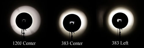
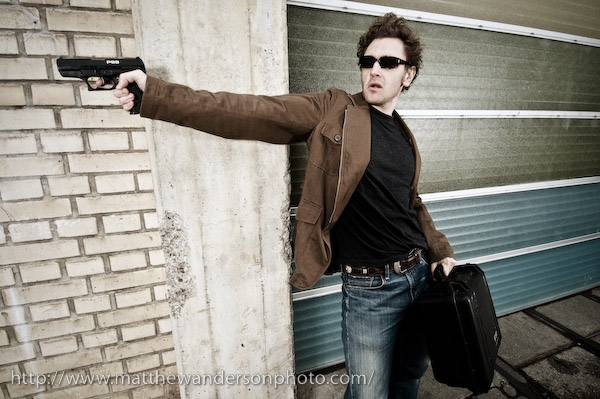
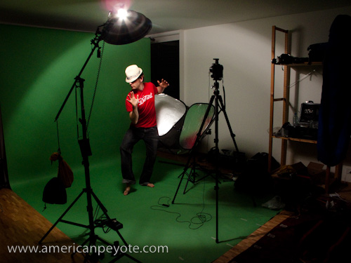
I ran a few test shots with myself playing the role of photographer, model, and art director, which feeds all the different parts of my creative brain. I wanted to get a feeling for the light I could expect from the Kacey Beauty Reflector both from a lighting and post-processing perspective. The setup was pretty basic, the dish went on a boom with the 120J above me and I setup my Lastolite Tri-Lite reflectors to get some fill. I did a few shots with my Minolta 7D and 28mm lens, Gadget Infinity radio triggers were used as well. I wore a shirt which says, “Enjoy Detroit,” because red is my color when shooting on a green background and Detroit is my city of eternal inspiration. I wore a hat I bought on the beach in San Diego and for some reason decided that the Katana would add a much needed element to the mix.

I did a few shots and then did some editing on them in Adobe Photoshop and Lightroom. The keen blog reader might protest, “No! You have post images straight out of the camera to give an accurate representation of what the dish can do!” Nothing is straight out of the camera anymore, and even with film it never went so smoothly. The truth is, you can try to imagine yourself as a Joey L or a Dave Hill, but if you don’t get the shadows you need from designing your lighting setup with purpose and determination, no amount of Photoshop alchemy will save your tones. I shoot images in raw, adjust shadows in Lightroom to get a good base, and them export to Photoshop to manipulate the lighting and tones in such as way that my art director brain waves stop and say, “That’s it! That’s the look!”

Kacey_BD-1.jpg

I’ll be blunt, I found the light from the Kacey Beauty Reflector to be nothing short of, exactly what I wanted. The tone and texture of the shadows are simply perfect. The texture of the skin and shirt are unique compared to what I was capturing with my umbrellas and softboxes, simply awesome. Even light distribution across the model, wonderful light fall-off on the edges. The shadows are deep where I want them deep and the transition from proper exposure to background shadow is excellent. This means that I have a very strong base image to work with when I define the final shadows in Photoshop. In the above image, the texture on the shirt has this almost wind-swept-mountain-ice feel to it after adding a Black-and-White layer and blending using Multiply (plus reduced fill on the layer), it’s like ski touring in the Swiss Alps in January and looking at the texture of a wind-swept snow ridge while wearing red-tinted glacier goggles. “Hells yes! I says in my heads.”

In the bottom Katana image, I was interested in getting some nice shadows on the hands and arms. What I love here is that the sword blade doesn’t get all blown out, even though the light is right above it. With my softboxes I would have a defined over-exposure with poor transition to the rest of the body. I’m pretty sure that if I had used an umbrella instead, the sword would have been blown out totally if I had attempted to get a decent exposure on the torso. The hat was another issue, it’s a light yellow tone, but you can see that it still has excellent texture in the weave of the material, the detail hasn’t been lost due to over exposure. And yet, I can still get excellent shadows to work with on the arms. This image didn’t have too much post, mainly just shadow work, some Smart Sharpening, and basic methods of defining shadow tones over the hands and arms.

kacey-bd-1-2.jpg

Am I Happy

So, the inevitable question, is the Kacey Beauty Reflector worth $150? I’m going with a fully confident Yes. In my estimation and experience so far, the Kacey dish rocks, it produces excellent light, and has so far fulfilled my ambitions and desires for a beauty dish. Should you also get the $150 bracket? As I have no direct experience with it, these remarks might be less significant. However, I do wish I had bought the bracket. If you know how to make a decent bracket then be all means do it yourself. I modified a cheap bracket and it shows in the light patterns produced with different flashes. If this means something to you and you have the money, the bracket appears to be one of those high quality pieces of equipment which is sure to out-last your DSLR. I’m looking forward to using the Kacey dish on studio strobes in the future, either from Elinchrom or Alien Bees, depending on which ones I buy. A grid would also be an excellent addition, and I believe one is in the works from Kacey Enterprises.

A Walk in LA – Street Bratz Photos

Bratz-1-2.jpgAfter hiking out of the San Jacinto wilderness in California I slept on a couch in an apartment in the Silverlake area of Los Angeles. On Sunday I took a walk in LA with Eric Wech, the famous comedian. It wasn’t a full day of walking, we had to drive of course. It’s impossible to walk in LA. Das Ziel of our hunt was graffiti. I wanted to shoot some with my new Canon G10 to continue my project of capturing graffiti images of all the cities I visit like Zurich. We stopped somewhere on Sunset Blvd. and started walking around. We found our way to Echo park, an oasis in the LA jungle with a lake with paddle boats. The local community was out enjoying the beautiful Sunday and a sidewalk sale from the locals started up. I was in a curious mood and we checked out the offerings. Most of it was pointless stuff I could never use, as I was set to fly back to Switzerland in a week. Nothing that is, till I met a nice Latino mother with a box full of Bratz dolls. $3 a piece she said, “Hells yes I says in my heads.” I picked up two Bratz, one with Go-Go boots, one with respectably unrealistic high-heels. I didn’t want to be too weird, so I just bought the two. The concept was easy, take the Bratz dolls around the LA streets and record the excursion with my Canon G10.

Bratz-1-7.jpg
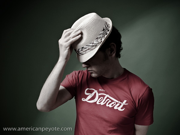
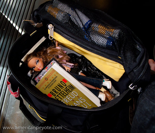
While the Bratz dolls provided tons of cheap fun on the streets of LA and San Diego it was obvious to me that more characters would need to be added. The key was contrast, as with camera lighting, contrast is needed in the subject matter. For some reason, I felt that nothing short of a vintage Godzilla would contrast correctly with the Bratz. This proved difficult to find, and I stepped into a toy store in Horton plaza in downtown San Diego. The store clerk asked if he could help me find something, and I promptly said I needed a Godzilla or giant lizard to go with my pair of Bratz. He laughed joyfully into the air and I could tell that he was down with the adventure. There were no Godzillas in the store, so he recommended a T-rex at first, but then brought up the idea of a large alligator. See, the alligator has proportions close to that to that of the Bratz, and I agreed. My credit card came out and the alligator joined the Bratz street shoot.

Bratz-1-5.jpgShooting on the street is a pretty cool photo project when visiting a city. You find a cool spot, unload a Bratz from your bag and set her plastic heels on the pavement. With the Canon G10 I underexposed the background and then added a reduced flash to the exposure. This allowed me to balance the power of the sun and fill in shadows around the Bratz. The challenge is to keep things fresh, so it drives you to keep moving, thinking up places and backgrounds. The fact that you’re shooting from street level means you’re challenging your photo eye in new ways and forcing a new perspective on to your visualization capabilities. A day later I was tooling around downtown San Diego, and happened to step into Sam Goody, on the hunt for a copy of the High Fidelity soundtrack. I found a used copy at a sweet price and realized that Sam Goody also sells various assortments of tripped-out toys and action figures. It was a hard decision: should I go with the Hellboy, Nite Owl from Watchmen, no…a bobble head Joker, and two freaky creatures. The Joker was only $10 on sale, I couldn’t resist. Now I had an entourage of Bratz, an alligator, two Freaky Creatures, and a bobble head Joker.

Bratz-1.jpgI shot the Bratz with my Canon G10, generally using the on-camera flash to fill-in shadows and balance the sun exposure. Generally I would want to shoot with an off-camera strobe, but I decided to go light on this trip and leave the lights at home. The relative size of the Bratz dolls versus the flash is very good, meaning you have nice control over the exposure of the Bratz doll, and can easily over-power the exposure of the sun. Excellent training ground for setting up future shots with “real” models. You would think people might find it weird to see a man walking around LA and San Diego with a Bratz doll and camera, but when you’re wearing Levi jeans and a green Berlin sweater, folks only look upon you with interest and merriment. I kept my assortment of toys, Brats, Freaky Creatures, alligator, etc. in my Mountain Smith backcountry briefcase and pulled them out whenever I felt the inspiration. On the San Digo trolley, at the train tracks, on the beach, during breakfast, at the Oceanside Triathelon, whenever I had few minutes to kill and felt bored. That’s the point of vacation, doing new things. What comes next? Well, the Bratz are in Switzerland now, and the possibilites are endless.

The full set of so-far processed and edited photos can be found at the Flickr Bratz Set.

bratz-1-3.jpg

Creative Spaces – The Home Photo Studio

home_studio-6The Home Photo Studio is one of those elusive mystical quests many photographers embark on once they’ve figured out f-stop from shutter speed and come to the realization that a little bit of controlled light goes a long way in defining a final image. And once you understand that you think,

“if only I had a few studio strobes, softboxes…and naturally a background, I could then start making amazingly-beautiful pictures of…books, cats, the kids, models, and…whatever!”

The point is that before you get fully ripped in the studio lighting equipment “buying stage” you may want to take pause and ask “why?” Do I really need a ProFoto Pro-7 setup to take portraits of my kids? Yes, because in a studio…magic happens. A studio is one of those sacred places in a home or apartment, a place away from the madness of the world where any caffeinated kid with a camera can make some lighting magic happen. But how? And for how much? Everyone wants a loft in New York filled with backgrounds and wet bar for the models, but reality means you’re generally lucky if you can get a free wall to shoot on when no one else is at home.

There are two essential elements one needs to consider for the home studio: space and light. By manipulating these elements you can create whatever magic you like.

home_studio-7Basic home-studio setup:

1 Lightstand
1 Modifier (softbox/umbrella)
1 Bracket
1 Trigger Receiver Device
1 Camera
1 Manual Flash
1 One Trigger Device

With this basic setup you can expand in whatever direction you like – location oriented, studio oriented, reselling your gear on eBay (when you find a new hobby), it’s all possible from this simple starting point. With a flash on a lightstand, and using a light modifier such as a softbox or umbrella, you can soften and direct the light as you see fit. This of course gives you the option of having hard light (without a modifier) or soft light (with a softbox/umbrella). The initial monetary investment is low (compared to a nasty heroine addiction), the gear can be had for about $250-$400, depending on what you buy. The type of trigger and camera are pretty irrelevant in the early stages. If you’re shooting for the web or to make normal prints, well, you don’t need a Canon 5D-II and the 85mm f/1.2 portrait lens. The money could be spent elsewhere as the lens won’t dramatically improve your images – where as a new reflector or strobe could have a comparatively significant effect. Since 90% of photographers seem to think they “need” the latest DSLR, the used market is saturated with old Nikon, Canon, Minolta, Pentax, Olympus and other random digital camera bodies. Currently I still shoot with a 6-megapixel Minolta 7D. All you “need” is a camera that allows you to set the exposure manually and a flash that allows the same. If you’re shooting in your home, you don’t need a Pocket Wizard setup, you can go with cheap radio triggers from Gadget Infinity or just connect your flashes using PC cords, but if you have the money, “why not?”

home_studio-3Expanding Your Studio

Once you’ve setup a basic lighting package the inevitable question is, “what to buy next?” My response is “nothing.” Use what you have till you get to the point that it’s limiting, and then thinking of adding another light, but not before considering the following.

Reflectors

The basic lighting kit is easily expanded on by adding another stand, reflector and boom arm. The reflector allows you to fill in shadows, and thereby start producing a well-balanced image. If you have one flash and are thinking of buying a second, I would recommend getting a reflector instead. They cost less, don’t require batteries and provide a great deal of reflective surface area that a second flash can’t do on its own. I have a long 5-in-one reflector which can be used with silver or gold coverings, and also can be used in shoot-through mode as a giant softbox.

home_studio-4Boom Arm

The boom arm allows you to position a second flash in various positions around your subject, and can be had for $40-$50. Once you use one, you’ll wonder why you ever went without. Like reflectors, boom-arms are often overlooked by the aspiring light painter as “unsexy” additions to the lighting kit. However, it’s an essential piece of gear which opens up new dimensions to your lighting design. With a boom you can put softboxes in close, directly over-head, to the side, however you like, and thereby really design with precision how your subject will be illuminated. The combination of lighting setups now starts to grow exponentially.

Background

There is a perverse notion that you need to buy a background for a home studio. If you have a free wall to start out with, by all means just use that. When you’re starting out it’s easy to get overwhelmed with choices, background type, color, where it should be placed, etc. Keep things simple at the onset, and grow as you need. In many situations, the background should be the smallest focus in your quest to acquire more gear. Besides, I’ve never liked the idea of hanging a tie-dyed piece of cloth behind people I’m photographing, and hope to never fall into that cliche. Any white wall, brick wall, or variant thereof will do. It doesn’t have to be large or tall or wide or fat, for a head shot, the background can be just a few square feet. In this case you can go for a pop-up background. Sometimes you can use a 5-in-1 reflector with a white or black cover, but there will probably be a lot of wrinkles in the material, I would recommend going with a dedicated pop-up if you go this route. Some of my favorite portraits were done with the equivalent background of just a few cinder blocks in a cramped basement. However, if you have the space, a wide background can be very nice, especially if you plan on filling the air with random volumes of flying coffee. Just maximize the resources you have. I dedicated part of my aparment to a full-lenght paper background setup, and have never regretted it.

home_studio-5Space

This is generally the biggest problem, as renting studio space is usually not an option, and generally, neither is moving into a larger place. In general you need space to do stuff in – this is clear. Ideally, the more space the better. But there’s something I’ve learned in life: When you know what you need and want to do, it makes sense to get the best you can afford. However, in all other situations, in particular those when you’re just learning, it makes much more sense to buy the cheapest stuff possible with poor performance, because you are then forced to excel in less than ideal conditions. Placing yourself in a challenging situation makes you smarter, stronger, and more capable.

While lights and backgrounds can be bought, borrowed, or rented, during shooting sessions space is generally at a premium, and the occasional photographer will end up using whatever is available. The question is how to use that space effectively? If you have one white wall free to shoot on you already have two background possibilities. One is white: throw light on the background and “blow it out” which is a fun little overdone cliche. Persoanlly I think that the background is as, and sometimes more important than the subject. Something more interesting is to place your subject well in front of the wall, and only provide enough light to illuminate them. If the light hitting your subject is more intense than that hitting the background, you will make the wall turn a nice deep tone of grey. The key to using a small space effectively is controlling light spillage. You want the light from your strobes to hit your subject, and not bounce off the walls and ceilings. I’ve photographed in spaces ranging from a large open parking garage to a cramped dorm room in Tokyo. There’s always a way to get the lighting look you want no matter the resources.

The Gist

Basically, no matter what you’re doing in life, you have to learn how to use minimal resources to your advantage. Want to create a man-floating-in-the-air shot? Throw a mattress on the floor just out of the frame of the lens…and jump. Rearrange bookcases and take pictures off the walls to create space, use white walls and ceilings as giant bounce reflectors. Actually, if you learn how to effectively use a small space, where random light bouncing from exposed walls and the distance from the subject to the background are critical factors, then you’re probably in a better position than if you had started out in a large studio with all the resources at your disposal.

home_studio-8


Urban Ninja – Concept to Photo

urban_ninja-2I was on a train heading back from Zurich and I had an image in my head, so I sketched it out and the next night setup some lights to create a few concept images of the Urban Ninja. This set of images is probably one of my more thought-out to date. The image is meant to be dark, with the main action elements distinct, this includes the pose, lighting, and post-processing. I can’t really say why I designed an Urban Ninja image concept. Partially it’s because I’m enthralled with the new Watchmen movie, partially it’s because I watched Akira Kurosawa’s movie Ran, and finally because I happen to have a Katana sitting on a shelf in my apartment. So how was the Urban Ninja image designed and executed? Well, lets look at the various elements, Pose, Wardrobe, Lighting Design, Processing.

urban_ninja

Pose

The pose was the primary reason for this image, and the driving force being it’s creation. I have a book somewhere in Michigan that I used to learn about drawing comics from. It was called something like, “The Marvel Way” it basically describes how characters are portrayed in the Marvel Universe. The main idea is that you draw characters at the height of anticipation or the climax of action. So you draw Spiderman in a crouched position before his energy explodes and he leaps off of the roof of a building, or you draw Batman with his fist connecting to the jawbone of some villain, but never portray the in between action, where people are just standing around looking normal. So, here our Urban Ninja is in full crouch, poised for action. The leg and sword extend and there’s a sense that there’s something just out of the frame. This is accomplished due to the lines of the body, leading the eye of the viewer. The line of the body leads you into it. The Katana is drawn and ready for blood. The scabbard is in a defensive position to extend the line of the right arm. All these elements are key to the visual impact of the image.

Further reading: Urban Ninja – Dramatic Pose Tutorial

Samurai Sword

The Katana is meant to be an extension of the warrior’s body, the curvature of the blade mimics the swoop and fluid moments of the body when it’s in motion, and this a key element in the pose. Symmetry between the leg and sword contrasts with the defensive crouch of the Ninja, using the scabbard in a defensive position forms a perpendicular line to the sword arm. These all lead the eye of the viewer.

Face Design

The face of the Ninja is totally covered in a mask I got the last time I drove go-carts at Block in Winterthur. The idea is to hide the face, while retaining the features of the face. The goggles are over-sized and remind me of Snake Eyes from G.I.Joe. The mask and goggles are essential to remove the sense of identity and humanity from the Ninja and focus on the pose. The hands were left bare to represent the philosophy that while we can hide our faces and identities in life, we conduct our lives with our own two hands, and there is nothing to hide behind when we have to answer for our deeds.

Wardrobe

Lighting is easy, but to have a cool image you need detail that people will find interesting. In this case, I just wanted to find it interesting for myself, thinking that others might as well. The trench coat and pants are from We, chosen for their close fit and reflective (but not gaudy) texture, which I knew would mix well with the hard lighting design I had in my mind. The Purple Doc Marten combat boots were chosen as the base of the image, the elements which connect the Ninja to the environment. Their size and hard lines complete the line of the legs and also work well with hard lighting. The T-shirt is from a Dandy Warhols concert in Zurich. I used it because the design is just sort of astronaut-cool and cuts down on the seriousness of the image. You just can’t take yourself too seriously when you’re posing for a self-portrait with a Katana in one hand and wearing black ski goggles.

urban_ninja-3

Lighting Design

The main driving force in the lighting design was to create some hard shadows and give definition to the Ninja which would hold up well during the post-processing in Adobe Lightroom and Photoshop. Hard light and a bit of soft fill was used to define the hardness of the trench coat and portray the face as melting into the night. Three lights were used and one reflector. The overall desire was to have hard light illuminating the Ninja, forming shadows of the night. The main light is a Sunpak 120J placed above and slightly behind the Ninja. I went with a 120J with a parabolic reflector because it dumps a lot of hard light, which is exactly what I wanted. An Orbis ringflash adapter with a Sunpak 383 was positioned in front of the Ninja, filling in shadows on the front and adding definition to the features of the Ninja. A second Sunpak 383 in an Alzo softbox filled in the front without softening the hard light from the 120J. The ultra cheap Gadget Infinity 16 channel radio triggers were used to fire the strobes. A Minolta 7D with 28mm lens was used, capturing the whole subject and adding a bit of wide-angle distortion which I like.

urban_ninja-4

Color and Post-Processing

A green background was used, to contrast with the black and grey color scheme of the wardrobe. The 120J illuminated the background from the upper left, giving a sense of a moon or street light cascading down over the ninja and rendering a hard shadow on the ground below. An orange layer was added in Photoshop to balance out the darks and work with the grunge concrete layer I used for the processing. The post-processing design was sort of hyper-real, translating into a few layers of Levels, Highpass, Curves and Smart Sharpening. This allowed the Ninja to have some deep shadows, and sharp definition of the body. I use a light de-saturation layer as well to tone down the color and match the “feeling” of the color scheme with that of the concrete grunge layer. This is better described in my Photoshop Grunge Tutorial.

Yeahhhh Baby – Swiss Strobist – CERN Workshop

strobist_cern-3Over the weekend I headed down to CERN in Geneva to check out the Strobist seminar on February 21st, 2009. I went down on Friday to shoot Geneva graffiti and ended up doing coverage of a Tamil Tiger demonstration at the United Nations, but those stories wait for another day. I’m the sort of person who doesn’t like spending money on photography education, mainly because there’s nothing really complex or technical about taking pictures which seems to justify the cost of advertised offerings like the Luminous Landscape workshops. A camera is a lightbox, you add light with flashes or manipulate natural lighting, what’s there to learn? You take the vision in your head and make it a reality. But I do occasionally drop money here and there, a Joey L Photoshop DVD, a book on Skin, a book by Michael Grecco, and I figured it was time to join a lighting workshop.

The Strobist workshop was all day on Saturday. We started around 9am, and finished at 5pm with a few breaks in between. In the morning we listened to David explain lighting design and methodology, and in the afternoon we watched David setup and execute four different lighting setups.

strobist_cernThe morning focused on lighting basics, the thought process for designing lighting in different environments. Lighting concept takes a few minutes to describe in every possible detail, but the morning was filled up on designing lighting for different environments, shooting outside in the shade, lighting an interior room by starting with the ambient light and then adding flash where needed. By the end of the morning I had a good handle on the method, which I hadn’t really used before. I finished the morning with one key process in my head:

When shooting a portrait outdoors, find a shaded location, under expose the ambient environment light, add light to paint the final picture using the strobes. Use the same basics for interior portraits.

That’s it, like I said, photography isn’t exactly complex, so there’s no reason to take away confusing tidbits on lighting ratios. If you write up a business plan and ask for $500,000 from an Investment Angel for your startup, they will want to hear your idea described in 2-3 sentences (Swiss StartUp Camp 2009). That’s it, keep it simple. I see no reason why lighting design should be any different.

strobist_cern-9Aside from having the basic process of lighting design, the afternoon exposed us to how to “execute.” Using the seminar room, we talked about four different locations to use for portraits. Then David set about the room with umbrellas and his Orbis ringflash, photographing participants. From a certain perspective, David Hobby is like the kid who got all the toys he wanted for Christmas, and spends every day rediscovering their amazingness. This was the impression I had watching him setup the different portraits. It seemed like each light setup was like finding a rocket in the backyard and getting to set it off. This is the corner stone, getting a sense for the energy and problem solving method of the man at work – the message which I took away from the afternoon. This aspect which is more difficult to communicate on a website like Strobist, and a good reason to attend a workshop. The technical aspects are of course – trivial. Flashes are not complex, neither is lighting design, it’s how one executes the shoot which matters.

When photographing, be a kid at play and you’ll have fun and take away cool photos. That’s it, nothing too complex.

strobist_cern-4Yeahhhh, Baby. That’s what we heard every five minutes, David’s way of pulling an emotional response from his subjects. It made me think of Platon asking Bill Clinton to “Show me the Love.” By channeling Austin Powers, David pulled a smile from everyone in the room, every time he said the same line again, and again and again, it got a positive reaction. Apparently he has other lines, but since “Yeahhhhh Baby” worked every time, there wasn’t any need to bring out the reserves.

Basically much of the technical information I took away from the Strobist seminar is covered on Lighting 101 and 102 on the Strobist website. Of course, pretty much all knowledge is available on the internet, you can teach yourself JAVA programming, electrical engineering, and quantum physics if you’re disciplined. The question I always ask in my head, “was this really worth it?” Yes, in the end I left CERN happy that I’d dropped 150 CHF on a Strobist lighting seminar, plus travel between Zurich and Geneva and a sound-proof hotel room on Friday night, just as I’m still happy I dropped some 200 odd dollars on the Joey L Photoshop DVD.

And that’s the key to having a successful StartUp, give people something which they feel they need, and which they find value in, and you’ll be successful.

If you’re in Switzerland an interested in Strobist stuff, check out Swiss-Strobist. There’s a post about the CERN workshop and info on the 1st Swiss-Strobist meetup for 2009.

Pelican 1510 Photo Gear Case

Pelican 1510 Lighting GodWhen one gets deep into photography the inevitable question becomes, what can I store my gear in to keep it organized, accessible, mobile, bombproof and cool when jet-setting across the globe? The default answer is a Pelican case. Although now a cliche – Pelican cases are still the gold standard in photo gear protection. I bought a Pelican 1510 for various reasons, but the primary being that I needed a mobile case to house my gear for locations and for taking whatever wherever I desire without worrying about stuff breaking in-transit. I’ve used my 1510 for over half a year now, on planes, in my apartment, anywhere I decided I needed it to be (mostly my apartment).

I buy my gear used and don’t upgrade my DSLR every two years. I just haven’t seen the logic in stopping my acquisition of camera gear, and once you have a fine collection of cameras and lenses, the natural desire is to push it as far as possible on a given budget, and what better way to do that than buying a nice case to keep and transport everything in?

Additionally, I was tired of looking around for ways to pack gear, put some stuff here and other stuff there, and wanted to consolidate everything in one reliable, robust, portable container. The Pelican 1510 is perfect in this respect for a small production photographer (or random Flickr poster). It’s uber portable and aside from being checked by security nearly every time I go through an airport, it’s been a joy to use on the airlines. So far it’s been between Zurich, Boston, Detroit, and Zurich. In nearly each place I get checked at the security line. It must have something to do with the case, because on previous trips with more or less the same gear distributed in my carry-on luggage I was never pulled aside. Of course, it makes a bit of sense, with three or four flashes all lined up side by side, the case does no doubt look like some sort of munitions case on the X-ray machine.

Then come the inevitable question, “are you a photographer?” Ahhh, no dude, I just carry a box full of cameras and flashes because it makes me feel cool (ok, this “is” close to the truth). In Boston the TSA guy asked where I was going and recommended the lobsters in Baltimore…or maybe the chowder, I can’t remember. He also mentioned something about this looking like a lot of equipment for a hobby. My natural response to him was, of course, “well, you gotta have a hobby.”

pelican_1510-2My hobby sometimes includes hanging off of parking garage supports or skipping around abandoned factories in my Doc Martens, and photographing the concept images using off-camera small strobe techniques. This was the main reason I got the 1510, to roll around as needed in any given urban location. At any given time my Pelican 1510 contains 4-5 flashes with Gadget Infinity radio triggers, a DSLR (Minolta 7D), 2 lenses (20mm and 50mm), my Hyperdrive, maybe a Zoom H4 cable release, extra AA batteries, memory cards, plus a vertical grip, and Ricoh GR Digital or Fuji GA645w. In general, almost all of the above fits nicely in the 1510. I can grab what I need and shoot instead of worrying about gear organization. I just choose the light modifiers and stands I want to use and I’m off. Now I never need to look aimlessly around wondering where I put that extra hotshoe adapter or if I have some extra AA batteries somewhere. It’s all there when I need it and I can take wherever I want to go. The stock 1510 comes with pluck foam, but I opted for a version from B&H which came with dividers, and I added the optional photography organizer for the lid. This was an extra $40 or so, but I highly recommend it if you plan on using the 1510 as a traveling toolkit. It’s worth the extra few bucks without a second thought.

The 1510 with its rolling wheels is also handy around the house. People living in an apartment which doesn’t have a dedicated studio room often need to setup their studio and break it down before their husband/wife/boyfriend/girlfriend starts complaining about having the living room back, and it’s a breeze to roll the Pelican from one room to the next. This has changed somewhat since I moved into a big place with space for a small studio, but it’s nice to know the functionality is there.

There are cheaper options of course. You could, for example just get a clear plastic case and drop your assorted flashes and gear in there. It would cost less and still be nearly as functional. However, I like gear that can be abused if needed. Plus, you can stand on it in a lighting storm to insulate your body from extreme electro-shock therapy of Mother Nature during thunderstorms.

pelican_1510-3I like the security of Pelican cases and knowing that I never have to worry about the stuff I put inside them. The only time I ever opened a Pelican case to find the contents broken was when the TSA decided they needed to break open every fucking chocolate Easter bunny which I had packed in my 1450 (as checked luggage) as a present for my niece and nephew. Because, obviously if I wanted to smuggle drugs into the country I would do it in chocolate Easter bunnies which were still in the sealed packaging they came in from the store I bought them at in Switzerland. Which brings up another point, the 1450 is the perfect travel companion to the 1510. I can use my 1510 primarily for my lighting kit and then pack my Minolta 7D and assorted prime and zoom lenses into the 1450 (which is paired with a Pelican camera bag). The 1510 counts as the normal carry-on bag, the 1450 can counted as a camera bag. Since the 1510 is bomb-proof, it’s not light, and some people could run into the problem that it’s too heavy to take in the cabin. However, for myself it hasn’t been a problem.

So, if you’re in the market for a mid-sized bomb-proof rolling case for your photo-related mayhem consider a Pelican 1510 ?- I highly recommend it. If you’re weight consious I’d look to a rolling Kata bag or a backpack.

Random Photoshop Tutorial – Grunge Textures

A Textured Sad Clown

In Photoshop a texture is just something, an overlay, an image layer, a way to add some sort of depth to the image which wasn’t there before. There are many different reasons and motivations for using textures in Photoshop, and I’m here to quickly educate the curious reader on how to use grunge textures in Photoshop.

First off, why grunge?

I don’t know why I like the feeling of grunge textures. Maybe it’s because I’m trying to re-create the feeling I get walking through Berlin or Detroit, maybe it’s because I’m a cliche and am just following the crowd. Joey Lawrence uses grunge texturing techniques, and I bought the Joey L Photoshop DVD Tutorial, so obviously I’m just copying his style. Maybe, but some people say that everything is just a copy of a copy of a copy. I know this because Tyler knows this and because Fight Club is one of my favorite books/movies. What I do know is that sometimes I take a photo and it’s perfectly exposed and has great shadows and yet it just doesn’t have the look, the texture that I want the image to have, so I have to go about adding such elements in Photoshop.

So, what’s a texture?

A texture is a separate image which is overlayed over your original image, and through the use of different blending techniques, defines a part of the image. Textures can be used to change the mood or intended interpretation of the original concept which was in your head when you took the photo. If an image is nothing but a story and the photographer is just the author, then textures are just visual storytelling tools.
Where do textures come from?

Anywhere, any image can be used as a texture and currently I prefer to use concrete and street art textures. I use custom images, which means that I photograph walls and doors and parts of cities which I think have an interesting texture or feeling, specifically to use as textures in Photoshop. I generally like creating images where the original photo, and the texture images are all taken in the same location. So if I do a portrait shoot in Winterthur, Switzerland, I will probably use textures shot in that area as well. I like this idea because it means you’re including environmental elements of the shooting location in the processing of the image, and then the final image is a combination of the subject as well as of the environment where the original image was produced. Once you have a image to use as a texture, how is it used in Photoshop?

How Do You Add A Texture in Photoshop?

If you’re visually inclined, check out the video tutorial above, which goes through how I created the Textured Sad Clown image. To add a texture to an image in Photoshop (or any other image edition program with layers) you just open the texture image and your main image, and then you copy the texture to the image to the main image. The texture will be imported as a separate layer, and now you just need to blend the texture into the layer below it. There are a number of different blending modes and techniques, which can be used to blend your texture into the final image. The two main ways to blend texture into the original image are via the blending mode, and then via masking of the texture layer. The blending mode defines how the colors, luminosity, tones, and visual parts of the texture blend into the layer below it. So, for example, if you choose “multiply” as a blending mode, then similar tones are multiplied together, producing a darker image. If it’s not the look you want, try another one till the image starts to look good. What is “good?” Good is whatever you think it is. There’s never one blending mode which works for each image and concept. You just go through them all till you find one that you like. Once you settle on a blending mode, you’ll probably still want to modify it to bring out different aspects of the image. This is done by masking. Masking is a technique to mask out or hide parts of a layer. It’s a non-destructive editing technique which is pretty essential in Photoshop. For example, with a portrait, you probably don’t want the texture layer to block out or dramatically change the face of your subject. So after selecting the layer mask on the texture layer, I can paint over Amber’s face, so her features aren’t hidden. The overall opacity of the image can also be reduced to uniformly reduce the impact of the texture layer.

Obtaining Textures

I’m continually adding to my texture library. It currently includes textures from Zurich, New Orleans, Tokyo, Winterthur, anywhere that I find a cool surface to shoot. The more textures you have, the more story telling elements you have at your disposal. I don’t use texturing techniques on every image, sometimes I want a certain look, sometimes I don’t. Sometimes it looks cool, sometimes it’s a cliche. Do what feels right to you when processing in Photoshop. If you limit yourself to a Joey L style or the Scott Kelby 7 Steps, then your images will look like those of a thousand other people. Is that what you want? Maybe every photo I take is just a copy of a copy of a copy. But so far I haven’t found that to be the case.

If you’re interested in trying out some texturing effects in Photoshop but don’t have any images to use, and you live inside a white box without a key, or it’s cold outside and you’re not in the mood to go shooting, or you just want to get started right now this second…

Here is a sample of my Texture library to download and fool around with. It includes custom images produced in the old industrial areas of Winterthur, Switzerland. These textures are free to use for non-commercial work and for educational non-profit uses.  When publishing an image, please add a credit for American Peyote, and link back to www.americanpeyote.com and please don’t hotlink to the Winterthur Textures zip file.

Winterthur Textures Library

I would be interested in seeing how you use these textures, so feel free to email me samples of your creations.

Additional Texture Library Sites:

Textura

Texture Warehouse

Lazy Swiss Sunday – Urban Poet Portraits

Urban_Poet.jpgThere are many boring things to do on a lazy Sunday in Switzerland. You can climb up a klettersteig, go paragliding, chill in a coffee shop, enjoy a movie, brunch in die Giesserei in Oerlikon, tour over a glacier, vegetate in front of the TV, but if you did all of that last weekend, then the obvious option is to go shoot urban portraits in Winterthur. As a Strobist-educated photographer, it’s nice to go out and shoot with someone who actually makes money taking photographs, and has an Elinchrom Ranger RX system. So, on a Lazy Swiss Sunday Matt and I headed to the old industrial area of Winterthur, just outside of Zurich to shoot some pictures that we called, the Urban Poet series.

I’m a bit of strange guy, and when I shoot images I naturally try to infuse a bit a strangeness into the process. Dry Tooling in a parking garage, vintage glacier goggles, and hiding my beautiful eyes behind sunglasses are my thing at the moment. This contrasts wonderfully with Matt’s take on portraiture, which is influenced by his background in photo journalism and wedding photography. He captures the beauty of reality, while I try to do anything but.  Fortunately, I was able to add my hint of strangeness during the post-processing.

Our location was at the back of the Lagerplatz near the train tracks in Winterthur. Winterthur is a historic industrial manufacturing base of Zurich, Switzerland. Since the Swiss economy has transitioned away from large-scale industrial manufacturing and become focused on biotech, medical, and technology companies, the hard industrial areas of Winterthur have gone through a large transformation in the past 50 years. Lagerplatz translates from German as something like loading or inventory place, basically it’s where you have warehouses for loading trains, and is right next to the old Sulzer manufacturing area. Since it’s industrial heyday, the whole area has since been transformed into a hip business location for designers, swanky apartments, a climbing gym, and is the go-to place for wedding photographers who want to make urban portraits for high-paying clients.

The Concept

We had two ideas in mind, one as an experimental action image, and would then go do some reality based shots. For the action shot, I had picked up a toy gun at the store the day before. In addition I took along my Pelican hard case and a simple wardrobe, consisting of Levi’s jeans, a form fitted T-shirt, and olive jacket with nice clean lines. As per Matt’s direction, I kept my vintage motorcycle goggles in my pocket and wore instead a pair of traditional black sport glasses.

The Gear

Nikon D300
Nikon 80-200 f/2.8
Nikon 12-24 f/4.0
Elinchrom Ranger RX strobes
Skyport RX radio triggers
Shoot-through and silver umbrellas
Medium Elinchrom octabox

Urban_Poet-2.jpgBullets Are My Prose

The night before I had been watching Casino Royale, getting ready for the release of Quantum of Solace, so I was pretty geeked to pick up a toy version of the P99 and pretend to be an extra from James Bond, Spy Game or a Jason Bourne movie for 1/100th of a second. The occasional kid would stop to look on his way to the indoor skate park at Block, asking what we were doing, and, “is that a real gun?” For the lighting Matt alternated between hard lighting and flatter diffused looks using the umbrellas. I went with this wardrobe because I like modeling with my olive We sport coat and relaxed Levi’s, the light blue and white of the jeans contrasts well against the green of the coat. Overall it has a sort of hip urban feeling mixed with funtionality of something I actually like to wear. Additionally, both types of clothing give great definition with harder or flatter lighting schemes. The shadows from the creases along the arms give a subtle dramatic texture to the overall image with the right light. I went with my Doc Marten wing tips (model 3989) because their large soles have a very defined edge, forming a nice separation visually between the subject and the ground. Again, the whiteness of the Docs juxtaposes nicely against the coat and sunglasses. It might have been better to have gone with a lighter T-shirt, as the dark grey shirt needs more direct lighting to bring out features of the subject’s torso area. Here it acts more like a visual void in the image, or maybe this is just my science mind making too much of nothing. The gun and Pelican case were added to give some story elements, and because Matt and I wanted to experiment with different visual elements in this series.

Urban_Poet-3.jpgThe Urban Poet

For the main Urban Poet portraits, Matt positioned me well in front of one of the buildings with one of those large garage doors in the background. This renders a nice geometry to the background, without over-powering the colors of the subject. For this shot Matt used the Nikon 80-200 f/2.8 lens, which gives a nice compressed image and control over depth of field to isolate the subject from the background elements of the shooting environment. And, the Nikon 80-200 is of course, very sharp. The lighting was done with one medium Octabox with an Elinchrom head. You can see in the portrait how the light is basically hitting about 1 meter in front of the subject, and then lighting the whole person. For this image, Matt designed a very cool portrait by separating the subject from the background using his choice of lens, and by keeping a shadow on the foreground, he minimizes the tendency of the viewer’s eye to be drawn away from the subject. So, basically it means your eye is drawn directly to the subject and not distracted by either the foreground or background elements. At the same time, having this foreground an background elements in place is what defines the urban environment, and makes the image look cooler and much more interesting than a simple studio shot.

Urban_Poet-4.jpgCould this shot have been done with small flash gear, yes, to a certain extent I’m sure it would have been possible, but if you happen to have an Elinchrom Ranger RX system with a medium-sized octabox, dealing with a small flash Strobist setup is just crazy. The Elinchrom octabox combined with the Ranger strobe heads gives you beautiful diffused light, and using the Skyport RX system meant that Matt was able to control the strobes without moving from his shooting position. If you have an assistant running around changing your lighting settings, then it’s fine to use a Pocket Wizard to trigger your lights, but when working alone the Skyport RX system makes the whole process painless. The use of the octabox is what made this image possible, otherwise it would be more difficult to create this dark shadow seen in the foreground, and hence, the image would have a different character.

Shooting with Matt was a great experience from multiple perspectives.  First, being directed by a photographer and doing what models do gives one valuable experience on how best to ineract with people which I shoot in separate projects. If you’re a photographer who has never gotten in front of the lens, I highly recommend it.  When you act out the part of a model, you become more aware of you body movements, and more aware of the difficulties of taking direction.  So, when you shoot your own projects, you now have a base for better connecting with your models.  You understand what it’s like to be on stage, their insecurities, and it will make you a better photographer.  It’s also important to work with photographers who have a vision and style which differs from your own.  You understand the value of different working methods, different lighting schemes, different portrait techniques, and in the end you are then challenged to reassess your own style  and become a stronger photographer because of it.

More of Matt’s work can be found at his website:

http://www.matthewandersonphoto.com/