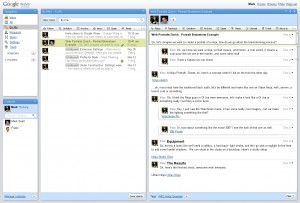
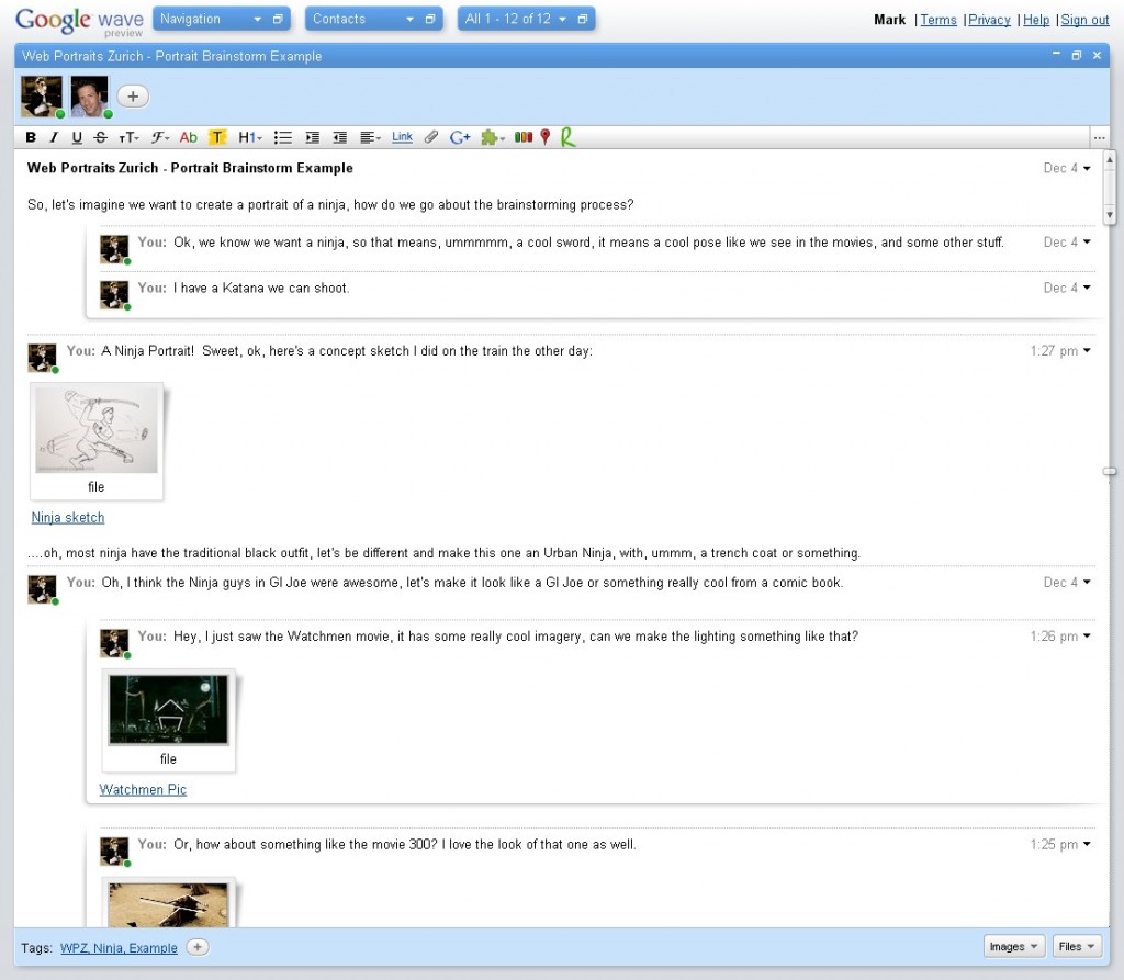
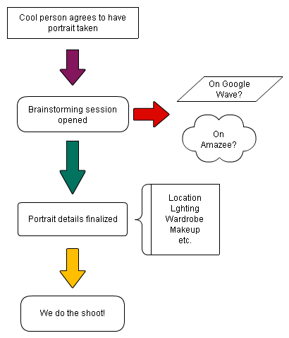
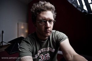
 The latest participants of the Web Portraits Zurich project were Dania and Gregory, the folks behind Amazee.com and help organize events like Web Monday Zurich and the Swiss Startup Camp. Before the shoot I sat down with Greg and Dania for a brainstorming session (after presenting some ideas to them online), which included Amazee Gothic. The purpose of Web Portraits Zurich is to give people a platform to be photographed, to challenge their ideas of themselves and be a part of how their images are created and portrayed.
Amazee Gothic
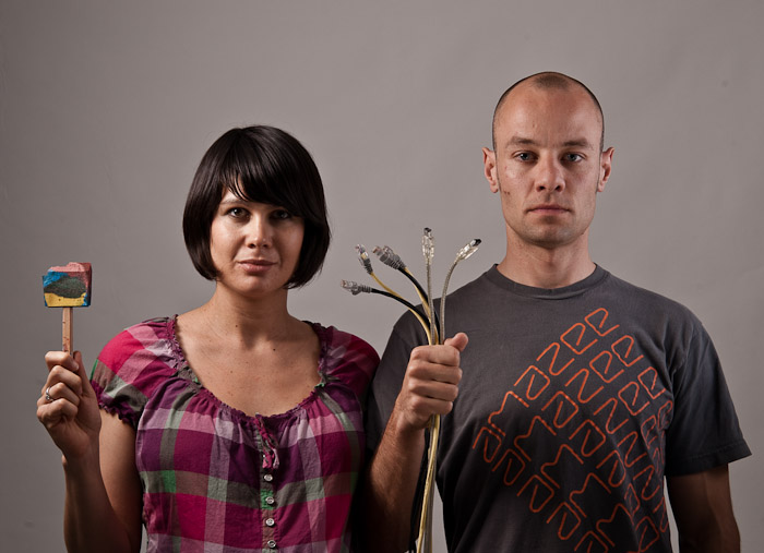
There’s an iconic image from Americana called American Gothic. It’s an image of a man and woman standing beside one another. The basic interpretation is that they’re married and have labored hard to build the barn, which dominates the background of the painting. The man holds a pitchfork, and you get a sense that hard work and family come together to build a life for the two of them and for the future. I love thinking philosophically about images, and tracking the origins of ideas. With Dania and Greg, the analogy was perfect and obvious. The two are married and have labored hard in the startup land of Switzerland to build their barn, Amazee.com using the tech tools and business sense of modern times. This was the central theme I presented during our brain storming session, and then we exploded out in a couple different directions, and settled on a Tech-Flesh Jungle analogy to represent the internet environment of startup and internet companies in the new net universe – but this one will take some time to digest and to present coherently.
 Raw Shoot
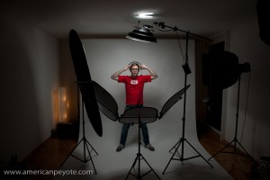
Before jumping into the Tech-Flesh concept, we did some basic portraits in my apartment studio. Dania and Greg dropped by one fine Tuesday night, and after a raclette dinner we set about shooting some portraits. Part of the Web Portraits project is to give people who don’t know much about photography and lighting the opportunity to learn. So we started out with Greg shooting after I’d set up the lights. Then I shot sets of Greg and Dania separately and together, getting a nice pool of images for the Amazee Gothic concept.
I wanted some nice, not-dark-and-moody lighting for the two of them. Greg has one of those fabulous near-bald heads that draws up from his body into a sort of classic form which almost demands a gridded softbox. I had one on hand and put an Elinchrom BxRi 250ws into it (a Creative Light 60x90cm gridded softbox). For Dania, and to balance out the sharper light hitting Greg I setup a white Elinchrom beauty dish with a diffusion sock, and inside I added a gold reflector element to give a warmer tone to her. I added some Lastolite Trilite reflectors in front of the two of them and we ready to shoot.
 First Cut
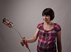
I put together a quick first edit of images from the shoot. I had just picked up a flame thrower for a future ProtestLove shoot and it seemed perfect to pair a pregnant Dania with a destruction device I originally saw when the Watchmen promotional posters were released. Basically I was looking for a retro-styled flame thrower like the one the Comedian used to light his cigar, and this one with Dania has the perfect look. The device I found is simplistic and is the perfect size, not too long and not too short. We were sort of thinking of compositing in a bomber in the background dropping a payload of blossoming flowers from the sky. All I need now is to hook the thing up to a propane tank and shoot the flame and do some photoshop magic.
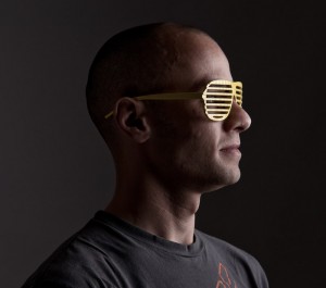
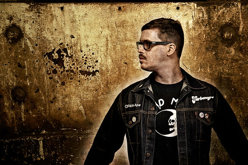
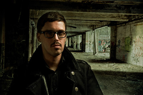
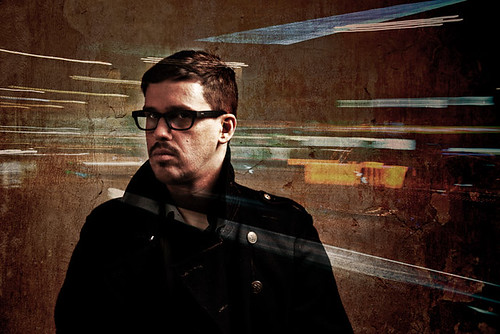
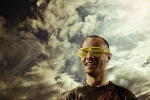 Greg found a pair of those cool 80’s glasses in my apartment I bought on the boardwalk in San Diego, and he wears them extremely well. I shot him with my large Creative Light softbox, and I guess he’s staring into the internet future, and with his smile, sort of reminds me of Max Headroom, I dig this look immensely. In the previous projects, I focused on a grungy look with Mathias, a cleaner look with Lukas, and now with Greg I wanted to do something lighter, so I worked up a composite of Greg with a summer sky shot in Berlin. I wanted something with a lot of light, but to maintain the texture of a painting canvas, some lightflare was added in Photoshop and I sort of want a hint of the awesome flare seen in Star Trek: where J.J Abrams used an anamorphic lens to get wicked flare, you also see this feeling in the Transformers movies, it gives you the sense of sitting in a desert.
A Person Is Not A Subject
When photographers talk about their photographs of people (like portraits), when I read comments on photo forums and on blogs from popular professional photographers it’s popular to use the term subject when referring to the image capture of a person, as in…
“I photographed the subject using a gridded octabox to feather the light off of their nose and give depth to their cheek bones…blah, blah…”
I like to call the humans I photograph people. After writing about subjects and lighting a lot of photographers then say something like, “but you have to make a connection with your subject.” I think that if you treat people like people instead of subjects, then it makes everything easier and natural to start out with. I think of a photo session as just an extended conversation. If you lose the human element in the photograph or image, then you also lose authenticity. And when you lose authenticity you have a picture which is worthless, without emotional impact, and is a waste of time to look. It’s tempting to say subject because it implies that you’re doing something grander than tripping the shutter on a camera during a conversation, but the truth is portrait photography is just about being a human talking to another human. When you get caught up in lights and gear and subjects you might not ever learn that simple fact, and end up treating a person you’re photographing like a science experiment – and I like photography because I’m not in the lab.








 The
The  Last up Mathias Vogel talked about the
 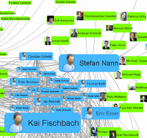 As part of the FHNW program two projects were also presented. Amazee is included in one of their partner projects, one goal being the creation of a sort of Karma Index into the Amazee system, which will include a recommendation engine so that new users are quickly connected with other users with similar interests when they join. I find this to be fantastic, because the first thing you wonder about when joining an online organization like Amazee (or Stylished, or Talenthouse, or Flickr) is how to find the people you want to work with. My mind had become a tad befuddled by this point from the free beer, but it was able to coherently listen to the presentation of the
