Web Portraits Zurich

Piotr Soluch – Web Portraits Zurich

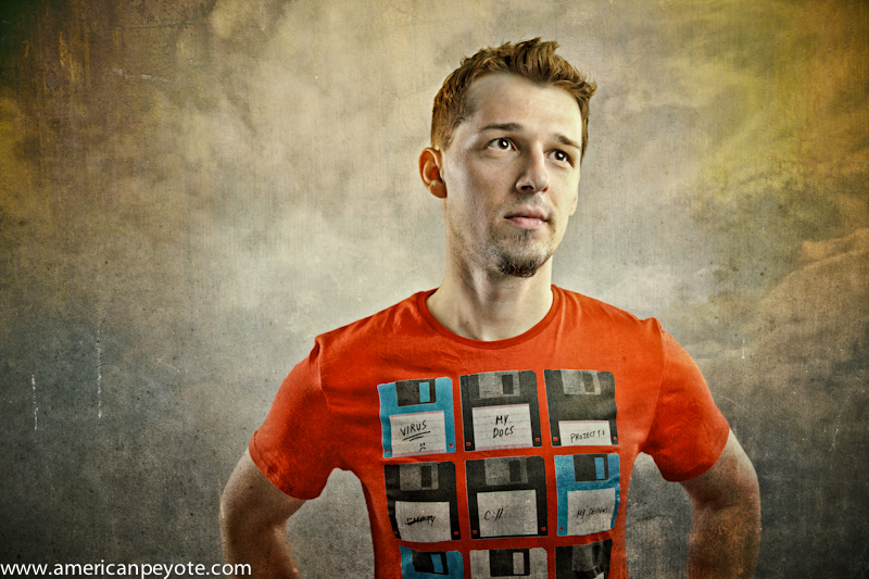
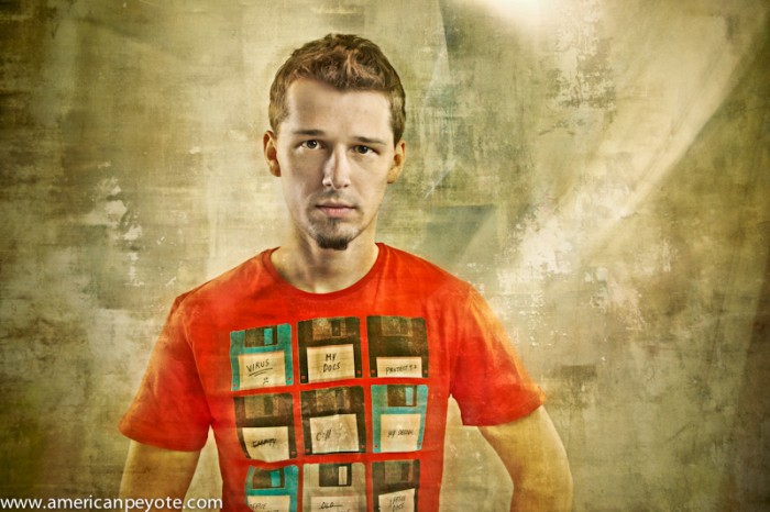
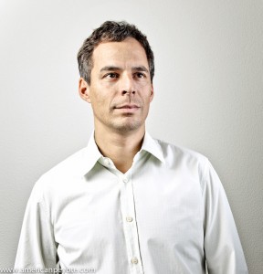
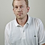
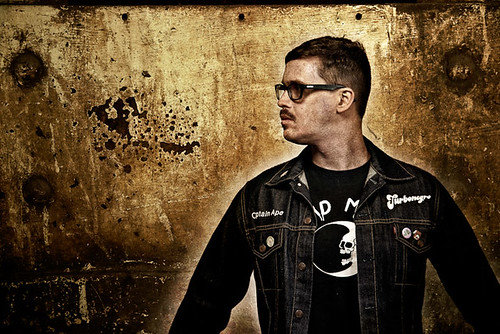
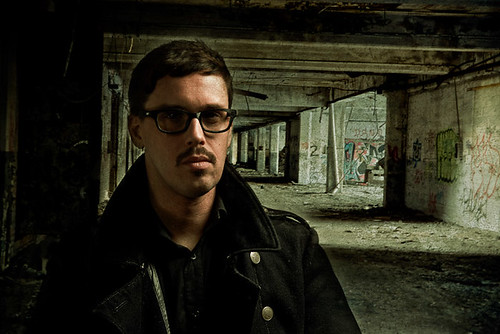
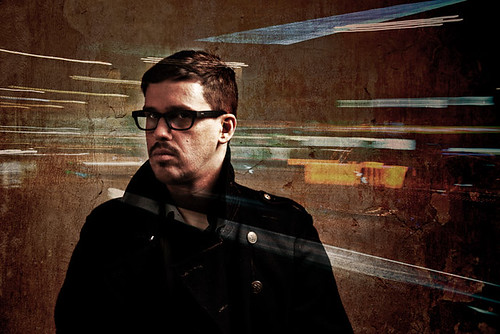
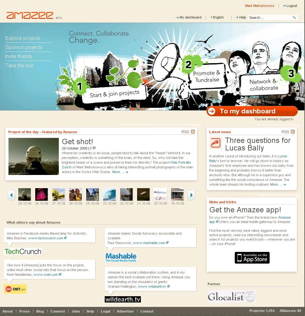
The latest addition to the Web Portraits Zurich project is Pitor Soluch, he just opened his web design business in Zurich, and I photographed in my new studio space in Hedingen. I hadn’t worked many projects lately, between moving out and moving in and running a few marathons I didn’t find a lot of time to organize any shoots or projects this summer. I met Piotr at a few web gatherings in Zurich like Web Monday, and we also ran into one another at the 2011 Swiss Startup camp in Basel. He’s an intricate designer with that required attention to detail that makes the difference between a professional site, and the ones that I throw together. For the shoot be came by with cookies and Polish beer. This was a fantastic combination and the shoot went smoothly for both of us.

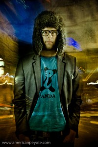
I wanted to get back to fine painterly shadows and images with a dramatic feeling. This included lighting Piotr with some CreativeLight strip boxes from behind either shoulder, a Metz MZ40 in a beauty dish from the front and LastoLite TriLite reflectors from the front. I then pulled in some textures from Rome and the abandoned hospital of Beelitz, just outside of Berlin. There’s no substitute for fantastic texture images. I’ll walk around a city for hours shooting walls and the streets and then maybe not use them till a year later. They add something you never expected when the shoot started.

Blankpage Portraits

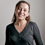
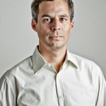
I was introduced to Blankpage through one of the team members, Lukas, who I met through Web Monday Zurich. Blankpage is an expanding startup in Zurich focused on B2B content distribution solutions. Blankpage was looking to be a part of the web portraits project, and this offered an opportunity to shoot a full startup team. I visited the Blankpage offices in Schlieren to discuss a shooting concept and get a feeling for the startup. Getting to know new people and hear about their startup ideas is one of greatest benefits of being part of the Web Portraits Zurich project. Blankpage is working on stuff I’m working on in the back of my mind, so it was great to see the iPad version of Das Magazine that they’re coding. Essentially, businesses like newspapers and magazines can come to Blankpage, and they offer solutions for getting that content onto mobile devices like iPhones and iPads, but this is better said on their website:

Design, build and customize electronic publishing technology to maximize business and usability impact for our customer solutions.

This was also my first location shoot for the web portraits project. All the previous shoots were done in my studio, and this offered the opportunity to see the company and get mobile with my lights. I brought a few lights to their offices and setup by a wall with enough space for a large softbox, reflectors, and a fill light.

For the concept, we wanted a certain uniformity between the shots (since it’s a team series), with a certain edginess, but not totally overdone with textures (like I normally do). I decided to go with some simple lighting, one large gridded softbox from one side to get some nice structure on the faces, another normal medium box from the other side, and some fill in the front reflectors.

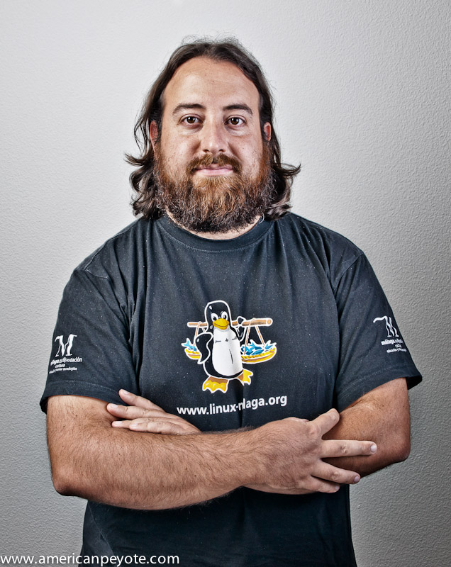
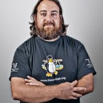
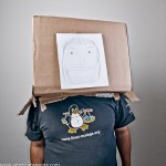
One of the most interesting portraits from the shoot is Bero, the Linux Guru of Blankpage. He came to the set with a box and a sketch of a face tapped to the front. This sort of humor is simply awesome. We shot a few portraits with the box and then pulled it off, Bero has that perfect mix of hippy and high-tech code warrior and I could easily do a whole series with this concept.

http://blankpage.ch

A Person is not a Subject

It’s been a fun year of photography so far, and running the Web Portraits Zurich project has given me reason to reflect on the process of making cool portraits of interesting people. I’ve contrasted my findings with the ramblings of professional photographers and teachers of the internet (where I learned a lot abouot photography), and have come to the conclusion that most internet sources don’t really have a handle on the portrait process, or they simply like to focus more on gear and dehumanizing people into subjects with gear talk rather than having a conversation on who is in front of our lenses.

Now, understand, it’s not their fault. It’s not embedded in their DNA. It’s just part of the mystique of this easy-lazy-art-form called photography. Cameras and photo gear became popular because it’s easier to click a shutter on a device than painting a canvas or doing a detailed sketch of what ever it is you’re looking at. When you shoot with a big camera it makes you feel important, but there’s a reason I don’t take myself too seriously. There’s this romanic ideal of photographers being like painters and artists delving with their whole soul into the artistic expression of the portrait. Photographers are expressing the inner soul of humans for all to see in the printed or screen viewed image…however…
A person is not a subject

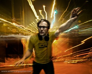
Simple, and to the point. A lot of folks get into photography because it’s cool – like I did. I drew things in math class because it was interesting, I started with photography and Photoshop because the gear makes it easy. There’s a romantic notion embedded in the collective history of photography of capturing emotions and elements of people, which would otherwise be lost forever as the second-hand ticked over and the present becomes the past and that look is lost forever (unless captured by the photographer). But a person is not a subject. Even models have names and personalities, but photographers sometimes like to ignore those humanizing notions and instead focus on the technical process of focusing light onto an image capture surface (like film or a digital sensor).  Afterall, we’re all engineers and poets, painters and scientists. But I like photography because it opens a door to the non-technical side of life. Models are not Barbie dolls. I know of what I speak, for I shoot pictures of Bratz dolls when I just want to photography plastic people. However, this gets boring quickly, and is a subject best suited to those moments when you’re looking for a way to till time but don’t want to sit in front of a television.

Photographing people is distinctly different than taking snapshots of Bratz dolls because with people you now have the opportunity to interact with the person. If you’re into photographing people, then just think of the process as an extended conversation with some visual elements thrown in. When you start saying things like, “I lit my subject with this and that camera and photographed them with an 85mm f1.2 lens…” Well, you’ve lost the point of the conversation. If you listen to professional photographers they’ll tell you to talk to your subject. Get to get to know them, make them feel comfortable. But here’s the thing, small talk like, “what do you do” “what’s your favorite color” “where are you from” is just filler talk. You’re probably doing it so the person doesn’t feel ignored but not because you really want to know who they are. This type of small talk simply says, “I’m just interested in my camera and making an image and you’re just a body…so smile.” This technique can be effective given the right situation. But is that the more interesting way to shoot? Is it more interesting to shoot a Bratz doll (who can’t speak) or to listen to a person and make a picture of them as well?

A Portrait is just Conversation

A photo session is just an extended conversation in my mind, and if you start out talking with people with an authentic voice, then the photo session will just be an extension of that initial, real, emotional connection. If you starting shooting like a pornographer and only start talking when you notice your subject is looking uncomfortable, then the whole positive momentum of the conversation has already been lost and you need to sort of start over. Tripping the shutter is the  shortest and least important part of a portrait photo session. But it’s the part that defines the final image. The question is, how does one get up to that point? I Think of the photo session in this way:
Conversation – Lighting/Set – Picture

The more time you take in getting to know a person before you light them with a million-gazillion photons, the more natural the resulting image will be. Or more unnatural, it depends on what you’re trying to achieve, and sometimes every photo session is full of suprises. Once you understand something about the person you’re planning to shoot you can design the lighting (some call this subject driven lighting), build a set or pick a proper location, and then being planning a post-processing philosophy, all before taking any pictures. I like to spend the least amount of time possibly on actually shooting and setting up lighting. The reason is simle, the shutter trip is the most insignificant part of the process if the process was done correctly. Now, maybe you’re going for the whole Stanley Kubrik, make-the-actors-feel-uncomfortable-to-illicit-emotion-from-them deal, but that’s a whole other level of person-photographer interaction. An authentic portrait session starts (and ends) with a conversation.

Most of the technical things about photography I’ve learned from the internet. It’s been a fun time and I’ve learned a lot about light control and lenses and cameras and strange terms like gobos and brolley. But my mind became exhaused and bored with this conent, and I’ve started wondering what else is there. However, when I watch things like creativeLive with Zach Arias or attend a Strobist workshop, I’ve started to notice how technology and lights are always at the forefront, and the whole emotional connection thing is thrown in afterwards, even though people generally admit it’s one of the mose important aspects of the whole process. Those conversations are there, but they’re not focused on in blog articles like David’s article On Assignment: Caleb Jones. Technical side of the shoot is all there, but what was the emotional connection between David and Caleb?

That’s a key element that a photographer like Joey L communicates extremely well in his DVD tutorial (Sessions with Joey L). In his tutorial Joey Lawrence pushes the ideas of trust and emotional connection as being primary, and lighting and camera technology as the secondary elements of a photo shoot (or photo career). This isn’t meant to be a negative critique of Zach Arias or of David Hobby (but it could be viewd as an encouragement or suggestion). The latter two (and internet icons like Chase Jarvis) are just responding to what sells. People love the technology of photography, the lenses, bodies, radio triggers, flashes, etc. People drop big bucks on technology and then wonder why their pictures look lifeless and ordinary when they know the person has a soul and interesting story to tell (like we all do). The thing I love about the Vincent Laforet CreativeLive workshop is that he started out talking about the philosophy behind movies, the story telling and emotional elements, and then got into the gear talk. It sets your head in the right mind-set, to tell a story and to make a connection to the viewers or consumers of the media product you’re producing. That’s not to say I miss the gear talk, it just gets boring after a while.
I love photo gear. I have more cameras than Onitsuka tigers and picked my last apartment based on how I could setup a photo studio. One reason I started the Web Portraits Zurich project was to do emotionally-driven portraits of people (I know that sounds a tad pretentious). I wanted to setup a process of including the emotion of the person in their portrait. I wanted to portray people including elements of how they perceive themselves. I shoot the web portraits based first around the person, and then as a secondary condition around lighting and Photoshop. For each portrait set we start out with a concept meeting, the people I’m shooting get to know me and I start to understand how they see themselves. This is the grounding for the whole photo session, and I see the whole process as one long conversation with some camera equipment and photoshop thrown in as an after-thought.

A person is not just a subject

A photo shoot is just an extended conversation

Amazee Gothic – First Cut

The latest participants of the Web Portraits Zurich project were Dania and Gregory, the folks behind Amazee.com and help organize events like Web Monday Zurich and the Swiss Startup Camp. Before the shoot I sat down with Greg and Dania for a brainstorming session (after presenting some ideas to them online), which included Amazee Gothic. The purpose of Web Portraits Zurich is to give people a platform to be photographed, to challenge their ideas of themselves and be a part of how their images are created and portrayed.

Amazee Gothic

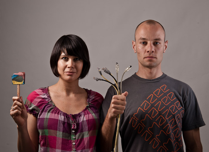
There’s an iconic image from Americana called American Gothic. It’s an image of a man and woman standing beside one another. The basic interpretation is that they’re married and have labored hard to build the barn, which dominates the background of the painting. The man holds a pitchfork, and you get a sense that hard work and family come together to build a life for the two of them and for the future. I love thinking philosophically about images, and tracking the origins of ideas. With Dania and Greg, the analogy was perfect and obvious. The two are married and have labored hard in the startup land of Switzerland to build their barn, Amazee.com using the tech tools and business sense of modern times. This was the central theme I presented during our brain storming session, and then we exploded out in a couple different directions, and settled on a Tech-Flesh Jungle analogy to represent the internet environment of startup and internet companies in the new net universe – but this one will take some time to digest and to present coherently.

Raw Shoot

Before jumping into the Tech-Flesh concept, we did some basic portraits in my apartment studio. Dania and Greg dropped by one fine Tuesday night, and after a raclette dinner we set about shooting some portraits. Part of the Web Portraits project is to give people who don’t know much about photography and lighting the opportunity to learn. So we started out with Greg shooting after I’d set up the lights. Then I shot sets of Greg and Dania separately and together, getting a nice pool of images for the Amazee Gothic concept.

I wanted some nice, not-dark-and-moody lighting for the two of them. Greg has one of those fabulous near-bald heads that draws up from his body into a sort of classic form which almost demands a gridded softbox. I had one on hand and put an Elinchrom BxRi 250ws into it (a Creative Light 60x90cm gridded softbox). For Dania, and to balance out the sharper light hitting Greg I setup a white Elinchrom beauty dish with a diffusion sock, and inside I added a gold reflector element to give a warmer tone to her. I added some Lastolite Trilite reflectors in front of the two of them and we ready to shoot.

First Cut

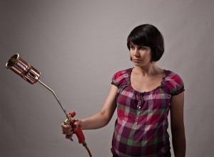
I put together a quick first edit of images from the shoot. I had just picked up a flame thrower for a future ProtestLove shoot and it seemed perfect to pair a pregnant Dania with a destruction device I originally saw when the Watchmen promotional posters were released. Basically I was looking for a retro-styled flame thrower like the one the Comedian used to light his cigar, and this one with Dania has the perfect look. The device I found is simplistic and is the perfect size, not too long and not too short. We were sort of thinking of compositing in a bomber in the background dropping a payload of blossoming flowers from the sky. All I need now is to hook the thing up to a propane tank and shoot the flame and do some photoshop magic.

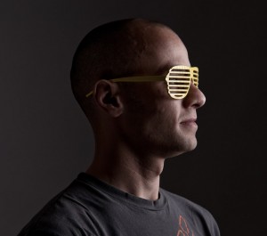
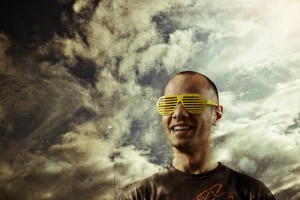
Greg found a pair of those cool 80’s glasses in my apartment I bought on the boardwalk in San Diego, and he wears them extremely well. I shot him with my large Creative Light softbox, and I guess he’s staring into the internet future, and with his smile, sort of reminds me of Max Headroom, I dig this look immensely. In the previous projects, I focused on a grungy look with Mathias, a cleaner look with Lukas, and now with Greg I wanted to do something lighter, so I worked up a composite of Greg with a summer sky shot in Berlin. I wanted something with a lot of light, but to maintain the texture of a painting canvas, some lightflare was added in Photoshop and I sort of want a hint of the awesome flare seen in Star Trek: where J.J Abrams used an anamorphic lens to get wicked flare, you also see this feeling in the Transformers movies, it gives you the sense of sitting in a desert.

A Person Is Not A Subject

When photographers talk about their photographs of people (like portraits), when I read comments on photo forums and on blogs from popular professional photographers it’s popular to use the term subject when referring to the image capture of a person, as in…

“I photographed the subject using a gridded octabox to feather the light off of their nose and give depth to their cheek bones…blah, blah…”

I like to call the humans I photograph people. After writing about subjects and lighting a lot of photographers then say something like, “but you have to make a connection with your subject.” I think that if you treat people like people instead of subjects, then it makes everything easier and natural to start out with. I think of a photo session as just an extended conversation. If you lose the human element in the photograph or image, then you also lose authenticity. And when you lose authenticity you have a picture which is worthless, without emotional impact, and is a waste of time to look. It’s tempting to say subject because it implies that you’re doing something grander than tripping the shutter on a camera during a conversation, but the truth is portrait photography is just about being a human talking to another human. When you get caught up in lights and gear and subjects you might not ever learn that simple fact, and end up treating a person you’re photographing like a science experiment – and I like photography because I’m not in the lab.

Lukas – Movement DJ Portrait

I shot Lukas for the Web Portraits Zurich project some time ago, and I’m finally producing some finished portraits from the shoot. Lukas runs Guzuu and is a fixture in the Swiss web community for his unique visual style. Like many people I meet in the web/startup scene, he’s not just into launching companies, but also has a creative side. In this case, Lukas likes to DJ in Luzern and runs an internet music label (LittleJig.com).

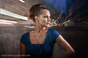
I thought for a long time about how create images of Lukas, I could have just composited in some graffiti and called in a wrap, but then the images would have looked too similar to what I created for Mathias, and my sense for photographic exploration was honed in the academic research world. In Academia the key driver is to do something different, start with what you learned from the work of Bent and Hagood on Active Fiber Composites (AFC) and do something slightly different, evolve the idea a bit. Similarly, I wanted images of Lukas which have more movement and motion elements in them than with Mathias. I wanted to take some elements from my experience dancing in clubs and other DJ images I’ve seen on Flickr, and combine it with the visual style I’ve been developing. This meant light trails, streams of light created from the headlights of moving cars and night scenes of the streets. So when I went to UXCamp Europe 2010 in Berlin, I took some extra days and walked around Berlin, shooting long exposures at Rosenthaler Platz and other locations to generate the necessary texture images for Lukas.

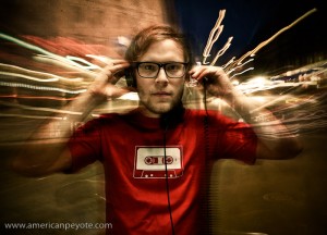
When I’m dancing in a club I like to loose my mind and let my body get connected to the music and the vibrations in my soul. It’s a very personel thing, rather hard to commuincate visually, but I figured I should at least try. A key here was to let the light trails and night scenes move around Lukas, not dominate his image or allow key elements to be lost in the shadows. I’m getting back into painting at the moment, so I had an eye for adding abstract visuals from the night which are probably more like brush strokes than elements from Berlin, but in my head it seems to work.

A Web Portrait – Lukas Uncut

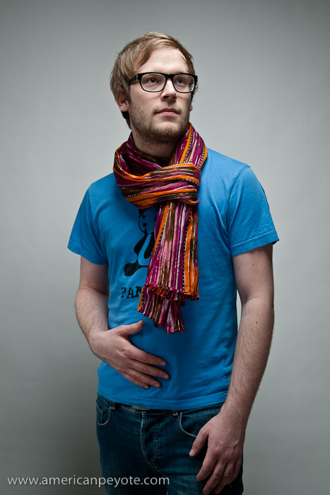
Lukas from Guzuu agreed to do a Web Portraits Zurich shoot at my studio just before Easter. Lukas is interesting on many levels and was one of the reasons I started the Web Portraits Zurich project. He’s got a web startup (Guzuu.com), he has a cool style, and he’s a DJ on the side. Lukas was the inspiration for the web portrait project. I met him at the Amazee booster party in 2009 and it was after a Web Monday meeting that I decided to start the web portrait project on Amazee. The reason was clear, people in the startup community have a cool combination of brains and style, making for excellent portrait subjects.

Pre-Production Concepts

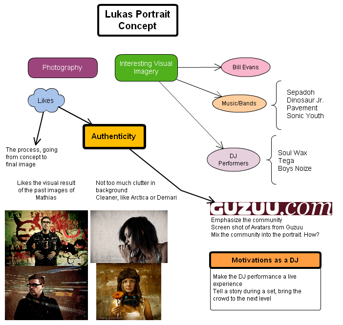
After Lukas agreed to do a web portrait we met for a brain storming session at Cafe Spheres in Zurich and from there we developed some visual direction for the shoot. I used Cacoo to work up a mindmap of the brainstorming meeting and used that in the pre-production lighting setup. Like Mathias, Lukas has a strong identity to music and the associated visual imagery. This is sort of a dream for the concept portrait photographer, because the person already has an opinion of what they like visually. This makes the whole portrait process way cooler, because it’s then a coming together of the minds and visual direction. Lukas knows the imagery he likes, it’s my job to work with him to create it virtual reality (digital imaging, photography, whatever you like to call it).

The Shoot – Respect the Image

Lukas dropped by with a bag full of cool clothes and after popping open a beer we talked for a bit and then started shooting. The interesting thing about the web portrait project is that I’m shooting real people in their own skin. When you shoot with models you’re often times shooting someone acting out a scene. They retain certain traits of their personality, but the image and concept comes from the photographer, the shoot is produced, the final image a result of pure direction. When I shot Demari Vi Syth her “psychotic sister of the girl next door” vibe is evident, but it doesn’t necessarily reflect who she is in real life. But that wasn’t the point of that shoot. A good model knows how they look, how to best portray their body, and it’s the job of the photographer to use that and make it look authentic with respect to the image concept. In general, real people don’t know how to pose, and as a photographer I’m not so motivated to tell them exactly what to do. I know this is what photographers are supposed to do, but if you direct 20 different people the exact same way you end up with 20 nearly identical portraits.

Respect the Person

The faces change, but the form of the body basically stays the same if you direct everyone the same way. How boring is that? Oh sweet, another picture of a band in front of a brick wall. Think outside the cookie cutter softbox. The goal of Web Portraits Zurich is to give people a platform to be themselves in an artificial environment, to create portraits which present their personalities as they see themselves. Naturally I add a lot of interpretation through shooting, lighting, and post-processing, but only so long as I can maintain that authenticity of the person in the portrait. I’m not saying I’m succeeding in this respect, I’m just saying I’m doing what feels right. Be true to the integrity of the image, and all the details will fall into place.

Fin?

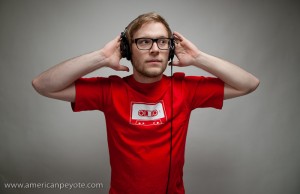
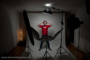
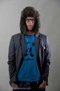
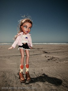
By the end of the shoot we’d gone through a variety of looks and killed a few beers. We had the idea of following a certain combination of color and jackets. Lukas had a shirt from Guzuu in Yellow with a tape on the front (one of the most popular items) and I let him borrow my version in red. Near the end Lukas brought out the DJ headphones an I switched to a wide-angle setup, shooting him like he was leading the crowd of a fanatic music rave calling out to the Gods of nights. Of course, the images aren’t finished, I’ll now move into the abstract stage and start putting together some post processing concepts for the images.

Web Portraits Zurich – Mathias Shoot

The first willing subject for the Web Portraits Zurich project was Mathias Möller, Editor and Community Manager at Amazee who agreed to have his portrait taken.

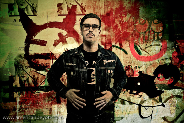
The shoot was relaxed, the way a portrait shooting session should be. We had had a concept meeting a few weeks before, and organized some ideas on Google Wave, so there was a clear direction for the shoot. Grungy and not too bright, a little counter culture and gritty. This wasn’t a high pressure shoot, Mathias just dropped by the apartment studio and we talked about random stuff like the Spores (a band out of L.A.) and imagery from Joy Division. An observer might call this “connecting with the subject” but I just call it a fun time talking with an interesting person. There were two main looks we went with during the session, Mathias had a vintage Swiss Army jacket and a cool band denim jacket. I was shooting on white seamless with a few lights and reflectors.

Lighting Philosophy

Mathias wanted some darker sort of photos, which is what I’ve sort of developed a style shooting, so our expectations worked well together. For me this meant creating lighting with shadows and darkness, while allowing the main features of Mathias be revealed. This meant some directional lighting on the face, casting dark shadows across his body, and a grungy post-processing philosophy. I worked primarily with my Elinchrom BxRi 250ws strobes and a Sunpak 383, with Lastolite Trilite reflectors and a large 5-in-1 silver reflector.

For the portrait with a Swiss Army jacket I put a BxRi in an extra small Photoflex octabox, and used this to create a large contrast on his face. A sort of Yin-and-Yang, darkside/lightside sort of lighting. A reflector and Orbis ringflash (with Sunpak 383) were used to maintain lighting detail of his cool vintage jacket. For post-processing I used some industrial grunge, including compositing Mathias into the old abandoned Packard car plant in Detroit, Michigan. Other background images and textures were shot around Zurich and Winterthur in Switzerland.

For a cleaner look, I shot Mathias with a BxRi flash in a large Creative Light softbox (60x90cm) with a grid, and added some fill using the Photoflex extra small octabox. The Creative Light softbox was placed on the side, and gave a lot of bright directional light, which works well for creating defined shadows with smooth but small transitions.

Visual Results

The idea with Mathias was to create images with a certain grungy darkness to them. This was accomplished via lighting and post-processing in Photoshop using layers of concrete and industrial scenes. Overall I think we accomplished the not-to-bright and not-to-sterile look without making Mathias look like a grungy gangster from the Zurich hood.

I’m always looking for new faces to shoot, if you’re interested in the idea of documenting the people from the Zurich startup and web scene it’s easy to get in contact with me to set up a concept meeting. More about the Web Portraits Zurich project can be found on Amazee.com or the articles here:

Web Portraits Zurich – Amazee Project
Web Portraits Zurich on the blog

Mathias Web Portraits Zurich

WPZ – Mathias Concept Meeting

WPZ - Video 1.001The Web Portraits Zurich project is moving forward. This was a project I started on Amazee to integrate photography with my interest in web technology. The first portrait shoot is with Mathias Möller, who works at Amazee and freelances for laut.de, a German music blog. The Web Portratis Zurich project is as much about exploring creative collaboration tools as it is about creating excellent portraits of people in the Zurich Web/Startup Scene. During the concept/brainstorming stage we’ve been using Google Wave, but at some point it makes scense to sit down for a face-to-face.

Face-to-Face

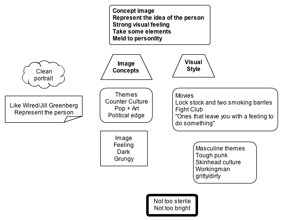
So, on a fine Friday night Mathias and I sat down at Cafe Sheres in Zurich discuss and get a concept direction for his portrait. I took along a sketchbook to make a mindmap while we talked. All in all it was an excellent meeting…coffee, free-flow of ideas, the stuff that brainstorming dreams are made of. The goal of our face-to-face was to throw ideas around, see what we like for the main shoot and make sure I don’t show up with a suit of Medieval armor when he imagined being photographed like a punk-rocker. A portrait is really a delicate thing, you are not making an image of a person, but rather taking an image of an idea (at least, that’s my view on it). The person is the idea, and their physical body a changing representation of only the outer shell. The key is to meld the elements of the person with the shadows of the outer shell. Maybe I think too much, but an image is usually not just a picture, and a portrait is rarely an accurate represenatation of the person in front of the camera.

The Person

During our meeting, I was sort of interviewing Mathias and the other half of the time he was talking out aloud about his ambitions and elements of his personality, which is exactly what should be going on during just such a meeting. What I learned is that Mathias is totally down with doing a cool concept portrait. Just to be safe, we’ll do a nice clean one as well (like Jill Greenberg/Platon), because it’s possible the concept fails (but it won’t). Among the various questions, I asked things like,

What movie do you see yourself in, or identify with?
What type of imagery do you like from music and album covers?
How do you want to see yourself?

These type of questions tell you a lot about a person, and I see it as more or less essential to get this background information, otherwise how will you know what elements fit the personaility of the person. Also, I don’t want to put Mathias into a concept he’e not comfortable with. The elements all have to flow together for the image to work. I learned that Mathias identifies with the Punk rock movement, doesn’t own a pair of Doc Martens, likes the dark and grungy tones in my photography, is interested in the skinhead culture, counter-culture, often sees things in a political context, likes the imagery of Sonic Youth and Morrisy, is interested in the connection between Pop and Art, wants an image that isn’t too sterile, and also not too bright.

Most importantly I found out that Mathias is interested in taking elements from himself (the person) and melding that the concept of the shoot (the idea). This was awesome to hear as it’s the way I go about developing portrait shoot concepts.

Mathias-Portrait-Concepts.png

Mathias_Wave_PicOnline Collaboration Tools

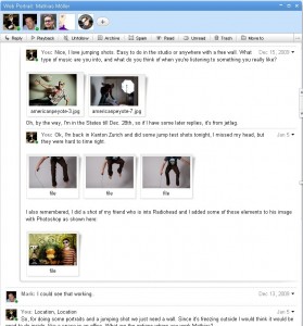
One goal of the Web Portraits Zurich project is experimentation with different online tools to help the brainstoriming process and…let’s call it: Creativity Management. We started the brainstorming process on Google Wave, which worked ok to throw up some initial ideas and concept images, but it’s not about to replace the face-to-face meeting anytime soon. In the future we’ll use Wave to throw around some basic ideas, and then meet at a cafe for a sit-down brainstorming session.

For organizing workflow and mindmaps, I’ve been using MyMind on my G4 Powerbook and Cacoo, an online diagraming tool. First I took the notes from the meeting, wrote them all up in MyMind for visual organization, and then cut and pasted the main ideas to Cacoo. Cacoo works very well for making mindmaps and workflow diagrams. Since it’s online I can access my documents from any computer. These can be exported as png images to be embedding in webpages, and the maps can be shared via a url link to the online document, which makes it a very nice online tool. Above is the mind map I made up on Cacoo for Mathias, something I do for every photo shoot now. It’s an easy way to view and arrange elements of a portrait shoot, mixing concepts with the shooting requirements.

The Resulting Vision

At the moment I see Mathias standing in front of some old TVs looking a bit like Ian Curtis from Joy Division, the background is gray, layered with a bit of industrial grunge. On the TV’s are images of static and protest. He sports an awesome pair of framed glasses (the ones he wears). Part of the visual style will be influenced by Control, the definitive Joy Division flick. The point here will not be to make Mathias into Ian, but to take some visual points from that music style, and layer with Mathias, sort of like adding a grunge layer to a portrait.

The next step is finalizing the concept and doing the shoot.

Google Wave – Photo Project Brainstorming

google_wave_logo-400x320.jpgI’m running a project on Amazee called Web Portraits Zurich. Basically it’s about creating cool portraits and images of people in the Zurich/Switzerland web and startup community. To try and be a little innovative, I started the project not just as a way to gather a lot of cool subjects to shoot with (like any selfish photographer), but also as an experiment in the online creative process. I usually do a lot of pre-shoot work for any portrait project I engage in, and I was thinking to myself, “what web tools can be used to improve the creative process?” I’ve written a lot about my Concept to Photo workflow here on the blog, and basically this includes initial brainstorming, shot logistics, and lighting design. What I was wondering was, “how can we do this online, so that multiple people can participate and really make it a community project?”

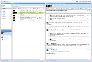
The biggest problem with brainstorming a photo shoot online is the lack of interactivity on most web platforms. Wether we’re talking about Flickr, Talenthouse, Amazee, etc. we’re always basically talking about posting messages and responses to a message board. The flow of dialogue is then static, and one has to read through the whole post of messages to figure out what was being said. That’s why I was excited to try out Google Wave and use Web Portraits Zurich as a test case for online brainstorming and as a photo shoot organizational tool.WPZ_Wave_Example.jpg

My expectations are that we post a new Wave for each new portrait project, then people start brainstorming how to do it. Do we shoot in my studio, on location, how will the startup company play into the portrait? Do we want dramatic lighting, soft, are there example images we can use to illustrate our ideas? Can we keep the dialogue going, with people commenting on certain parts of the conversation and can we replay how the how project evolved? In short, all of this is possible with Wave – and it’s fucking awesome.

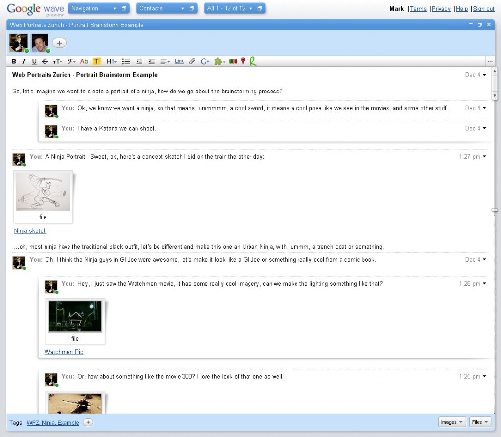
With Google Wave you have the ability to create posts, and have people add and respond to different parts of the dialogue. You can upload files like images, which is important for brainstorming a photo project, where the concept is always the most important thing (I think). The concept of the person being photographer, the concept of who they are, how they are perceived by the world, etc. With Wave a person can sketch out an idea (for posing for example) and upload it directly to the Wave. Everyone can then visually see what they mean and thereby we maintain momentum in the brainstorming process.

WPZ_Wave_Example_2.jpg

I started out with an example Wave to illustrate the process. This was an attempt to recreate the brainstorming process I went through to create my Urban Ninja images. With Wave I can upload sketches, concept images from Watchmen and 300 (a significant inspiration for this set), and you can see all right there on the screen how the idea evolved. People can then discuss about the concept for a portrait, post example images (like a scan from a magazine) to illustrate the type of look they want, and then we can directly discuss how to create it in reality.

The Future

Google Wave is an awesome product. I don’t say this often about we technologies. Often “new” are just regurgitated copies of a copy of a copy of an old idea. I feel that Wave is more innovative than the common “new” web thing (like Facebook), but what I see in my head is even better than what I’ve described so far. Think Android and Chrome for a second. Android is the open-source mobile operating system Google has developed for devices like smart phones. There’s the Droid, the HTC, that run on Android, and that’s only the start. Android can be used on netbooks, and soon on web tablets. This is the perfect combination in my mind for the creative professional who want’s to network.

Imagine a touch phone or net tablet running Android with Wave as an application, allowing you to interface directly with other people on your creative team anywhere in the world. Imagine creating and changing lighting diagrams intricately and posting concept sketches and having a creative director on the other side of the world adding notes. Imagine doing this on your computer at home, on the move running around during the day, and doing online conference calls to shore up all the detail. I think the possibilities are fantastically awesome for Wave and the future of mobile computing.

Web Portraits Viral Intro

WPZ - Video 1.001The Web Portraits Zurich project got a viral presentation today. I put it together and uploaded it to SlideShare to act as a viral type of device to embed in other pages and visually communicate the main idea, inspire people, etc. The design includes a bit of the grunge look that I like, as well as a few mottos like,

“…the net is also human.”

“the web is also mortal.”

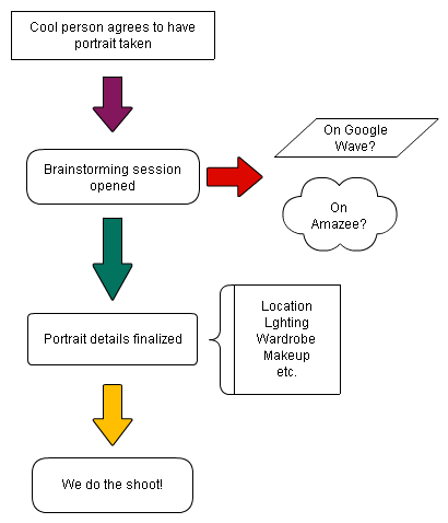
Afterall, the whole point of this project is to make that emotional connection between the creator and the users of web technology, so the mottos seem proper to use in this context. Over the past month since I launched the project I’ve been going over the organizational themes in my head before gathering people to start shooting with. The main question is how to handle the creative brainstorming. I would really love to use Googe Wave for this purpose. The main project flow will be as described in the diagram below (unless someone has an excellent alternative). Basically we’ll brainstorm some ideas for cool portraits based on who is being photographed, organize the concept, location, etc. and then produce some sweet pictures.

WPZ_Workflow

I’ve been experimenting with Googe Wave to brainstorm a portrait. It would be sweet if the Wave could be embedded hereWith Google Wave you basically have a mad-scientist cross between a forum posting, a time machine, and a normal conversation. At least, you should have all of that once it’s out of the Beta stage. At the moment I can’t upload photos, which will be pretty important when brainstorming ideas for shooting and production. I want people to be able to sketch out and upload their ideas to the discussion, and from there we get ideas on lighting and stuff, and then we have a cool tool for creative portrait brainstorming online. A person from Tokyo could suggest the makeup, one from San Diego the lighting, someone from Zurich suggests a location, etc.

Another option is to use the Wall on the Amazee project board. However, there are some limitations here, and it’s more like using a forum to post and discuss ideas, which works for some things but isn’t the idea brain storming platform in my opinion. Well, part of the project is exploring how to organize a creative project online, so whatever happens, I’m sure we’ll all learn something.

Here is the Intro Presentation

Web Portraits Zurich – The Idea

Amazee-Balmhorn

A few weeks ago I launched a project on Amazee called, Web Portraits Zurich.

The project is simple, easy to explain and painless to promote. I want to combine photography with the interesting people I’ve met in the Zurich web scene. While heading to events like the Swiss StartUp camp in Basel, barcamps in Berlin and Switzerland, as well as the WebMonday meetings in Zurich, I’ve met a lot of interesting people with interesting ideas. Then, after WebMonday Zurich #10 I brainstormed some lighting setups for an upcoming photoshoot – and then an idea was revealed in my head. The idea is to use Amazee to organize portraits of the people in the web and startup community around Zurich. Right now I’ve cut a few videos in my head explaining the Web Portraits Zurich concept and will cut them for real this week. These will both present and explain the Web Portraits concept and organization. This seems the most effective way to give people an idea of what to expect and to promote to interested parties.

But as a prelude, I’ll reveal some personal motivations behind the project. Why Web Portraits? Why organized on Amazee? After all, to just do some portraits of the web people in Zurich, I can just contacted people and shoot the portraits and than would be it. You see, with Amazee I see some inspiration to experiment with Creative Production.

The Web is also Human

The Net is also Mortal

If you shoot a portrait it might all be done by the photographer, setting up lighting, choosing a location, organizing things and then doing the shoot. In my experience the process of creating a portraits involves a few steps (or non at all): Concept Creation, Production Design, Shooting, Post-Processing, Distribution.

I want to give back, to give the opportunity to people to participate in the process of creating these portraits. Why? Because I’ve found that exercising your creative tendencies outside of your normal interests (or jobs) makes you a better, more flexible thinker and enables you to improve your ability to view the world in different ways, and that improves your ability to come up with new solutions for different problems in life.

Since the project was launched on Oct. 29th there’s been a healthy interest on Amazee, including a feature on the main page. Now it’s up to me to build on the momentum and release these videos and start shooting. If it all works out in the end there will be a sweet collection of portraits from the Zurich web scene, we’ll integrate the interesting personalities with their cool technological achievements and see what trouble we can get into along the way.

Get_Shot_Crop